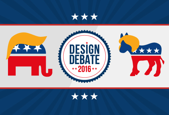
Design Debate 2016: Political Logos
WANT TO SEE MORE LIKE THIS?
Sign up to receive an alert for our latest articles on design and stuff that makes you go "Hmmm?"

With the 2016 election mere weeks away, political discourse is practically impossible to tune out. While the means by which spreading word about candidates has changed since our country’s early days, the goal remains the same: presenting a political brand that a majority of voters will “buy” come Election Day. Not an easy task in a country as large and diverse as the United States, according to branding strategist Laura Ries: “Even the iPhone doesn’t have a 51% share of the smartphone market in the U.S”. In an effort to appeal to the masses, candidates have, in the past, followed a standard political aesthetic through symbolism and color: American flags, as well as the flag’s individual components of stars, stripes and red, white and blue.
President Obama’s 2008 “O” logo has been pinpointed by many graphic designers and political commentators as a distinguishable turning point in campaign logo design. With the growth of technology and the internet, the simple “O” became a standalone symbol, and could easily be transferred between mediums, whether stamped onto merchandise or shared on social media sites (see a more in-depth look at some examples from our 2012 election article). Not only that, but the letter “O” tied into Obama’s campaign rhetoric, evoking “Openness”, “Opportunity” or, as seen later in street artist Shepard Fairey’s now iconic poster, “Hope” and “Progress”.
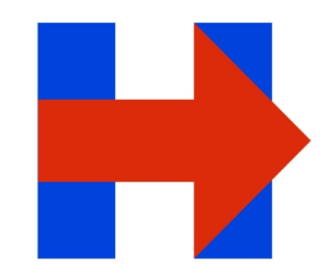
President Obama’s “O” set a new precedent, according to designer Sagi Haviv of the New York firm Chermayeff & Geismar & Haviv: candidates “really are trying now to kind of claim something distinctive, something ownable.” Similarities between what President Obama’s logo accomplished in 2008 and what candidates in the 2016 election have tried to accomplish are clear, especially in Hillary Clinton’s “H”. While many designers agree that the H looks bold and strong, Scott Thomas, design director for President Obama’s 2008 campaign, observed that “It’s just a red arrow moving to the right”, in itself confusing given Hillary’s party. Some even harken its similarities to the famous FedEx arrow. However, others praised the H’s simple versatility, saying it has endless possibilities for tweaks in color as well as malleability across social media platforms and merchandise. On her website, the arrow has been changed to blue and is used to point visitors to the site’s various calls to action.
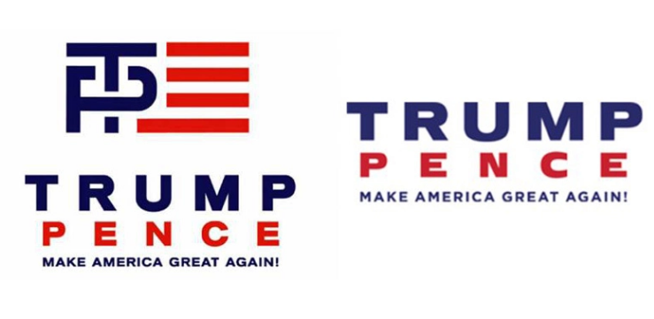
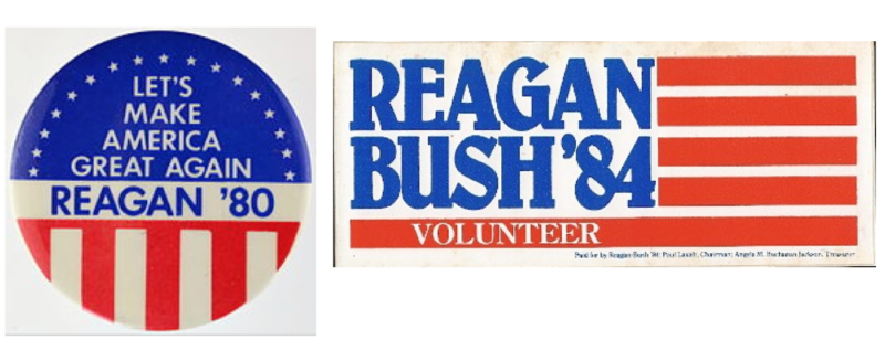
Critiques of Clinton’s logo have more recently been overshadowed by those aimed at Donald Trump’s, which had to be quickly altered and rereleased due to an onslaught of online mockery suggesting Trump and Vice Presidential nominee Mike Pence’s initials contained a sexual reference. As often happens in political elections, and as any quick Google search will reveal, this satire has become a political narrative of its own. His new logo hasn’t received particularly positive responses, with some saying it lacks distinction. His patriotic colors, simple layout and the phrase “Make America Great Again” elicit an old-school political sentiment, particularly that of Ronald Reagan’s 1980 campaign, and even George W. Bush 2004 campaign.
When you think about it, politics and design actually have a lot in common: they can be influential and inspirational, and other times confusing and dull. While campaign logos are an election tradition, the election in itself is a great American tradition. Logo design aside, don’t forget to get out there and vote on November 8th!
Need to push your business identity forward? Want to make your brand great again? We can help….Contact us today!