Emotional Backlash from Failed Food Packaging
WANT TO SEE MORE LIKE THIS?
Sign up to receive an alert for our latest articles on design and stuff that makes you go "Hmmm?"

One of the more notorious moments in recent food industry history had nothing to do with the poor quality of the product, a food safety violation, high-carb content, or some other nefarious health effect.
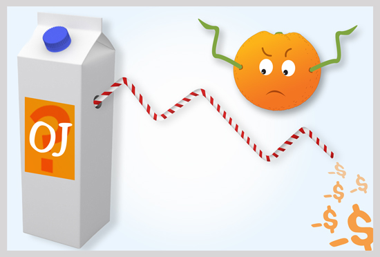
No, a very large American company lost more than $30 million because of bad design.
I’m referring, of course, to the Tropicana debacle. To refresh your memory, in January of 2009, PepsiCo, parent of the juice brand, introduced a new look. Instead of an orange skewered with a straw, the new Tropicana Pure Premium OJ carton centered on a photo of juice. The creative force behind this change, brand-guru Peter Arnell, said the focus of the orange-less look was on squeezing—fresh-squeezed juice.

Sales suffered almost instantly. Consumers complained. The design was widely described as looking like a “generic” or “discount store brand.” Just seven weeks after its launch, PepsiCo scrapped it, and returned to the orange with a straw.
The Tropicana fiasco was a rare moment where the details of food packaging design and branding became headline news. An orange juice carton was one of the world’s most-blogged-about topics for a week. The New York Times’ Stuart Elliot likened the design debacle to one of the grandest brand flops of all. “It took 24 years, but PepsiCo now has its own version of New Coke.”
In Search of Packaging Design that Boosted Sales
About a week ago, I started wondering if there was an anti-Tropicana—that is, a situation where a package change, or a logo design change caused a surge in product sales in the beverage or food world. Off the top of my head, none came to mind.
Now, there are plenty of examples of legendary packaging successes in the food and beverage world. But in almost all cases, they’re legendary because they have a clear functional benefit—convenience, ease of use, shelf-stability. A survey of food packaging designers listed the “Top Packages of the Last Century.” Not surprisingly, the list highlighted bags, which extend produce shelf life, safer baby bottles, resealable bags, microwave-friendly packaging. Every year, food makers pour billions into developing packages that make life easier.
But I was curious about the cases in which it was only a change in aesthetics—a new logo, a rebranding—that caused a surge in popularity in the product.
Making a splash on the shelves of an American grocery store, circa 2011, is not an easy task. Not only does a product package need to “pop” off the shelf, but it also needs to establish brand recognition. After all, there is plenty of competition to choose from.
Consider this:

One UK design consultant described the food marketer’s challenge as “Being the 1 in 1000.” (For everything the average consumer buys, there are 999 things they don’t buy.)
Over the past few days, I’ve browsed local grocery store aisles, casually looking for signs of good design in the fruit juice category—I quickly discovered that the juice world isn’t rife with radical packaging design approaches. Minute Maid, the leading juice maker, pulls from the same design playbook as Tropicana. Simply Orange and Florida’s Natural also have an orange split in half. Odwalla, ditto. No one dare tries what doomed Tropicana—a fruitless design.

So I took to the Internet, browsing juice packages on designerly web sites, like Packaging World and The Dieline. The Dieline, which bills itself as the world’s # 1 package design web site, featured several interesting juice cartons, including this modern design from a Swedish brand ICA and this ultra-simple glass bottle from micro-juicer Organic Avenue.

But the most arresting discovery on my short search of juice packaging was clearly this one—which you might call “literal packaging.” Created by the industrial designer Naoto Fukasawa, the package embodies the actual fruit in the juice. The strawberry drink package is made to have texture of a strawberry. The kiwi juice has the feel of the fuzzy exterior of a kiwi.

I learned about Fukasawa’s juice design from Eva Maddox, the renowned Chicago designer and brand strategist. Earlier this year in the wake of the Starbucks logo change blog-a-thon, Maddox wrote an interesting Huffington Post piece that singled out 10 food packaging designs that succeed: ie: attract our attention, deliver a brand message, compel people to buy.
One of her favorites is Kashi Lean, a sleek design that has the added benefit of encouraging portion control. Another was the “extreme carrot” package. With baby carrot sales flattening, a bunch of carrot growers deployed ad giant Crispin Porter Bogusky to present carrots in packaging that looks eerily like Doritos. The hope: that $25 million in junk food marketing-tactics (including “extreme carrot vending machines”) will persuade kids and teens that baby carrots as just as cool as other neon-orange chips and snacks.

Next Stop: The Land of Hello Kitty
In a forthcoming post, I’ll take a look at some innovative food and beverage packaging from the country that spawned the “literal juice” package—Japan is widely lauded for its steady stream of food packaging ideas.
In the meantime, what’s a food or beverage design that recently caught your eye? And if nothing in Dominick’s or Jewel is grabbing you, here’s one designer’s gallery of the 50 Most Beautiful Food Packages of all time.

by Josh Schonwald
Josh Schonwald is an Evanston-based writer. He’s the author of the The Taste of Tomorrow: Dispatches from the Future of Food, which will be published this April by Harper.