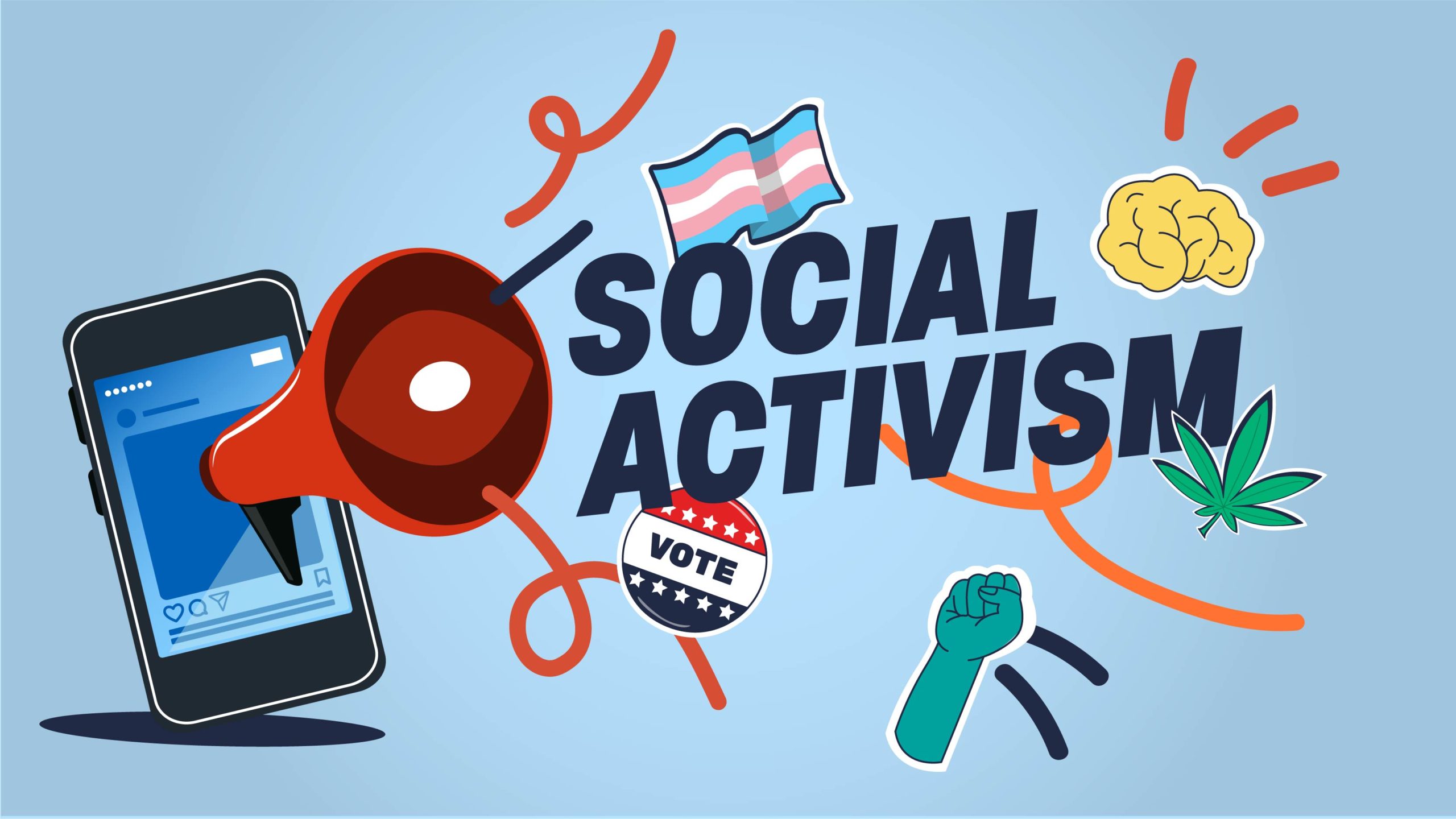
Design Trends in Instagram Activism
WANT TO SEE MORE LIKE THIS?
Sign up to receive an alert for our latest articles on design and stuff that makes you go "Hmmm?"
Appreciating and sharing how activism-centered posts are designed for Instagram
My internship with Glantz has led to me starting to recognize design everywhere. I appreciate the thought and care that creators put into their work, and I have especially recognized this in activism-centered Instagram posts.
You’ve probably seen many social justice graphics on Instagram. These graphics share information on topics such as race, gender identity, immigration, sexuality, sustainability, and more. These graphics are posted by many: large accounts, individual creators, and nonprofit organizations, for example.
I have found that design styles behind these posts tend to take a few forms: art-based, text-based slideshow, and a combination of visual aids and text.
Art-based examples
One thing that I really appreciate about this post, “Call for Questions,” from @theniftyfox is the creator’s use of color. It is a simple drawing that uses color (blue and pink) to keep the topic of the gender binary central to the post. There is also emphasis around the word “gender” through subtle lines.
The caption of this post is extremely intentional. It asks what infographics trans and nonbinary people need. This centers the group in the conversation and brings their thoughts to the forefront.
Activists and artists sometimes partner with consumer brands that share their views. Illustrator Leeya Rose Jackson, the creator behind @leeyamakesnoise, worked with Heinz for this post in support of Black-owned restaurants.
In an often-static environment like Instagram, motion can capture user attention effectively. This piece’s animation is simple and eye-catching, moving the sign from closed to open. The sign itself stands out due to its bright yellow color on top of the white shirt and faded pink reflection. While the animation moves, the yellow-brown background stays static, making the motion stand out even more.
Text-based slideshow example
This account uses the same visual approach for every post: a slideshow with a formatted headline on the first slide. This makes it simple for the user to browse the entire profile page and read further on specific topics that they are curious to learn more about.
This post uses bolding and background colors to format the content within the post. There are so many ways to direct a reader’s eye through design techniques, and this is one of them. The second slide uses a darker background at the bottom of the page to summarize takeaways from the above text. Additionally, the above text on the second page has certain phrases bolded, making sure the reader really focuses on the examples. This post both draws the viewer in and provides information to them quickly.
Combination of visual aids and text
Courn Ahn, the designer and illustrator who runs @courtneyahndesign, breaks down complex issues with simple design elements. She uses doodles, text, and arrows to guide viewers through social issues.
Reasons Your Mail-In Ballot Could Get Rejected is a good example of her approach. It has a headline along with small blurbs and animations. The different angles the text and images are presented in piques the user’s attention and curiosity. The supportive tone of this posts is carried through by using exclamation points and doodle-like images, successfully keeping an upbeat and motivated energy.
I found this post from lettering artist and illustrator Julia Ketsner to be very powerful. The reader’s eyes are brought to the woman in the center with the dark blue cloud hanging over her head. The blue highlights, cloud, and sweater seem to represent sadness and mental illness, while also serving as a place to draw the eyes. The arrows are a simple design element that makes the post serve as a flowchart. The handwritten text blurbs share with the reader the emotions that she is feeling.
These posts provide examples of how design can amplify messages on Instagram. The use of color, typography, hierarchy, illustration, and animation share important information with Instagram users. I hope that these examples provide inspiration to take more time to engage with these posts, and maybe create some on your own.


