Just dillin around. The Art of the Pickle Label: Ranking Eight Iconic Brands
WANT TO SEE MORE LIKE THIS?
Sign up to receive an alert for our latest articles on design and stuff that makes you go "Hmmm?"
Why some pickle brands look premium, some feel nostalgic, and one stands out as a masterclass in modern food branding.
National Pickle Day is coming up, so as you walk down the pickle aisle at your local grocery store, take a look at some of the best pickle brands and how they communicate their style. Dill-lightful.
From the traditional grocery-store aesthetic of Mt. Olive to the contemporary personality of Grillo’s, here’s my take on pickle packaging.
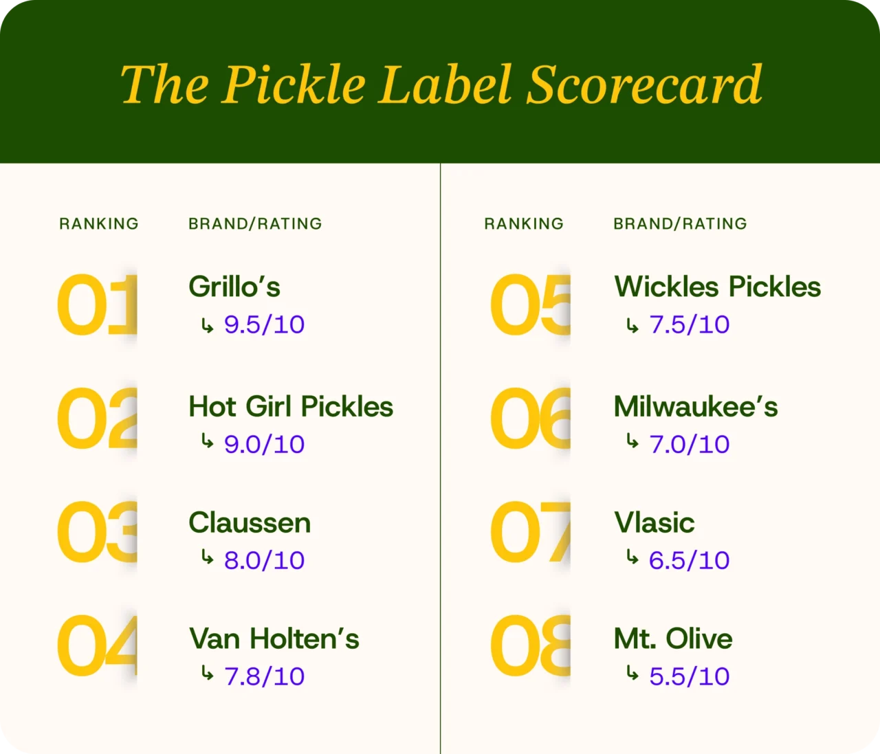
8. Mt. Olive — 5.5/10
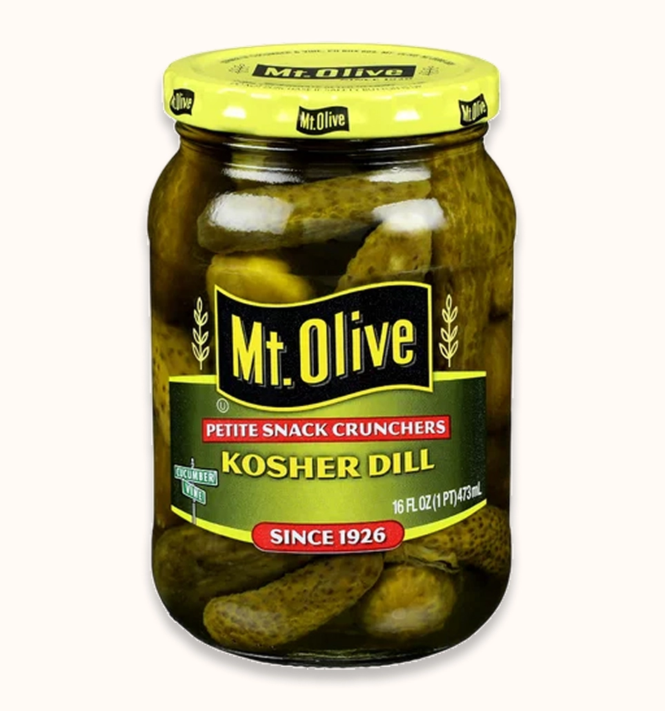
Familiarity Over Innovation
Mt. Olive represents a traditional approach to its packaging, harkening back to the days of small-town markets and pickles in barrels. Its branding prioritizes recognition and familiarity over contemporary visual sophistication.
Label Design strengths
- Established brand recognition.
- Familiar grocery-store aesthetic.
- Straightforward communication of the product.
- A visual identity that feels accessible to everyday consumers.
Design weaknesses
The biggest challenge this label is facing is visual differentiation and hierarchy. The packaging feels part of an older generation of grocery-store design, with less emphasis on modern typography, negative space, and simplified visual elements.
The label needs a stronger visual hierarchy. The most important information should grab attention immediately, while secondary elements should support, not compete with, the brand name.
Verdict: Dependable and recognizable, but visually less progressive than its competitors.
7. Vlasic — 6.5/10
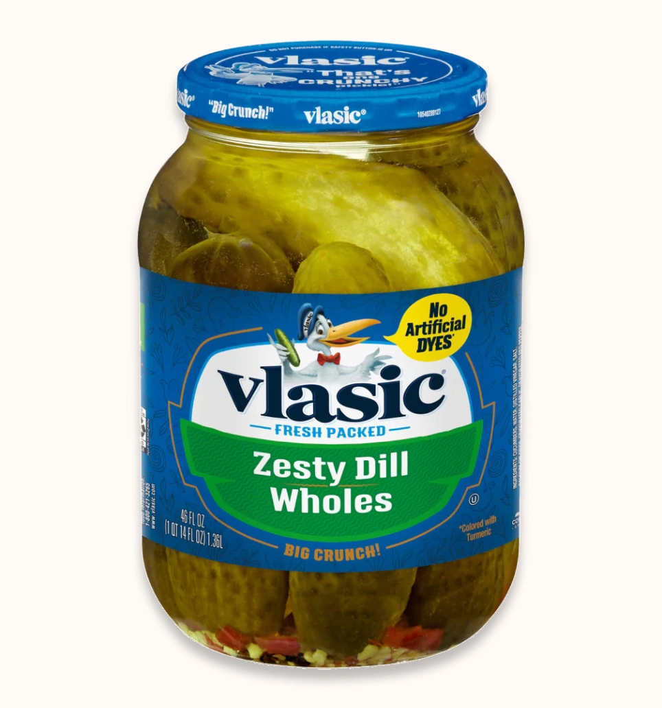
Mascot Branding – make it make sense
Vlasic takes a different approach. Its most recognizable design asset is its stork mascot, which gives the brand a distinctive personality.
Design strengths
- Highly recognizable mascot.
- Strong brand personality.
- Established visual identity.
- Memorable differentiation from competing brands.
Design weaknesses
The challenge with mascot-driven branding is balancing personality with visual simplicity.
Modern packaging design often favors clean layouts, limited visual elements, and strong typographic systems. Vlasic’s more traditional visual approach can feel visually busy in comparison.
The stork is an excellent brand asset, but the rest of the packaging could benefit from a cleanup.
Verdict: Strong brand recognition and personality, but its packaging could use a contemporary refresh.
6. Milwaukee’s — 7.0/10
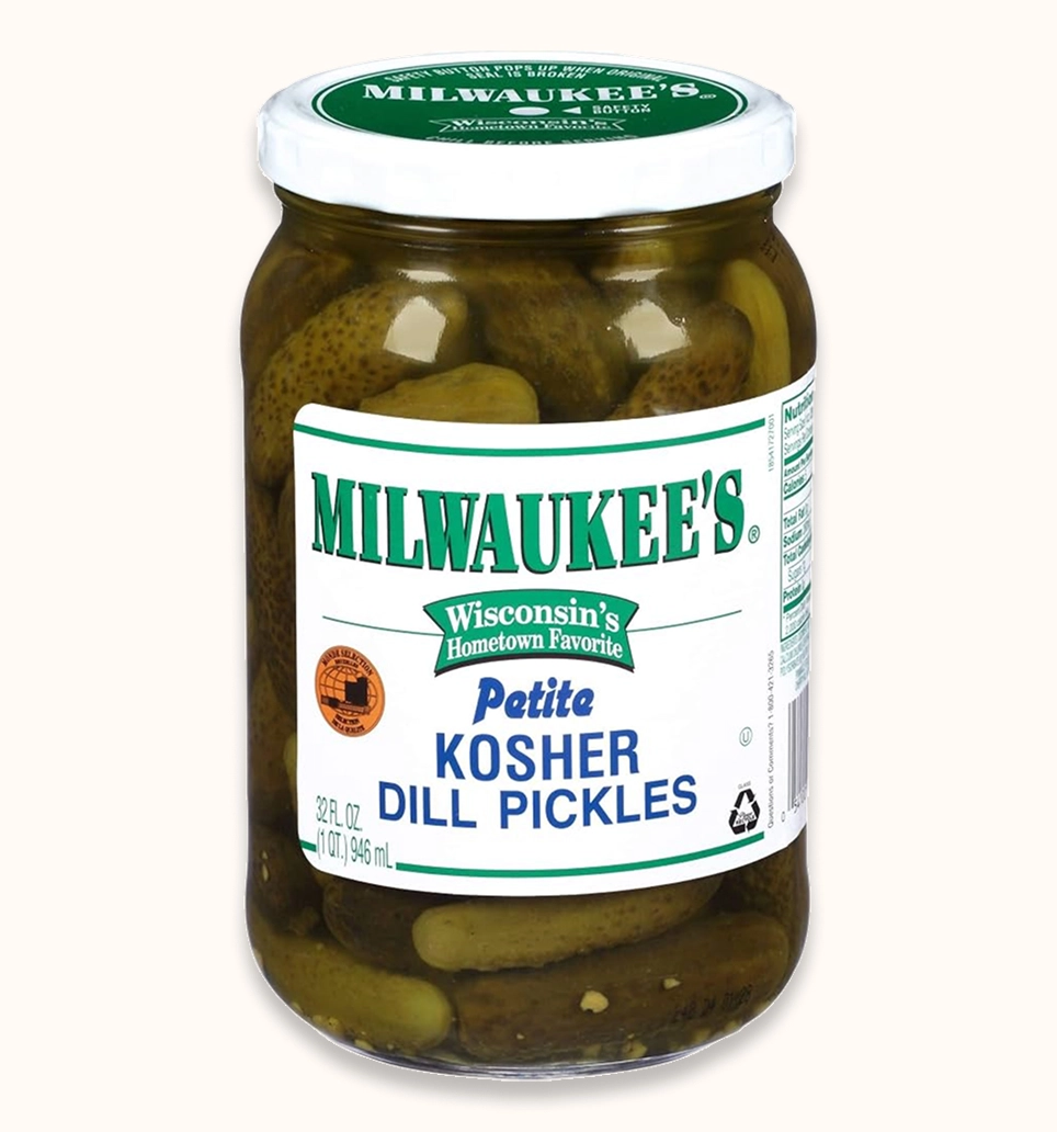
The Value of Authenticity
Milwaukee’s takes a more traditional, heritage-oriented approach to pickle packaging.
Rather than competing through minimalism or playful branding, it leans into established food culture and familiarity. What you see is what you get: a delish pickle.
Design strengths
- Traditional deli-inspired personality.
- Communicates heritage and authenticity.
- Strong association with classic pickle products.
- Appeals to consumers who appreciate established food brands.
Design weaknesses
Heritage branding can sometimes become visually dated if it relies too heavily on traditional packaging conventions.
However, some of the strongest contemporary brands successfully combine historical references with simplified layouts and modern typography.
Milwaukee’s has an opportunity to make its traditional identity feel more intentional and premium.
Verdict: A solid identity with character, but it could benefit from a more refined execution.
5. Wickles Pickles — 7.5/10
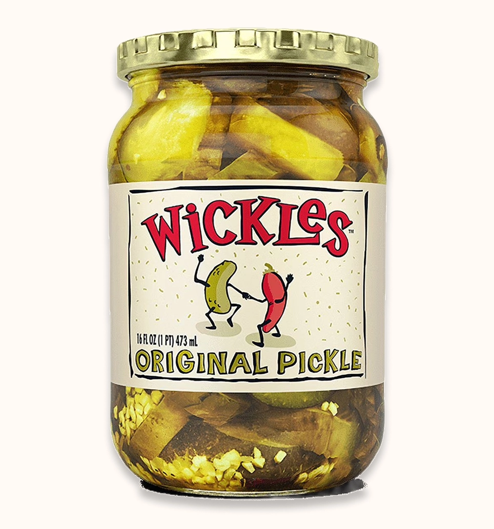
Spicy Personality Meets Bold Branding
Its Pickly Delicious positioning, distinctive name, and Southern-inspired identity give it a memorable place in the category.
The brand doesn’t attempt to look overly sophisticated or minimalist. Instead, it embraces a playful, slightly crafty personality.
Design strengths
- Memorable brand name.
- Strong personality and attitude.
- Distinctive identity within a traditional food category.
- A recognizable heritage-inspired aesthetic.
- Clear connection between branding and product personality.
Design weaknesses
Wickles has a strong identity, but its traditional jar presentation doesn’t have quite the same visual freshness as some newer food brands.
The brand could benefit from a more contemporary font system and more intentional use of negative space.
There is also an opportunity to create more consistency across its different product families, including Original, Wicked, and Dirty Dill.
Verdict: A memorable, character-driven brand with room for a more polished, updated design system.
4. Van Holten’s — 7.8/10
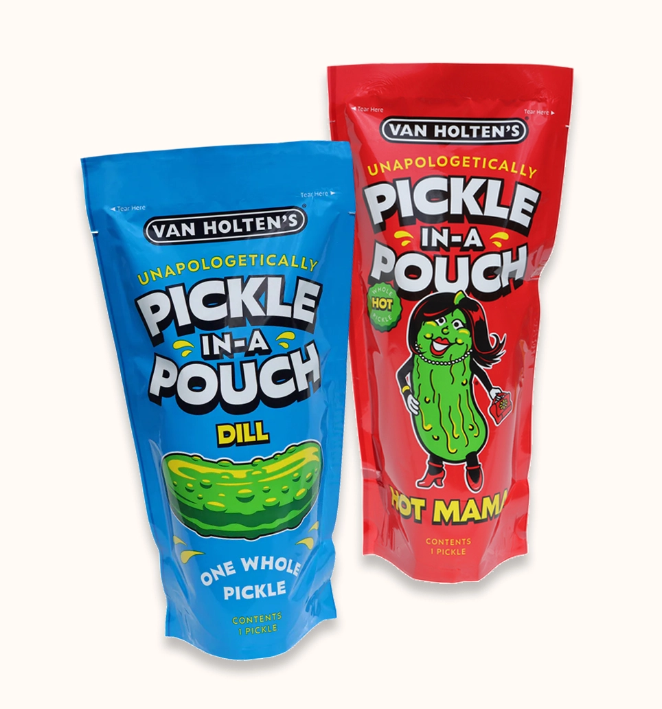
Packaging Designed for the Trend Generation
Van Holten’s is one of the most interesting brands in this comparison because it challenges the traditional definition of pickle packaging.
Instead of relying on a conventional glass jar, the brand has built its identity around individual pickle pouches.
Its bright colors, illustrated pickle characters, and flavor-specific personalities make it feel more like a modern snack brand than a traditional pickle company.
Design strengths
- Bold, eye-catching colors.
- Distinctive illustrated characters.
- Strong flavor differentiation.
- Memorable packaging format.
- Excellent potential for social media recognition.
- Strong appeal to younger consumers.
Design weaknesses
The biggest challenge is visual restraint.
Van Holten’s embraces a deliberately playful, high-energy aesthetic. While that approach is effective for its target audience, the characters, graphics, and bright colors can make the packaging feel busy.
It also doesn’t communicate the same premium or artisanal positioning as Grillo’s or Hot Girl Pickles.
However, this isn’t necessarily a weakness for its target audience. In fact, it might be its biggest design benefit, making it entirely recognizable and accessible to those on social media.
Verdict: Excellent differentiation and an innovative packaging format. A little visually crowded, but extremely effective at establishing personality.
3. Claussen — 8.0/10
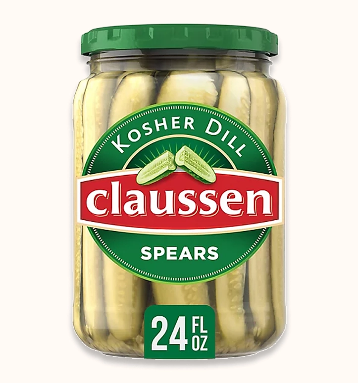
Simplicity, Trust, and Visual Hierarchy
Claussen earns third place because its packaging communicates its product identity with clear, confident clarity.
Its recognizable white and green colour palette creates an association with freshness, cleanliness, and quality. Since it’s owned by a big brand, this makes a lot of sense.
Claussen demonstrates the importance of visual hierarchy.
A successful package should communicate three things almost immediately:
- What is the brand?
- What is the product?
- Why should the consumer choose it?
Clear typography, contrast, and restrained colour use help accomplish this.
Claussen performs well in these areas.
Design strengths
- Clean and recognizable colour palette.
- Strong brand identification.
- Good visual contrast.
- Communicates freshness and product quality.
Design weaknesses
Claussen’s packaging is effective, but it doesn’t necessarily feel as distinctive or culturally relevant as some others.
Its visual identity leans toward conventional premium grocery branding rather than creating a particularly memorable new design language. But, hey, never stopped me from munching a whole jar. As my absolute favourite pickle (tastewise) from the list, I’m happy for the recognizable jar.
Verdict: A strong example of functional, clean packaging that communicates quality without unnecessary complexity.
2. Hot Girl Pickles — 9.0/10
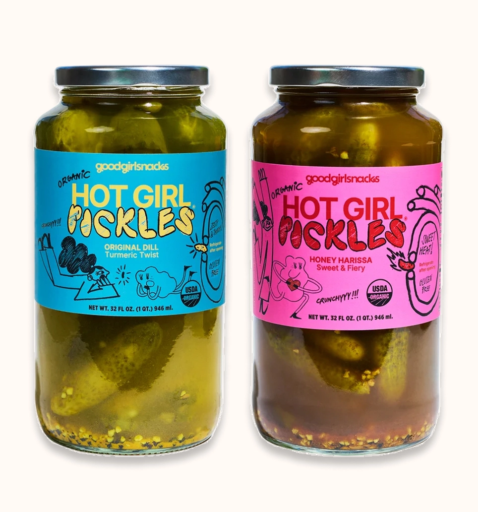
A New Generation of Food Branding
Hot Girl Pickles, from Good Girl Snacks, is arguably the most contemporary brand in this competition. Its packaging takes a completely different approach from traditional pickle companies, transforming a dated snack into a contemporary kitchen must-have.
The pink packaging, bold typography, and playful product naming create a brand that feels designed for a younger, social-media-conscious audience.
Design strengths
- Distinctive pink color palette.
- Strong contemporary personality.
- Memorable product naming.
- Clear differentiation from traditional pickle brands.
- Strong potential for social media visibility.
Design weaknesses
The biggest challenge is balancing personality with longevity.
Trendy branding can generate immediate attention, but visual trends evolve quickly. A brand that relies too heavily on a particular moment risks looking dated as consumer preferences change.
Hot Girl Pickles also occupies a very specific brand position. Its identity may appeal strongly to its intended audience while being less universally approachable than Claussen or Grillo’s. It’s a disruptor in the category, which makes its design noteworthy.
Verdict: One of the strongest contemporary identities and designs in the category. Bold, distinctive, and culturally relevant. It feels less like traditional grocery packaging and more like a modern lifestyle brand, pretty impressive for pickles.
1. Grillo’s — 9.5/10
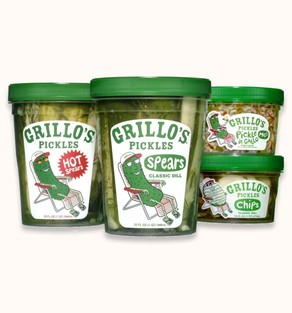
Pickle my fancy: A Masterclass in Modern Food Branding
Grillo’s takes the top position because it understands something fundamental about contemporary packaging design:
Though pickles are a grocery staple, a product doesn’t have to look traditional to communicate authenticity.
Its bright green and yellow palette, minimal typography, distinctive packaging, and playful brand personality create a visual identity that feels fresh and immediately recognizable.
Grillo’s doesn’t just look like another pickle brand; it looks like a modern food company with a distinct point of view.
Design strengths
- Bold, recognizable colour palette.
- Strong contrast and visual impact.
- Minimalist design language.
- Distinctive packaging layout and build.
- Contemporary brand personality.
- Strong differentiation from traditional competitors.
Why it works
Why does Grillo’s work? Visual economy: communicating as much as possible with few competing elements.
Grillo’s packaging uses a relatively simple visual narrative to establish recognition.
Its green and yellow combination also creates strong visual energy. The colours feel connected to the product category while helping the brand stand out.
Its transparent packaging is another important advantage. Instead of relying entirely on graphics to communicate quality, the product itself becomes part of the visual presentation.
This creates a relationship between packaging design and product visibility.
Modern design theory perspective:
Grillo’s succeeds through a combination of:
- Minimalism: Reducing unnecessary visual complexity.
- Colour theory: Using a vibrant, recognizable palette.
- Brand differentiation: Establishing a personality that feels distinct from traditional competitors.
- Packaging architecture: Using the physical container as part of the overall brand experience.
- Visual hierarchy: Making the brand easy to identify at a glance.
The result is packaging that feels contemporary, approachable, and premium without becoming overly sophisticated or pretentious.
Verdict: The strongest overall design because it combines simplicity, personality, differentiation, and product visibility.
The best pickle label isn’t the one with the most information or longevity. It’s the one that communicates its identity most effectively, creates an emotional impression, and sticks with consumers.
And in this competition, Grillo’s does exactly that.