Judging your summer book by the cover

WANT TO SEE MORE LIKE THIS?
Sign up to receive an alert for our latest articles on design and stuff that makes you go "Hmmm?"
As we head into the last weeks of summer we’ve been looking for that perfect beach companion, so we started to comb through articles with titles like “Your Ultimate Summer Reading List” and “The Best Books to Read This Summer.” All of these lists provided us with some great suggestions and inspired us to create our own list with a slightly different, more design-focused approach.
In spite of the old adage, “Don’t judge a book by its cover,” the appearance of a book often influences the reader’s expectations for the tone of the story within, and encourages them to then pick it up and turn the page. For our summer reading list, we made our picks based on the merits of the cover’s design strategy and its effectiveness in ensuring that the reader wants more. With that inspiration for our own Glantz Summer Reading List in mind here are five books we enjoyed, with covers that indeed accomplished that goal.
All That Is Solid Melts into Air

Novel by: Darragh McKeon
Cover design: Unknown
This novel, set around the Chernobyl nuclear crisis, focuses on the political response to the disaster, as well as the actions of private citizens. The cover truly sets the tone of the novel. The use of a geometric, sans-serif font contrasts with the aging and abandoned park. The pixelation of the text and photo calls upon the physical and emotional impact of radiation and the unsettling clicking sound of Geiger counters, creating a visual concept that is cohesive with the novel’s subject matter.
Columbine
 Novel by: Dave Cullen
Cover design: Henry Sene Yee
This non-fiction book was written by Dave Cullen, a journalist present the day of the Columbine shooting in Colorado. Within the book, he works through many of the misconceptions about the Columbine school shooting. The simplicity of the cover allows the weight of the word “Columbine” to affect the reader. The positioning of the school below the title and under a slightly menacing gray sky mirrors the feelings invoked by the title.
Heart of Darkness
 Novel by: Joseph Conrad
Cover design: Phil Hale
Heart of Darkness is a classic novel that recounts the horrors of the Belgian Congo during the era of colonialism. This illustration by Phil Hale is not the novel’s original cover, but it expresses the atrocities committed due to colonial influence that is chronicled in Conrad’s story. The illustration is a direct allusion to the violence in the Congo and its utilization of unsaturated, dark colors effectively conveys the horrific nature of the novel’s subject matter.
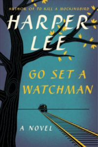
Go Set a Watchman
 Novel by: Harper Lee
Cover design: Unknown
Though there is some controversy over the publication of this novel, the design of the cover makes interesting allusions to the first edition cover of Lee’s famous novel, To Kill a Mockingbird. The tree on this cover echoes that from the first edition, but with changes that make the design more modern. The lines on the trunk of the tree, along with the sparse leaves, echo the influences of the passage of time both on the text itself and the plot of the two novels.
1984
 Novel by: George Orwell
Cover design: Unknown
There have been dozens of covers for Orwell’s famous novel, but the simplicity of this version stands out. The eye peeking through the cut-out title suggests the theme of governmental surveillance that permeates the novel. The nine in 1984 also resembles a keyhole, which again calls upon the idea of an invasion of privacy. The contrast between the parchment colored background and the red typography parallels the appearance of classified documents. These elements work to convey the disquieting feeling of being watched.
Well-designed book covers can tease the reader with allusions to the story inside. When designing a book cover, artists must decide how to integrate the desires of the publisher and the author while considering their own design sensibilities. There are innumerable colors, fonts, and images to choose from that must work together to cohesively convey the intent of the author. The combination of aesthetics and marketing makes the choices that go into the design of a book cover straddle the line between branding and art. So in the case of our Glantz Summer Reading list, we will judge these books by their covers.


