
Standard vs. Creative Resume: Which One Should You Use?
WANT TO SEE MORE LIKE THIS?
Sign up to receive an alert for our latest articles on design and stuff that makes you go "Hmmm?"
A creative resume is best suited for applicants in creative industries like fashion, design, or art, allowing them to showcase personality and skills beyond a traditional format. In contrast, standard resumes are preferred for fields such as finance, law, healthcare, or government, where a more conventional presentation is expected. Glantz advises that effective creative resumes prioritize "less is more," using smart and restrained design elements like typography, color, and arrangement to highlight relevant skills without over-stimulation. Creative directors specifically look for proper alignment, thoughtful kerning, and appropriate leading to ensure professionalism.


Getting your foot into the door at that dream job used to require a powerful cover letter and a resume filled with relevant experience. Is this still the case?
Introducing the eye-catching resume that highlights some of your specific skills, defines your personality, and gives your resume a “pop” in comparison to the stack of boring, black and white, standard resumes. But when does it actually work and not just aggravate the employer? Let’s take a closer look.
Which industries are best for a standard vs. creative resume?
Applying for a job in finance, law, healthcare, or government? Let’s maybe bury that creative, quirky side until you land the interview. Whip up the creative resume for—yes, exactly that—the creative industries. Gunning for a position in the fashion, design, or art industry? Give it a shot, but don’t go overboard.
How can you apply 'less is more' to creative resume design?
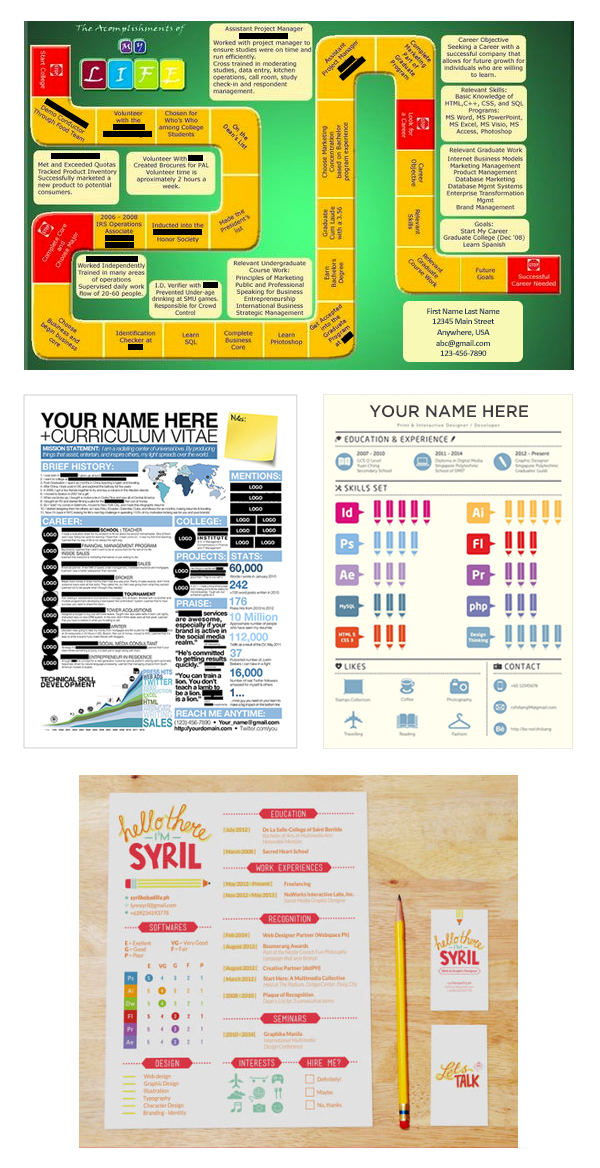
This board game idea is fun, but unfortunately it is not up to par creatively or professionally. If you choose to do a creative resume, know that you are already doing more than most other applicants. That being said, let’s not overdo it.
Resume #2 is a little more attractive and professional, but much too busy and over-stimulating. The reader’s eyes jump all over the document. You don’t want your prospective employer to have to work extra hard to find what they are looking for.
Resumes #3 and #4 are better organized, but the overzealous colors detract your eyes from what’s really important. The ideas are there, but it lacks simplicity and clarity for your prospective employer.
What should you avoid when creating a creative resume?
- Go overboard with visuals, textures, backgrounds, crazy fonts, alignment, or spacing (i.e. don’t be tacky).
- Make the important information hard to find, read, understand, etc.
- Give off the wrong vibe—make sure it’s you.
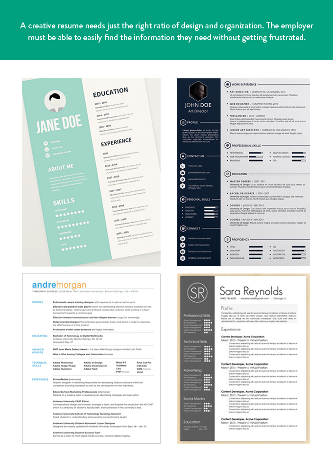
Above are examples of creative resumes that work without over-stimulating. Great design helps organize content and lead the reader through, while not over-designing. It is about adding dimension, but also reducing to the simplest, most important elements.
What are the best practices for creative resume design?
- Have it be an example of your work by highlighting your relevant skills. Your resume should be an extension of your portfolio, but remember to keep it simple so the employer wants to see more.
- Pay attention to typography. Be smart and restrained about color, arrangement, and font choices: they show your personality.
- Be purposeful with arrangement. The organization needs to be neat and tidy. Creative directors scan for proper alignment, thoughtful kerning, and appropriate leading.
- Proofread. Proofread. And proofread again. A single typo could send your crafted resume straight to the trash.
- Remember that, in the end, you are looking for a job, so have fun with it while remaining professional.
Think your resume captures all these “do’s”? Give it a shot. Apply now