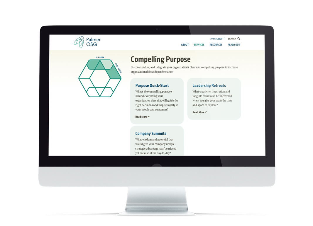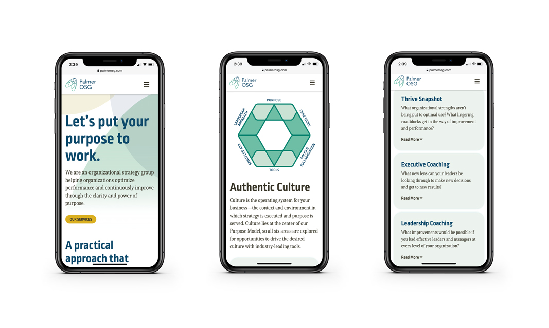
Palmer OSG, an organizational strategy group, was at an inflection point in its lifecycle—ready to position itself quite differently, both within its parent company and in the marketplace. Our job was to reinvent their branding and website.

The new logo, an innovative and abstract mark, takes cues from hardworking bumble bees, the company’s Chicago roots, and transformation.
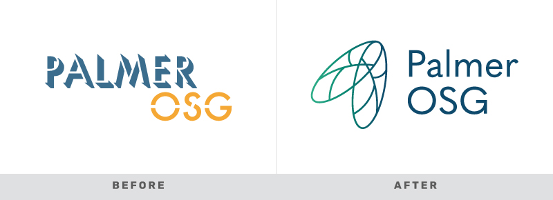
Palmer OSG before and after logos
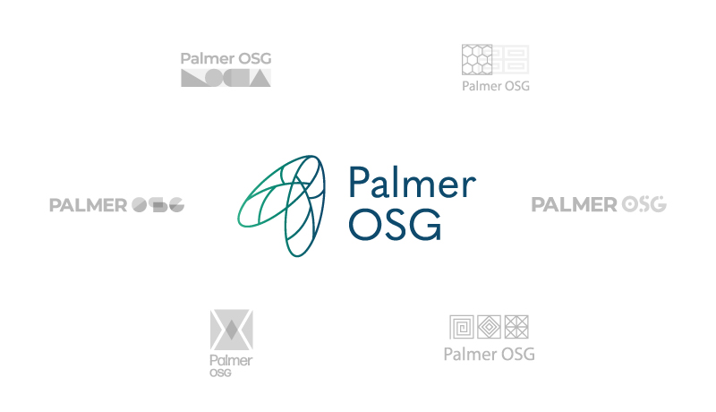
Palmer OSG rebrand concepts

Using the logo as an inspirational jumping off point, we set out to create a website that truly highlighted Palmer OSG’s own company mission–helping organizations continuously improve through the power of purpose. We used the color palette and shapes from the identity to create a subtle yet dynamic backdrop for the information and visuals throughout the site.

We also had the opportunity to create a visual toolkit that would be used not only on the company’s website, but in their documents and presentations as well, that would help the organization explain to their clients the power of defining their purpose. This set of graphics, ultimately coined The Purpose Model, consisted of seven distinct diagrams all relaying the effectiveness of Palmer’s consulting method.

We are excited to see Palmer OSG grow as an organization, utilize the graphic toolkit we built form them, and help propel other businesses forward. Visit the live website.
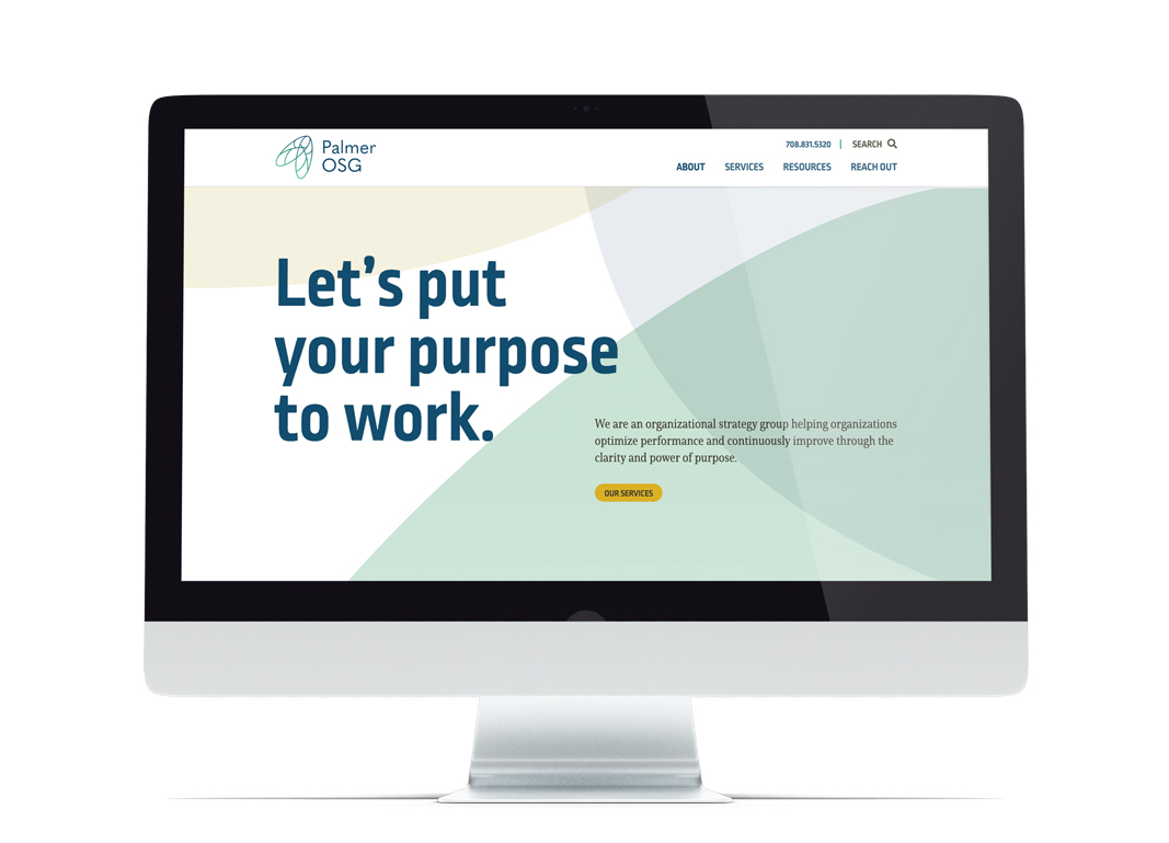
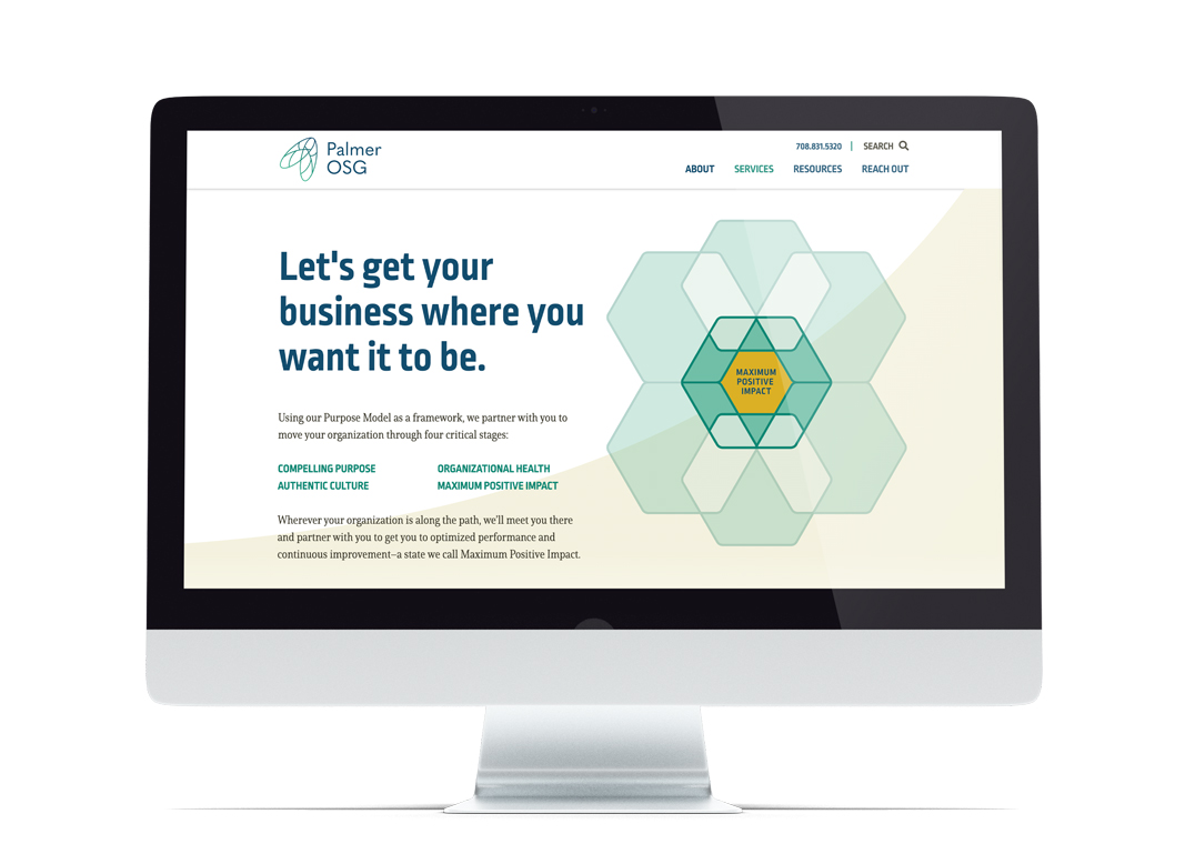
Palmer OSG desktop home
Palmer OSG desktop solutions page
Palmer OSG desktop solutions page component
Palmer OSG mobile view
Let's work together

Is your brand ready to level up?

GET IN TOUCH

Frequently Asked Questions

1 What was Glantz Design's approach to reinventing Palmer OSG's brand identity?

Glantz Design reinvented Palmer OSG's branding by creating a new, abstract logo inspired by bumble bees, Chicago roots, and transformation. This new identity aimed to position Palmer OSG differently within its parent company and the marketplace.

2 How did Glantz Design approach the website development for Palmer OSG?

Glantz Design created a website for Palmer OSG that highlighted their mission of helping organizations continuously improve through purpose. The site utilized the new brand's color palette and shapes to create a subtle yet dynamic backdrop for information and visuals.

3 What visual tools did Glantz Design develop to help Palmer OSG explain its consulting method?

Glantz Design developed a visual toolkit, ultimately coined "The Purpose Model," consisting of seven distinct diagrams. These graphics were designed to help Palmer OSG explain the effectiveness of their consulting method to clients in documents and presentations.

Quick links
Get in touch

847.864.8003

Evanston, IL 60201

Stay in the know

Join our "soon-as-we-get-to-it" newsletter, which you can count by the seasons.

©2008 - 2026 Glantz Design, Inc. All rights reserved.