healthcare
Women’s Pelvic Surgery Specialists
A group of pioneering surgeons needed a brand and a website that empowered their patients while establishing their expertise.
Launch Website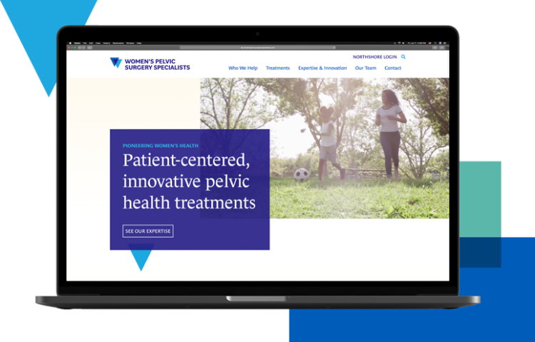
What’s in a name (and logo)?
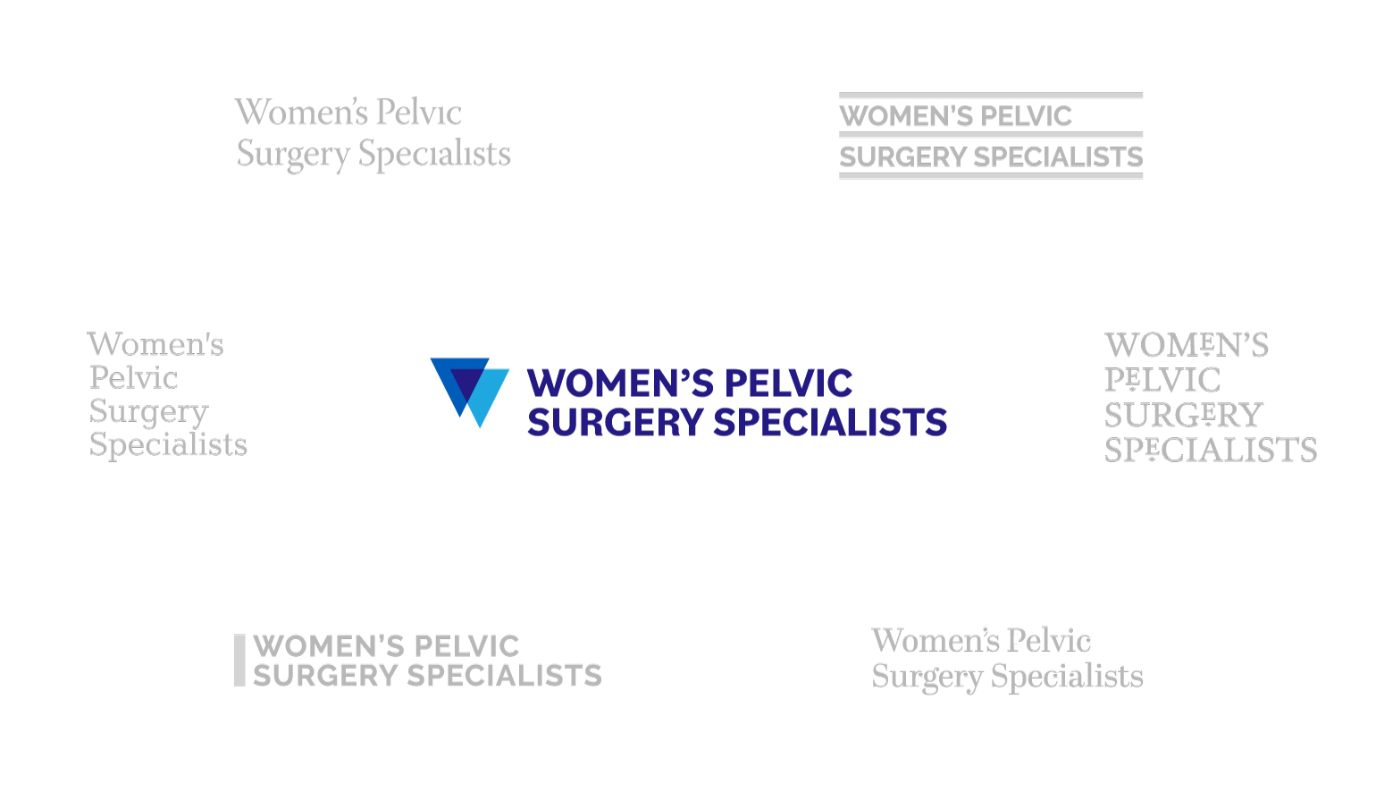
Women’s Pelvic Surgery Specialists is a medical group that treats urogynecological issues. The surgeons commissioned our team to launch their practice’s brand. The tone had to both assert confidence and create a safe space for vulnerability.
With that in mind, we started with a direct name that spoke to the doctors’ experience and rigor. We paired that with a dynamic, graphic mark that subtly represents womanhood.
A patient-centered digital experience
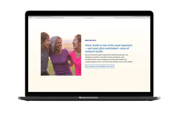
Women with pelvic health conditions often suffer from embarrassment and isolation. Our goal was to create a website that normalized their conditions and made clear that treatment is possible.
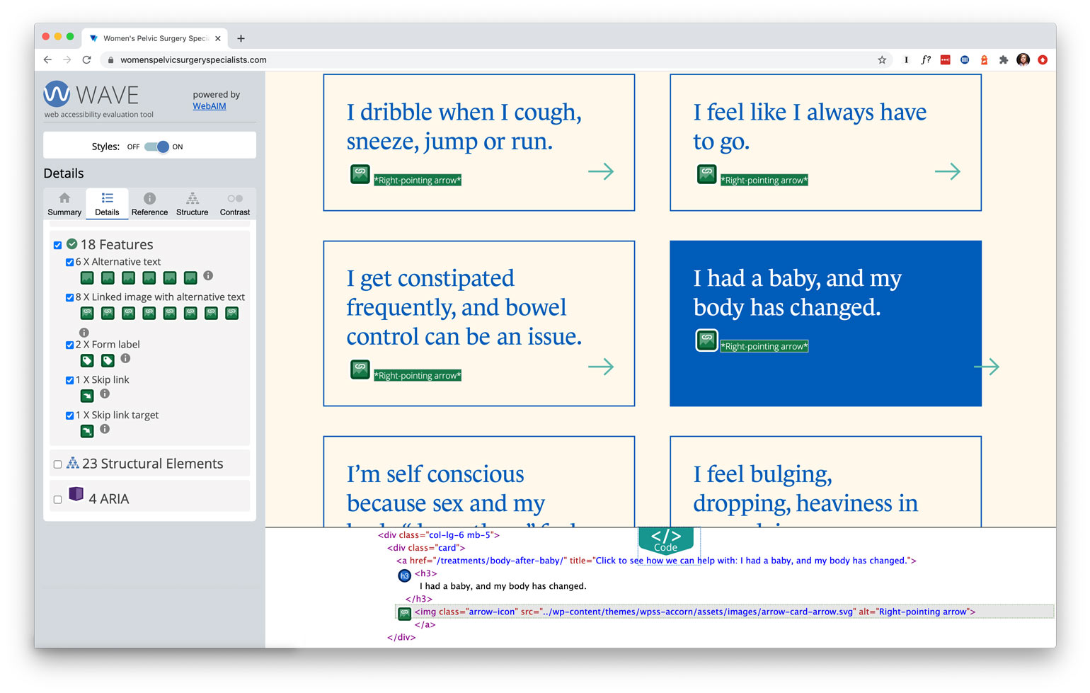
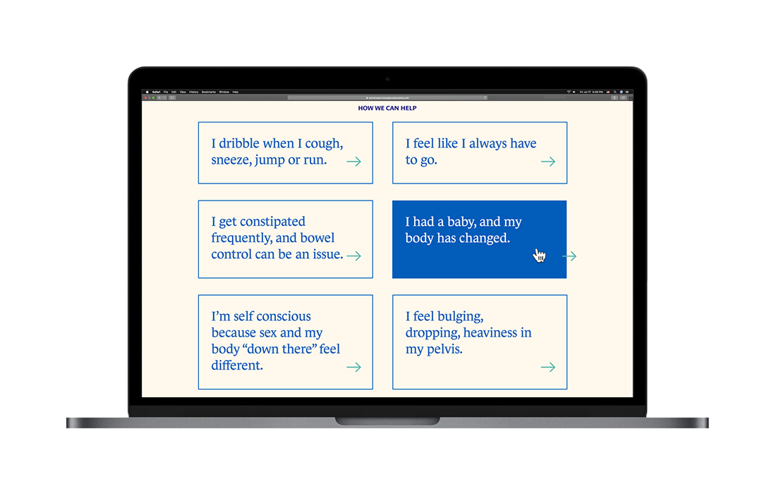
Empathy and approachability drove the website’s content and user experience. We eschewed the scary, clinical names for treatments on the home page. Instead, we favored symptom-focused “I statements” that described conditions with real-world examples.


Visualizing the cure
Imagery and interactions were used to communicate empowerment and possibility. Look at what happens when you hover over an “I statement” on the home page, for example. The arrow moves forward and outside the box, creating positive momentum and a feeling of breaking free.
The video at the top of the homepage also tells a story of strength and achievement. Each clip depicts a woman returning to the activities her pelvic condition made impossible. Through the treatments from Women’s Pelvic Surgery Specialists, each woman regained control of her body—and her life.
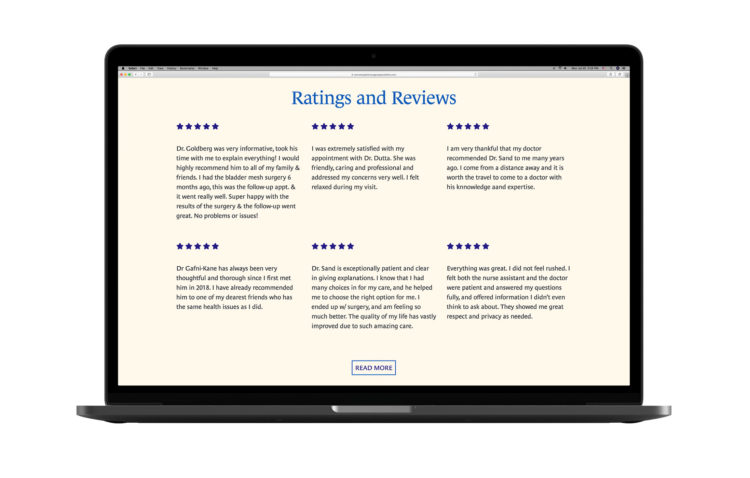
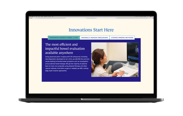
Our user experience research showed that many women first learn about pelvic health treatments through friends. As a result of that insight, testimonials and reviews became an important part of the site. We sprinkled a comprehensive set of patient quotes and ratings throughout the site. These points of social proof were backed up with details about and photography showcasing the practice’s technology.
Making care accessible to all
In addition to making women feel comfortable with the subject matter, we also made sure the site was usable for everyone, including those with vision or hearing impairment, cognitive problems, physical disabilities, and even the elderly. We tested the design and code to ensure that it met Web Accessibility Content Guidelines at the A and AA levels, the accepted standards for ADA compliance.
This means that the website is optimized for color contrast and legibility, uses semantic markup, adopted keyboard navigation, and ARIA/ALT tags amongst other things. Don’t just take our word for it, as we have tested it using a variety of online tools such as Google Lighthouse, AxeCoconut and WAVE.
