Beyond the Logo: 2020 Olympics
WANT TO SEE MORE LIKE THIS?
Sign up to receive an alert for our latest articles on design and stuff that makes you go "Hmmm?"
Is it the summer heat or Olympic fever that’s causing temperatures to rise? The 2020 Olympics are set to begin in Tokyo in just a few short weeks.
As designers, we geek out over the unique design elements each host country and Olympics committee create for the momentous occasion.

In fact, we’ve written about the history of the Olympic logo, and during the last Winter Olympics we held our own winter logo trials.

These 2020 Summer Olympics are proving to be interesting in so many ways.
First and foremost, The International Olympic Committee, when forced to delay the games for a year due to COVID-19, decided to keep the year of the games 2020. So many pieces of collateral had been produced in preparation for the games, that it would be incredibly wasteful to scrap them. However, it seems the real reason these summer games in Tokyo will be referred to as the 2020 Olympics is because never in the history have the games been played in or named an odd number.
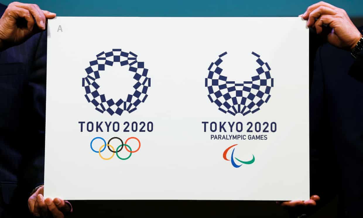
What’s also curious about the identity of the Tokyo 2020 Olympics is the controversy in arriving at the mark. Initially the committee had selected a logo by artist Kenjiro Sano, but when accused of plagiarism, they needed to choose an alternate. The final logos for the 2020 Tokyo Olympics and Paralympics were designed by the artist, Asao Tokolo. The pair of logos, entitled Harmonized Checkered Emblem, are comprised of various rectangles representing diversity and unity.

Finally, as admirers of the craft, we must point out the elements beyond the logos themselves. The concept video produced by the Olympics committee extends the concept into the digital space, using the rectangular fragments as frames.
Will you join the global community in cheering on these amazing athletes and artists alike?


