Winter Olympic Logos that Deserve a Medal
WANT TO SEE MORE LIKE THIS?
Sign up to receive an alert for our latest articles on design and stuff that makes you go "Hmmm?"
That’s right folks, it’s that time once again. While the rest of us are just beginning to recover from our Super Bowl food comas and debating whether to cancel that untouched gym membership we made on January 1st, the world’s top athletes are about to push their bodies and minds to the limit in front of millions of viewers. Oh, how we love the Winter Olympics! There’s nothing better than watching figure skaters flip through the air like acrobats from the comfort of the couch, selectively putting aside our political angst to chant “USA, USA,” and, without fail, boasting, “I could do that!” as we wonder why curling is a sport.
But what excites Glantz most about the Winter Olympics? You guessed it—the design. We’ve reviewed every Winter Olympics logo since 1980 to determine which should win the gold. Check out Glantz Design’s Olym-picks for best and worst logo design in recent history.
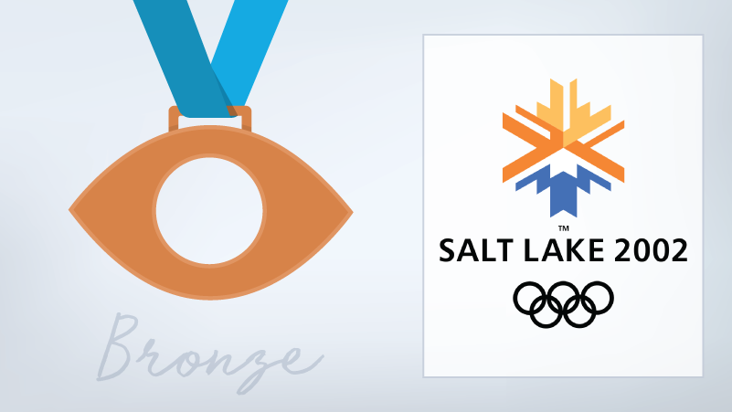
Ahhh the bronze. Well, you took home a medal. You got to stand on the podium. But you can’t help but feel a little disappointed.
Salt Lake 2002, we see you. We appreciate the color scheme’s nod to the local landscape, and the not-quite-symmetrical design gives it complexity without making it busy. But to our team, the concept behind this logo just doesn’t quite translate. The snowflake-like design was supposedly intended to depict the sun setting over a mountain, formed from the negative space around the blue. It’s an interesting attempt—and we can kinda see it now that we know what to look for—but this optical illusion eluded us at first. A valiant effort, Salt Lake, but not enough to take silver.
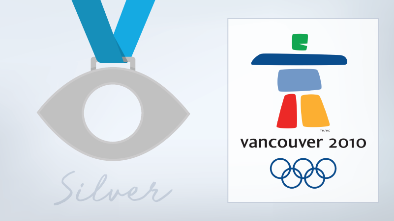
So close, but yet so far.
We’re really digging the Vancouver 2010 Logo design. The vibrant colors nicely evoke the five symbolic Olympic Rings. The composition is simple and striking, and is clearly grounded in the culture of the host nation, inspired by man-made stone landmarks called inukshuk. Plus, we always like to see a riskier font choice—in this case, it serves as a subtle nod to the playfulness of the rounded shapes in the logo. Consider us impressed.
And now… the moment you’ve been waiting for. Cue the lights, cue the music. The winner of our gold medal for logo design is:
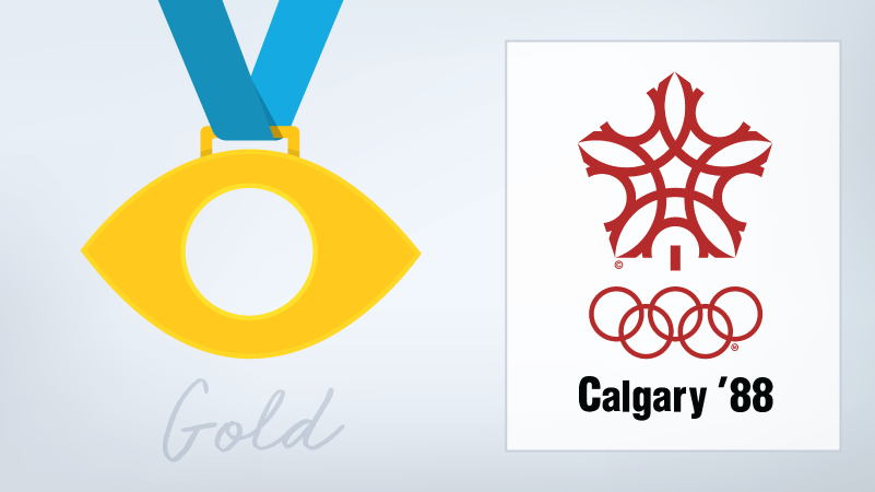
1988 Calgary!
Clean, eye catching, symbolic. There is so much to see in this 1988 Calgary logo, and yet it’s so simple, composed of only one reproduced red circle. Razor sharp lines define the shape and cut through the complexity, keeping the logo dynamic and digestible. The classic red color and shape clearly evoke Canada’s traditional maple leaf emblem. We’d also like to point out that of our 3 top picks, the Olympic Rings in this logo seem least like an afterthought, fitting in cleanly with the rest of the design. Sure, the the typographic treatment feels slightly outdated, but it was the 80s after all. Cheers to you, Calgary 1988! We can almost hear “Oh Canada” playing in the background.
Not everyone can be a winner…
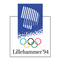 The Lillehammer 1994 Olympic Logo is both confusing and uninspiring. With an inspiration as dynamic as the Northern Lights, you’d expect the design to have some life to it. But there’s nothing magical or airy about this logo. Instead, uninspiring barcode-like lines sit stiffly in a heavy blue box. The pattern connecting the blue to the olympic rings might be an attempt to introduce some motion to the composition, but to us, it looks more like a composition notebook than one of the world’s greatest natural wonders.
And finally, the logo you’re about to see every day for the next two weeks…
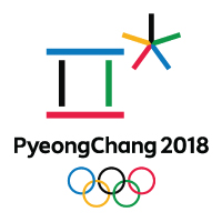 This year’s logo is inspired by a letter in the Korean alphabet and represents the harmony of heaven, earth, and man. PyeongChang 2018 uses the Olympic colors and a snowflake of converging arrows to emphasize the international unity at the heart of the Winter Games. Unfortunately, the final design ends up feeling fragmented and the culturally specific inspiration doesn’t translate to a global audience. In the grand scheme of Winter Olympic logos, 2018 falls short of expectations.
Welp, that’s our take on some of the best and worst Winter Olympic logos. It just goes to show that the best designs are driven by thoughtful strategy and clear execution. It’s the kind of thing that we can’t help but geek out about at Glantz.
Need your own logo designed? Leave it to Glantz. We’ll convey your brand’s message with intelligent, eye catching design. Craving some more Olympics? Check out our past post on the Games!

