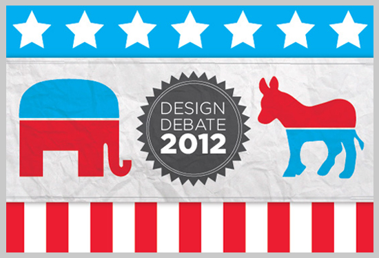
2012 Design Debate: Romney vs Obama
WANT TO SEE MORE LIKE THIS?
Sign up to receive an alert for our latest articles on design and stuff that makes you go "Hmmm?"

As most of you know, designers can be quite opinionated when it comes to brand strategy. Especially when we’re talking about two of the most publicized brands of 2012: Obama and Romney.
Let’s face it; each candidate is essentially a brand. Both presidential candidates have their own campaign managers, policy directors, speechwriters, press teams, research teams and (last, but not least) extensive design teams that work around the clock to develop effective, creative and visually appealing campaigns.
The exciting ’08 presidential election will always be remembered as an election of ‘hope’ and ‘change’ fueled by striking visuals and effective brand messaging. This was largely a result of being the first campaign to ever have an internal design team. Obama’s hugely successful ’08 campaign certainly spotlighted the importance of using new media in today’s political campaigning.
Since the last presidential election, most politicians have caught on to the pivotal role design and social media can play when it comes to winning voters’ support and raising campaign funds. This year, both Romney and Obama’s design teams pulled out all the stops, engaging voters through Facebook, Twitter, YouTube, Apps and various other media channels.
Which candidate wins our 2012 design debate?
![]()
1. Logo: The ‘Face’ of The Campaign
![]()
Romney-Ryan: Romney’s logo has been criticized for looking shockingly similar to the Aquafresh logo. The idea was to represent “togetherness,” but the joined ‘EY’ at the end is a bit of overkill. They made the mistake of counting on people reading this abstracted “R” in conjunction with the regular letterforms next to it…so, it ends up reading as OMNEY-RYAN.
![]()
Obama-Biden: Obama’s ‘O’ is arguably the most recognized and talked about logo in political history. The logo, depicting a sun rising over the plains, is a clear and simple symbol of ‘hope.’ This symbol was executed beautifully. It does not make the same mistake Romney’s logo does—replacing the ‘O’ in Obama. Instead, it is only used in addition to writing ‘Obama’ next to, above or below it—a classic lockup used by most modern brand identities. My favorite part about Obama’s 2012 logo is the custom designed Gotham Serif font created by Hoefler & Frere-Jones for the campaign.
2. Yard Signs: A Traditional Campaign Tactic

Romney: Fairly Traditional. Romney’s official online store offers a variety of campaign signs customized for Women, Young Americans, Catholics and Hispanic voters wanting to show their support. While the target consumer varies, the overall design layout does not.

Obama: Creative use of typography. Obama’s team designed an array of visually interesting yard signs to choose from, including customized options geared toward Women, Latinos, Hispanics, and African Americans.
3. Campaign Website: Crucial Fundraising Tools


Romney: A more conventional design than Obama’s blog-style. Visitors may find it easier to browse through the site using traditional navigation. Romney’s site, like the president’s, encourages real-time news sharing among supporters with Twitter or Flickr. Visitors looking to read up on policies in further detail are directed to download text-heavy pdfs. The overall feeling is professional and trustworthy.


Obama: Obama’s site is designed similar to a blog. Appealing to younger audience, this site is constantly updated with relevant news and info. The site implements several interactive features, such as his ‘Tax Cut Calculator’, which allows visitors to feel more involved with the campaign. Web developers can appreciate the use of responsive design. By changing the width of your browser window, the site alters its layout down to two columns and then one to accommodate visitors using a mobile device.
Both sites act as excellent fundraising tools, with a clear call to action.
4. Election Apparel: The Candidates ‘Open Up Shop’

Romney: Uhhh…. Not many positive things to say about Romney’s boring unisex apparel. Lack of creativity or strategic thought put into Romney’s campaign apparel.

Obama: It looks as though Obama’s team enlisted the help of Urban Outfitters or American Apparel? There is an overwhelming selection or form-fitting, trendy pieces. They offer custom ‘State Tees’ that you can choose the shirt color, the ink color and of course, the state of your choice. The personalized merchandise is a creative way to raise campaign funds.
5. iPhone Apps: Yes, There’s an App For That

Romney’s App: Romney’s team did a great job developing an app that provides users with up-to-date news and allows easy sharing of campaign information through social media. The design is slick, but is fairly slow to load—perhaps because there are more embedded icons, images and videos.

Obama’s App: The app delivers real-time news about the Obama campaign, lets supporters locate and sign up for nearby campaign events and allows users an easy way to donate to the campaign. The controversial “Canvass” feature loads a list of homes near a user that are occupied by registered Democrats. Campaign staff and volunteers can use the app to walk door-to-door to recruit volunteers or get voters to the polls on Election Day. Overall, A+ on beautiful design and user-friendly functionality.
Both apps allows supporters to easily donate.
A Not So Close Race
To the credit of both parties’ design teams, it’s no easy task to design a brand identity that is supposed to appeal to an ENTIRE country—with demographics that vary across the full spectrum of backgrounds, lifestyle, interests, etc. Though, it’s obvious Obama’s innovative campaign continues to raise the bar and change the game for elections to come.
*Note: this blog is not meant to be political or skew your presidential vote in any way. And if your vote is based on this design debate, then you probably shouldn’t be voting in the first place.
Feel free to agree or disagree with our observations in the comments section below. After all, you can’t have a debate without more than one opinion!