Hit the Follow Button: Scroll Through the History of Instagram’s App Redesign

WANT TO SEE MORE LIKE THIS?
Sign up to receive an alert for our latest articles on design and stuff that makes you go "Hmmm?"

App redesign is a complicated and delicate undertaking. Nonetheless, it is necessary to keep up with the ever-changing trends of technology. If an app is outdated, it will fall behind its competitors, and users may flock to more current apps. The ultimate goal for redesigns is to improve the approachability of the app, often through simplicity. This technology engages a broader audience, which is essential for growth. This blog explores a failed attempt at app redesign and an enduring evolution that serves as a model.
First, let’s consider an ill-fated attempt by Snapchat:
In 2018, Snapchat pursued a huge redesign of its app in an effort to increase revenue. The evolved app contained ads along with publisher and celebrity media. Friend’s stories were mixed into the messages page and removed from the discovery page. Thus, users could not easily access friends they didn’t message frequently.
Users found the new format of the app confusing and challenging to follow. In response, 1.2 million users signed a petition for the company to bring back its original layout. Snapchat lost 2% of its daily users in one quarter. This forced the company to make edits reversing aspects of the redesign. User-generated stories were returned to the discovery page to exist with professional content. Despite their efforts, the company saw user growth trend down for quarters to come.
Next, shift your focus to Instagram’s evolution:
On the other hand, Instagram has showcased how to strategically update an app in many of its past redesigns. This is a result of careful and diligent choices by designers who take input from consumers. Instagram continually aims to make the app more user-friendly and puts the focus on the user.
The Icon.
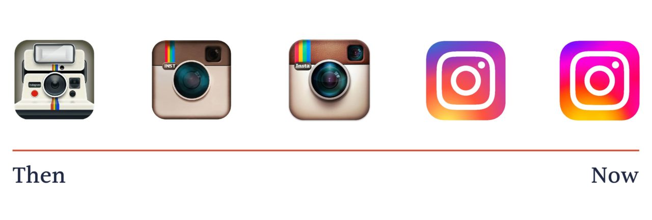
Instagram has gone through a true evolution from its first icon in 2010 to its most recent design in 2016. The original icon featured a hyper-realistic polaroid camera. The camera was based on an old Bell & Howell camera from the 1940s. After a few makeovers, we now have the rainbow abstract icon we know and love today. The current icon was designed in 2016. Ian Spalter, the mastermind behind the icon, settled on a simple, flat design. This followed the trend of flat icons during the IOS 7 update. He created a rainbow backdrop inspired by color blocks featured in the top left corner of the previous icon. He then simplified the camera design to make it digestible and overall pleasing.
The Feed.
Instagram was created as a check-in app for users to upload photographs taken on a mobile device. This service has been at the core of the user’s mobile experience for twelve years. As the app has gone through redesigns, Instagram has simplified the page as much as possible. All pages are entirely black and white other than pictures uploaded by users. Additionally, navigation buttons are uncomplicated shapes (a magnifying glass or a shopping bag) and clearly represent their purpose. This simple design draws focus away from the app’s layout and to the users’ photos.
The Profile.
An individual’s Instagram profile features a gallery of photos over time. Users have started to associate their profile with a representation of who they are as a person, suggesting an individual’s identity has become their Instagram presence. This is an indication of the profile’s importance for coming generations. Along with the gallery is a public display of “followers” and “following”. This feature faced pushback when users felt it encouraged the quantification of popularity. Instagram responded by altering the top section of the profile. The “followers” and “following” metrics were shrunk and moved above the photo gallery. Additionally, space was created for highlights, and the user’s profile picture was enlarged. This was a way to focus attention on a user’s profile photo and bio instead of their metrics.
Likes.
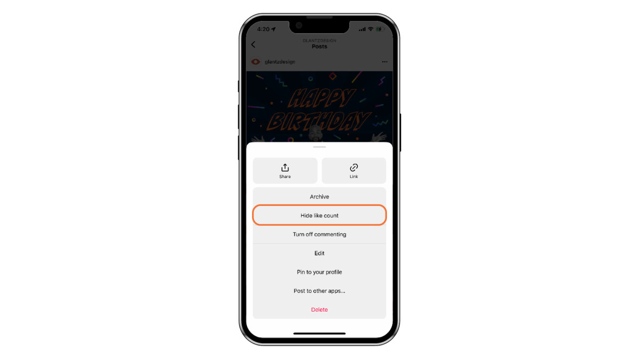
Finally, in May of 2021, Instagram added a “Hide Like Count” feature. This feature was created to decrease social competition. Users can conceal their like count– a true testament that Instagram listens and cares about its users.
Reels.
It is important to note that in recent Instagram updates, the company has implemented “Reels”. These short videos have faced criticism for copying the popular video sharing app, TikTok. Videos directly from TikTok can often be found on Instagram’s reels section, which calls the value of this addition into question.
Overall, Instagram’s app redesign deserves a like.
In most cases we can look to Instagram when it comes to redesigns. They have flawlessly kept the original use of the app at its core, effectively implemented user feedback, and simplified and modernized the app. Instagram has routinely kept users content with anticipation for continual and lasting growth.
Follow Glantz on Instagram to keep up with the latest in the studio!