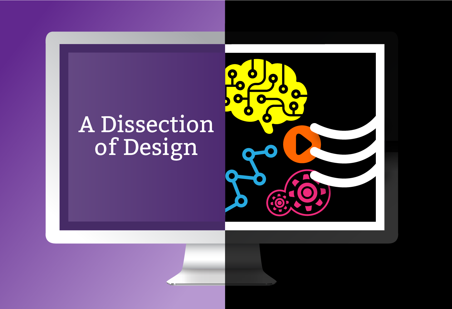
A Dissection of Design
WANT TO SEE MORE LIKE THIS?
Sign up to receive an alert for our latest articles on design and stuff that makes you go "Hmmm?"

In school we’re taught to dissect things. There was, of course, the dreaded frog dissection in biology, but we took apart a lot of other things too—like the Cold War, because the Wall didn’t just fall, and The Great Gatsby, because Gatsby wasn’t just in love with Daisy. And what did we learn? That things are never as simple as they seem. And that when you dig deeper, there’s always a more complex and interesting story to be found.
Over the holidays, I happened to wander into 21_21 Design Sight’s exhibit “Design Anatomy” in Tokyo. Curated by Japanese graphic designer Taku Satō, the exhibit is a culmination of his 15-year long research into consumer product design. Its name concisely sums up the vision of his project: Instead of dissecting the anatomy of an organism, Satō prompts us to dissect design through the analysis of everyday consumer products. He forces us to take note of things we never bother to consider—a product’s functionality, the layout and printing of logos and packaging, and the reasoning behind such decisions.
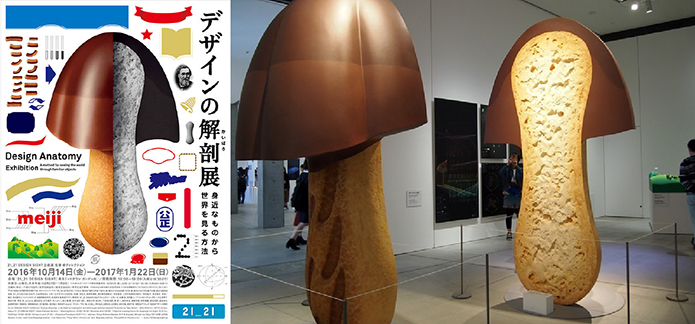
The informative, thorough, and playful exhibit hints at a designer’s obsessive and relentless mind. More importantly, however, it succeeds at what Satō set out to do: provide an opportunity in which we investigate—for what seems to be the first time—the objects we see and consume every day.
As I wandered through this bizarre exhibit, I realized that we’ve stopped dissecting upon leaving the classroom. Here we are, surrounded by countless things born out of countless decisions, and we don’t bother to notice the thought and sometimes genius behind these simple objects. We marvel at the design of architectural masterpieces and engineering feats, but what about the tiny spoon you find in the lid of an ice cream cup? Or the shape of the Styrofoam cup noodles that you eat for lunch?
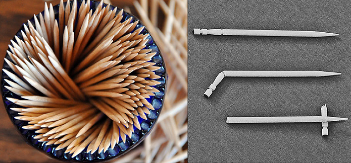
Even the toothpick you use to dislodge that persistent shred of spinach can be dissected. Those decorative grooves on one end? They were designed to enable the picker to lay his/her used toothpick on the table without it touching the surface!
Since arriving at Glantz, I’ve realized that web design can be taken apart too. I visited at least a dozen websites every single day, and I had never appreciated how easy they were to use. That doesn’t just happen by magic. Just like how the ice cream spoon designer thinks about how it will be used, website designers are perpetually aware of how their website design affects user experience. You realize how central experience is when visiting a website like dontclick.it—a site that doesn’t require clicking. The site challenges you to not click, and you find, unexpectedly, that it really is a challenge. Scrolling and clicking have become so central to user experience, we balk when those functions are taken away from us. It all just goes to show that we take a lot of things for granted. There’s a reason why there’s a clickable button there, and why we scroll here. There’s a reason why one page leads to another, and why websites just make sense.
As a designer, sometimes it doesn’t hurt to overanalyze: notice a product’s various textures and colors, its shape, functionality, and design. We live in a world of objects both real and virtual that are full of intentions, yet we rarely bother to consider them. So start looking, start digging. Design is everywhere and the world becomes that much more interesting when we take the time to stop and notice it. Even an unassuming toothpick.