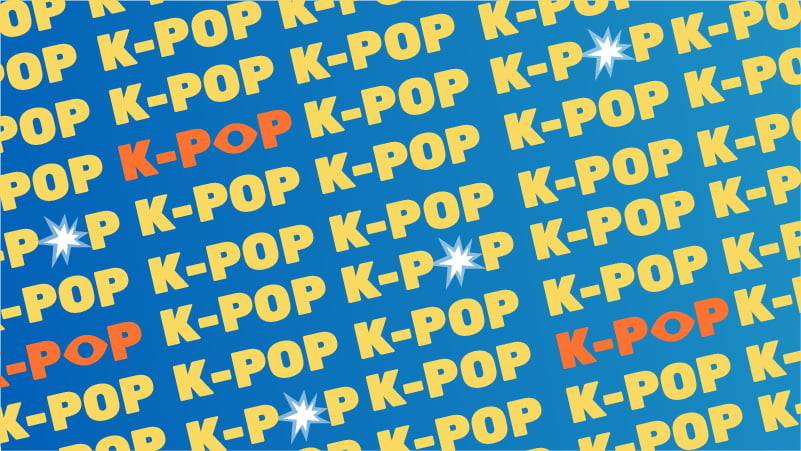
For the Love of K-Pop Branding
WANT TO SEE MORE LIKE THIS?
Sign up to receive an alert for our latest articles on design and stuff that makes you go "Hmmm?"
Korean Pop Stars BTS Lead the Fan Experience with Strategic Design
K-pop, Korean pop music, is becoming more and more popular across the globe, and this Glantzer is loving it. (Disclaimer: BTS is my life and they have all of my money. But I will try to limit my obvious bias for this analysis.)
Living in Korea for a year to teach English ignited a fire in my already existing love for K-pop. Korean pop groups do music, performances, and TV appearances on an entirely different level from American groups. Being a fan also means “fandom” at an entirely different level—attending shows, buying merchandise, reading and writing fan fiction, and endless scrolling on Twitter and Instagram for any mention of your favorite group. Keeping up with it all can feel like a full-time job! Some fans actually have turned their fandom into a full-time job by reselling merch and ads on their fan fiction sites or on their Instagram/Twitter accounts.
Strategic Thinking
But the biggest thing that makes K-pop groups stand out is their thorough approach to branding and marketing. Every K-pop group has a name, website, logo, official colors, light stick; and the fandom for each group has all of those things as well. All these things are carefully planned out before the group even debuts. This is something that doesn’t happen with American pop music and can be the most overwhelming part of international fans getting into a K-pop group; there is so much to learn.
When it comes to K-pop, the term “casual listener” doesn’t really exist. “Everyone gets a house… like Hogwarts,” as one of our team members pointed out. Fans of every group are decked out in shirts, hats, purses, and yes, even cloaks, with their groups colors or logos on them. What do all these things mean? Don’t worry, I’m going to try to take it slow. For the purpose of this analysis, I will only be looking at the group BTS, the logos, and the lightstick.
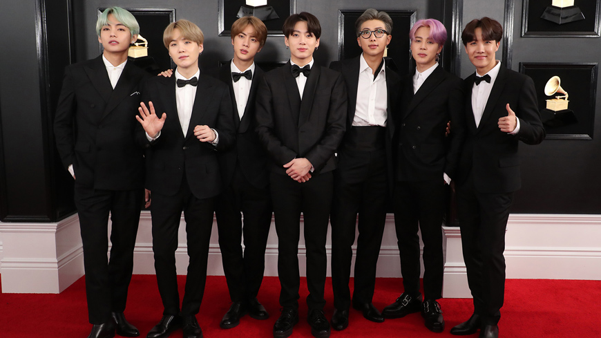
Currently, BTS is the most well-known Korean pop group worldwide and have broken multiple records in recent years. (I won’t list them because that would cause me to go well over the word-limit here, but if you are curious, listen to Mic Drop.) Translated to English, Bangtan Sonyeondan means Bulletproof Boy Scouts. They are often referred to as BTS, which is typically easier for their international fans to pronounce.
The Primary Logo
Their logo, a simple but powerful image, is an excellent example of the emotional connection fans have with this group.
The shape of the bars creates an image of two doors (or gate) opening. This mimics what the fans see moments before the group comes out onto the stage or a fan meet. (In Korea, groups will have “fan meets” which includes the group playing games on stage, talking about their lives, sometimes a short performance, and autograph signing. This happens usually after a major album is released.) By mimicking that image, fans are instantly reminded of their amazing memories from concerts and the anticipation of seeing the members of the group. The image of walking through doors is also meant to symbolize the band going into a better future.
The black and white color contrast helps to highlight the group’s motto of openness. The image of the door opening is a familiar trope often connected to moving into the next stage in life or a beacon of hope in a dark time—thinking of the phrase “When one door closes, another opens”. Even though the design is simple, the emotions connected to it are powerful, making it unforgettable and excellent for branding.
The Fans’ Logo
Their fans are called ARMY, paying homage to their slightly militarian name, Bulletproof Boy Scouts. The ARMY logo is purposefully very similar to the group’s: theirs being simply the reverse of the group’s logo, giving fans the viewpoint of the doors from the perspective of BTS. Once more, connecting the fandom and artist with these two complementary images.
The idea may be simple, but it’s also powerful, allowing fans to see how they’re in the same group as the group members. They face the same personal battles of loneliness and self-worth, a focus of much of BTS’s music.
Both logos focus on the exact moment the direct connection is made between artist and listener. This reminder helps fans to build a stronger connection to the group.
Think of the connection Cubs fans have to the W flag—it serves as a constant reminder of happiness and gives fans a stronger emotional connection to the team.
The Unified Logo
A third variation of the logos brings these shapes together into a unified mark. When all the pieces come together, the image of a larger door or gate opening is revealed. What’s more, if you take away the white space, it becomes a shield—yet another connection to their name Bulletproof Boy Scouts.
Allowing all the logos to fit together into a single mark connects the band’s motto of togetherness with their fans. They constantly stress how they are closely connected to their fans. As an example, not only do they release a massive amount of social media content that delves into their individual lives, but they also get very personal in response to their fan letters and messages.
The Fan Experience
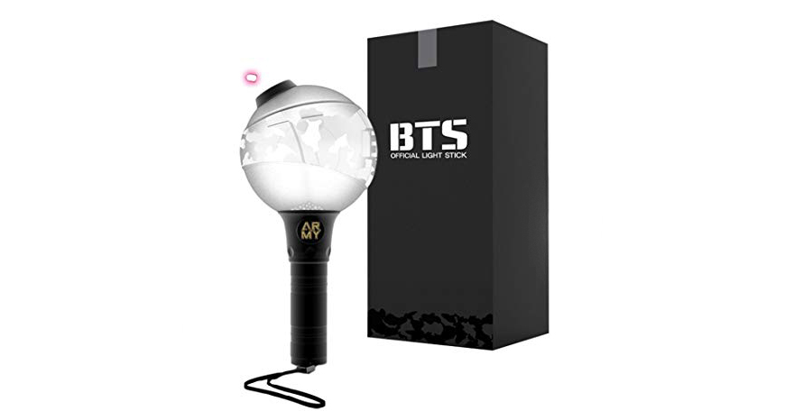
The colors of the BTS logos are typically shown as a classic black and white, but the group, unlike most K-pop groups, does not have an official color. Most K-pop groups have official colors for their logo, shirts, and merchandise. And while BTS doesn’t have official colors, their use of colors is very well thought out. The lightstick, officially called the Army Bomb, is used during concerts to showcase the group’s use of colors. It looks like a bomb with a stick attached as a handle. This goes with their slightly military theme; their fans being called ARMY and name meaning Bulletproof.
During concerts, they use this to put on beautiful visuals and colorful displays as a way to show their acceptance of all people. It also goes with their message of the importance of connection.
A single ARMY bomb can only give off so much light and has a smaller visual; however, when ARMY comes together and all the bombs connect (via Bluetooth), they are able to create something amazing. (Seen below)
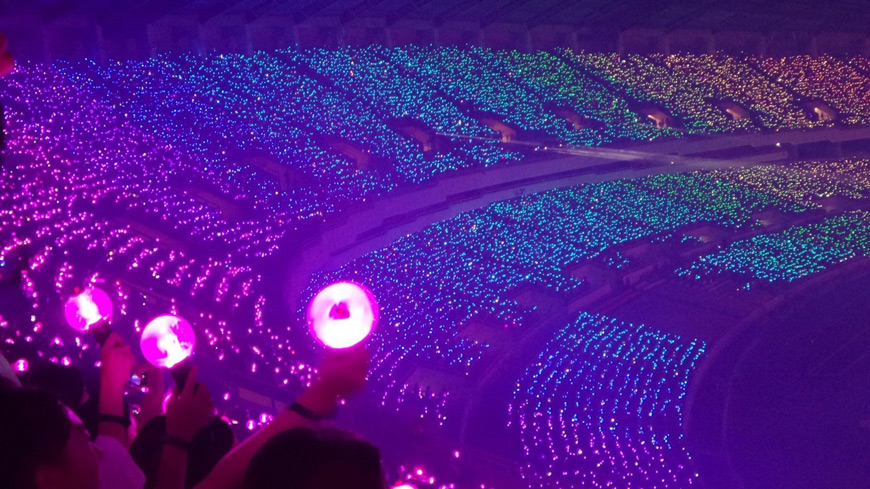
Showing their fans what they can do when they connect with others is a beautiful, purposeful message, especially for the younger generations.
Buying In
From a marketing perspective, all these things allow BTS to make a fortune in merchandise sales. Anything with a logo on it, branded as a must-buy for any ARMY. The fans do it not only because it is from their group, or house, but also their emotional connection to the symbols themselves.
(And this is speaking from experience. They really do have all my money.)
Looking at the BTS empire simplistically, it’s easy to see it as just a way to make money.
But that’s just not a happy way to look at things. I prefer to think that all these things are a way to promote acceptance of others and to give people a sense of belonging. Everyone gets a house! ARMY looks out for BTS, BTS looks out for ARMY, and ARMY look out for each other, which I personally think is a good investment. I guess you could say this a brand I truly buy into 😉
Interested in learning more about our strategic branding work? Check out our favorite logo projects.