How to Make and Use a Sitemap
WANT TO SEE MORE LIKE THIS?
Sign up to receive an alert for our latest articles on design and stuff that makes you go "Hmmm?"
Designing a new website can be intimidating, especially in the early stages of a project when you’re trying to conceive and organize what information you should include.
How do you kickstart the project in the face of that uncertainty? Build a sitemap.
A sitemap is a planning tool for designers, writers, developers, and business owners alike. You use it to explain how content is arranged on a website and show the pathways for accessing that information. Think of a sitemap like a blueprint for a house: it shows the rooms and the hallways that connect them. Similarly, your sitemap shows designers, developers and writers where and how visitors will find each piece of content—like information about a business’s consulting services, for example—on your website.
The best sitemaps work toward your business goals while prioritizing the needs of your website’s visitors. Achieving this harmony requires realistic and practical prioritization, which, we know, can be hard. But it’s not impossible! Here is how we approach creating sitemaps that help both website owners and visitors achieve their goals:
- Start with your website’s goals
- Layer in your website visitors’ goals
- Gut check and prioritize
Start with your website’s goals
Before you begin, think about why you are building (or rebuilding) a website. What do you want to tell your visitors? What action do you want them to take? The answers to these questions will help you clarify your site’s goals and align them with your company’s objectives. They’ll also help you define what makes a successful website, which in turn will allow your web design and development partner to effectively organize, write, and design the site.
We like to answer those questions by making a list. Grab a marker and your favorite shade of sticky notes, and start writing down the different topics and bits of information that you want to include on your site. If you’re redesigning your site and are drawing a blank, start with a quick inventory of the content that’s on your current site. Chances are, you’ll want to keep at least a few of those topics and categories. Treating the project like a remodel instead of a teardown will have fewer implications on your search engine optimization and redirect strategy.
Don’t forget to include your action items, or the elements that will allow visitors to interact with your website, such as a “contact us” button or video. When you’re done, you’ll likely have about 30 sticky notes, with one piece of content on each.
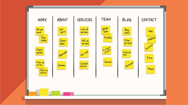
Next, scatter the stickies across a table, wall or whiteboard. Step back, give yourself a moment to take them all in, and then organize them so that related pieces of content are grouped together. When you’re finished you should have a field of notes that looks like the groupings that we put together with a B2B communications firm, which we’ll call Amazing Comms Company, in the example above.
You’ll notice that we labeled Amazing Comms Company’s groups. The goal here is to be descriptive, not wonkish or creative, with the group names: they should identify the content within, or what these pieces of information have in common.
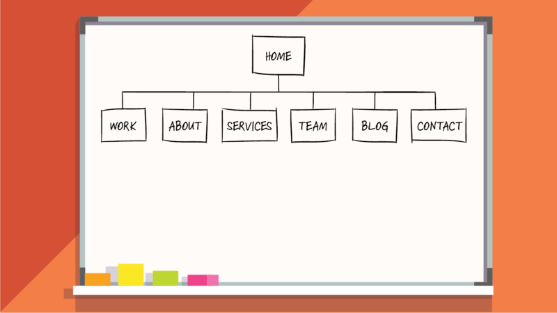
This organization of categories and names is the first draft of your website’s sitemap. Each named group represents a page on your website, and together they make up your website’s primary navigation, or the main sections of your website. That’s why descriptive group naming is so important: The section names act as street signs, directing visitors to specific types of information.
Layer in your visitors’ goals
So far, we’ve only considered your business goals and how you want to talk about them on your website. But website visitors are looking for a solution to a problem they have. If they’re unable to find what they need, they’ll seek help elsewhere. Steven Krug puts it simply in his landmark website design guide, Don’t Make Me Think: “People won’t use your website if they can’t find their way around it.” You’ll lose the opportunity to turn visitors into customers.
A sitemap that considers your visitors’ needs guards against such attrition. If you have market research, segments, or proto-personas, now is the time to get them out: we’re going into the minds of your visitors.
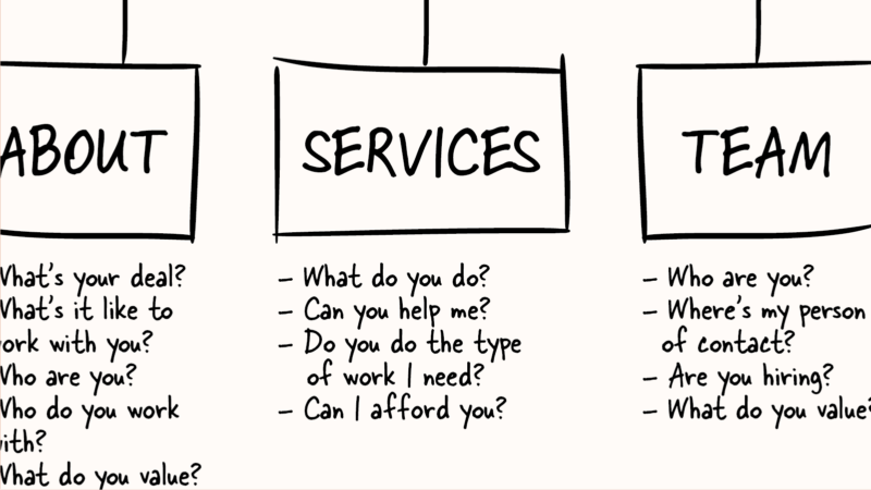
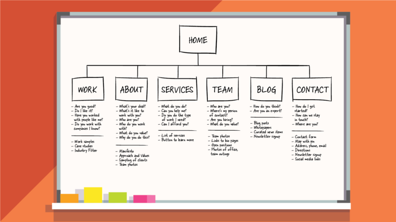
Pick one of the pages from the first draft of your sitemap and think about what kinds of solutions visitors may be looking for there. What questions are they looking to answer when they land on that page? Visitors to Amazing Comms Company’s “Services” page, for example, want to learn “What does Amazing Comms Company do?”, “Can Amazing Comms Company help me with my social media strategy?”, and “Does Amazing Comms Company work with people like me?”
It’s likely that visitors will have more than one question—or have different questions, if you’re working with multiple proto-personas.
Next, list out the ways you might use your content to answer those questions. Let’s look back at Amazing Comms Company’s example. To answer the visitor question, “What does Amazing Comms Company do?”, it selected a piece of content from its sticky notes: A list of capabilities. For visitors wanting to know, “Does your company work with people like me?”, Amazing Comms Company answered with a sampling of client logos to show the types of clients they work with.
Repeat this exercise for each section in your sitemap, all the while remaining in your visitors’ shoes. When you’re done, the second draft of your site map will look like this:
Gut check and prioritize
Remember that the best sitemaps—which address both business goals and visitor goals— require realistic and practical prioritization. Prioritization is the focus of your sitemap’s last iteration.
Take a step back and look at the questions your visitors are asking and how you’re answering them. Are visitors asking the same question on multiple pages? Are you repeating the same answer? Areas of overlap are opportunities to streamline and add clarity to your sitemap.
When Amazing Comms Company gut-checked its sitemap, it realized that visitors were asking identical questions—“Who are you?” and “What does Amazing Comms Company value?”—on their About Us and Our Team pages. The firm also noticed that it was answering those questions with identical content on both pages. To avoid the confusion that comes with repetition, Amazing Comms Company took the opportunity to simplify it’s sitemap: It removed the Our Team page from the primary navigation and incorporated its high-level content in the About Us page.
By removing merging its Our Team page with its About Us page, Amazing Comms Company also reduced the number of pages in its top tier navigation to five pages. Fewer navigation items are good for your visitors—it makes it easier for them to find what they need and recall where it to find it when they return. We recommend simplifying to 5-7 primary navigation pages to maximize browsability and recognition for visitors.
Now, take one last step back. Remind yourself of why you are building this website and the action your business wants website visitors to take. Is that action represented in your sitemap? If so, can you make it easier for visitors to complete it?
Amazing Comms Company had two business goals: To tell visitors about the services it offers, and to increase the number of contact form submissions. With that in mind, Amazing Comms Company made two final edits to its sitemap. First, it moved its Services page to be first in its primary navigation. Next, it put its Contact Us page at the end.
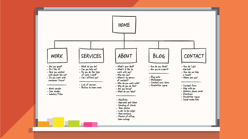
Website visitors from the Western world read left-to-right and top-to-bottom, which means the first and last pages are the most noticed in a website’s primary navigation. For this reason, we recommend putting your most important pages in these locations. Start with your pages that educate visitors—or “learning links,” like Amazing Comms Company’s Services page—and end with pages that prompt an action, like the Contact Us page. This is a natural cognitive pattern for visitors (learning before acting) and a strong website design convention that should not be broken.
What’s next?
Sitemaps are planning tools, but, as more information becomes available, plans can change. Maybe you uncovered a mind-blowing customer insight on a sales call that needs to be incorporated into your website structure. Go ahead and tweak your sitemap! We encourage businesses to treat their sitemaps like a living document during the discovery, user experience, and visual design stages of the project. (Avoid changes once your website has gone into development, though, as that can upend the technical architecture and redirect strategy.)
Transferring your whiteboard and sticky notes to a shareable document is also recommended. We like to use OmniGraffle, a diagramming software that makes creating flowcharts easy. Microsoft PowerPoint is also suitable, as is a simple outline in a Microsoft Word or Google document.
Web design projects can be intimidating, even after they’ve been kickstarted with a solid sitemap. Use your sitemap as a touchpoint if you feel lost or overwhelmed. Remind yourself of your business goals, and take comfort in how you’ll be filling your visitors’ needs. Take a step back, take a deep breath, and forge onward.
Clients often ask us about the difference between a sitemap and a wireframe. We’ll be tackling that soon, but here’s an overview of wireframes in the meantime. Still have questions? Drop us a line.