How to Use the Fold to Your Website’s Advantage
WANT TO SEE MORE LIKE THIS?
Sign up to receive an alert for our latest articles on design and stuff that makes you go "Hmmm?"
Above the fold is a saying from the past. Here’s what current user behavior tells us about optimizing website content for your business needs.
One of the most important decisions in web design is determining what visitors see the moment they land on a web page. Many clients want to make sure the viewer sees everything: they want multiple links, buttons, images, and headlines because they’re afraid the viewer won’t scroll. This is what we call the urge to put everything “above the fold”.
We understand the instinct, but it’s misguided. Because today the reality is: People will scroll. And the “fold” does not exist.
What is “Above the Fold”?
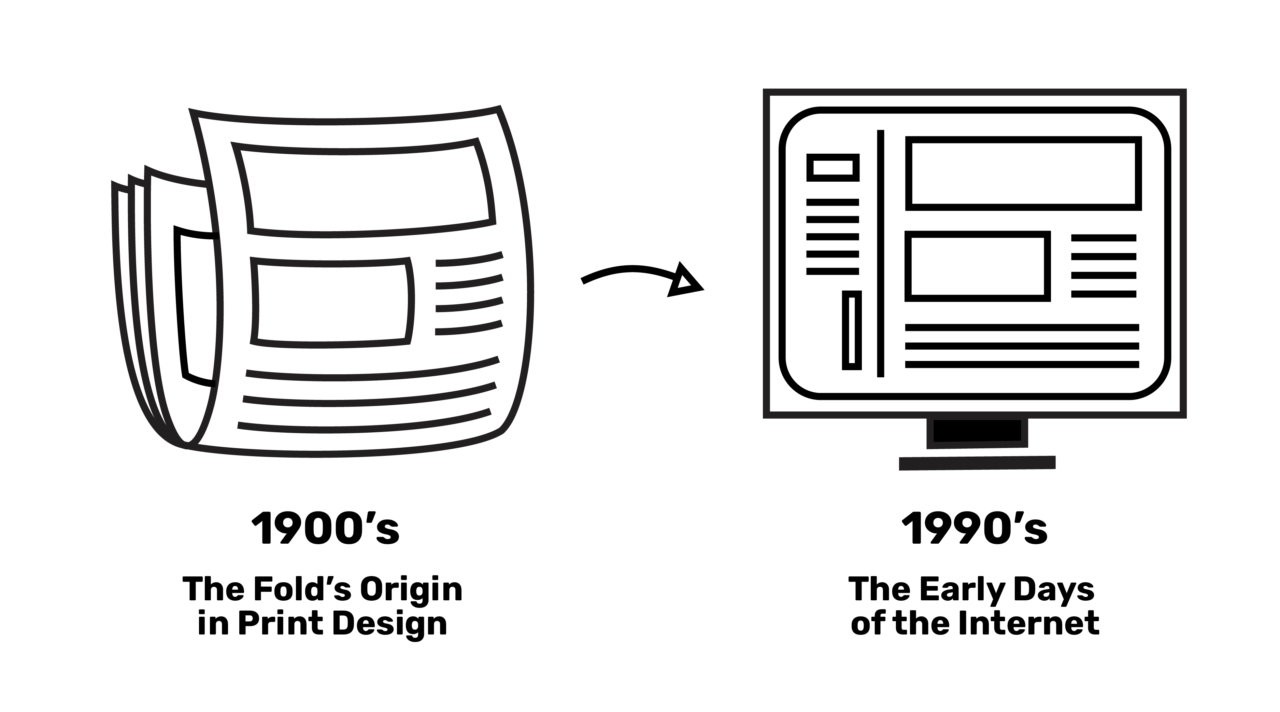
Above the fold is the first sight viewers encounter on a web page upon loading. Historically, the fold originated from print design: newspapers needed eye-catching headlines on the top half of the paper to sell. Translated to digital design in the early days of the internet, the recommended practice was putting all important web content above the fold. This was because users navigated through websites by clicking to deeper pages, rather than scrolling on a single page.

Fast forward to today, two major trends have changed this norm:
- Mobile Technology: Technology today is dominated by mobile touch screens and social media feeds. People are accustomed to scrolling (addictively) on their phones, a current user behavior that’s translated across all digital devices.
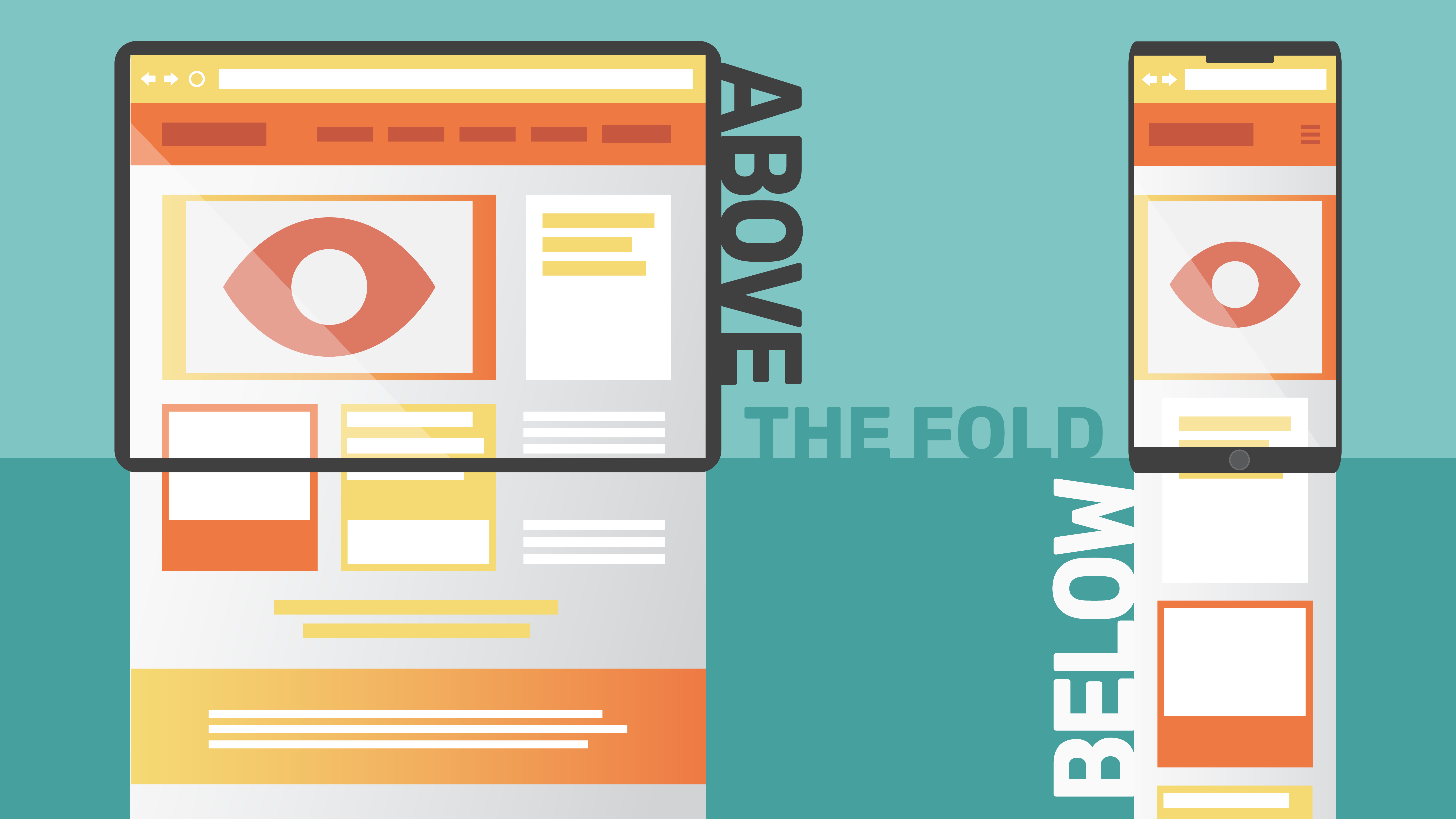
- Responsive Design (There Is No Fold): People now view the web on every kind of device. As a result, there’s no such thing as a single fold on your web page. Screen sizes come in every form, with each screen creating a different “fold”. Websites even change their layouts according to the screen they’re being viewed on, a development called responsive design.
People Will Scroll
People today interact differently with screens. On websites, they understand there’s more content below the viewport of their device. And research reports consistently prove that these people will scroll:
- As reported by Rareview, digital analytics company ClickTale analyzed 100,000 pages and found that 76 percent of website visitors scrolled below the fold and 22 percent scrolled all the way to the bottom of the page, regardless of page length.
- On mobile, half of the users start scrolling within 10 seconds and 90% within 14 seconds, according to stats from the Mobile Overview Report published in UXMyths.
So What Does This Mean for Your Website?
How can you optimize your website for scroll behavior in the business category you operate in? How can you engage your users, welcoming them to dig deeper and scroll down the page to find the content they seek? Let us tell you.
1. First Impressions Still Matter.
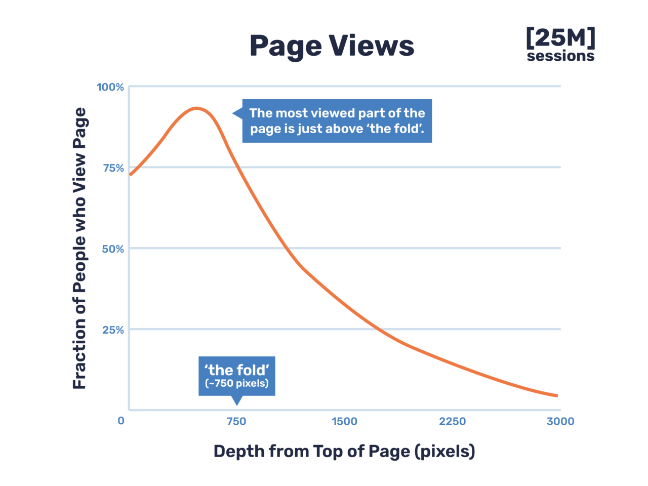
To begin, even though the fold does not exist, the content at the top of your home page still matters. In a study of 25 million users across a random sample of varied sites, data analytics provider Chartbeat found that the most viewed area of the page, with just over 80% viewership, is just above the fold. The first impression of your website matters.

Here are ways to make that impactful impression:
- Prioritize your most important message. Use a big value proposition headline and a clear well-organized navigation bar.
- Place elements across the fold or use a scroll icon. Users will scroll when it looks like there is more for them to see and read.
- Include a call-to-action to improve conversion rates. This makes it quick and easy for users to get where you want them to go.
2. All Content is Important, No Matter Where it is on the Page
Just because a message or call-to-action is not at the top doesn’t mean it won’t be seen. Imagine your website’s home page as a five-paragraph essay: you begin with a snappy introduction, continue onto your main argument, and conclude with a final call to action. The main argument, your content right below the fold, should contain your key messaging where you convince viewers what your company can offer them and what they should do to get started.
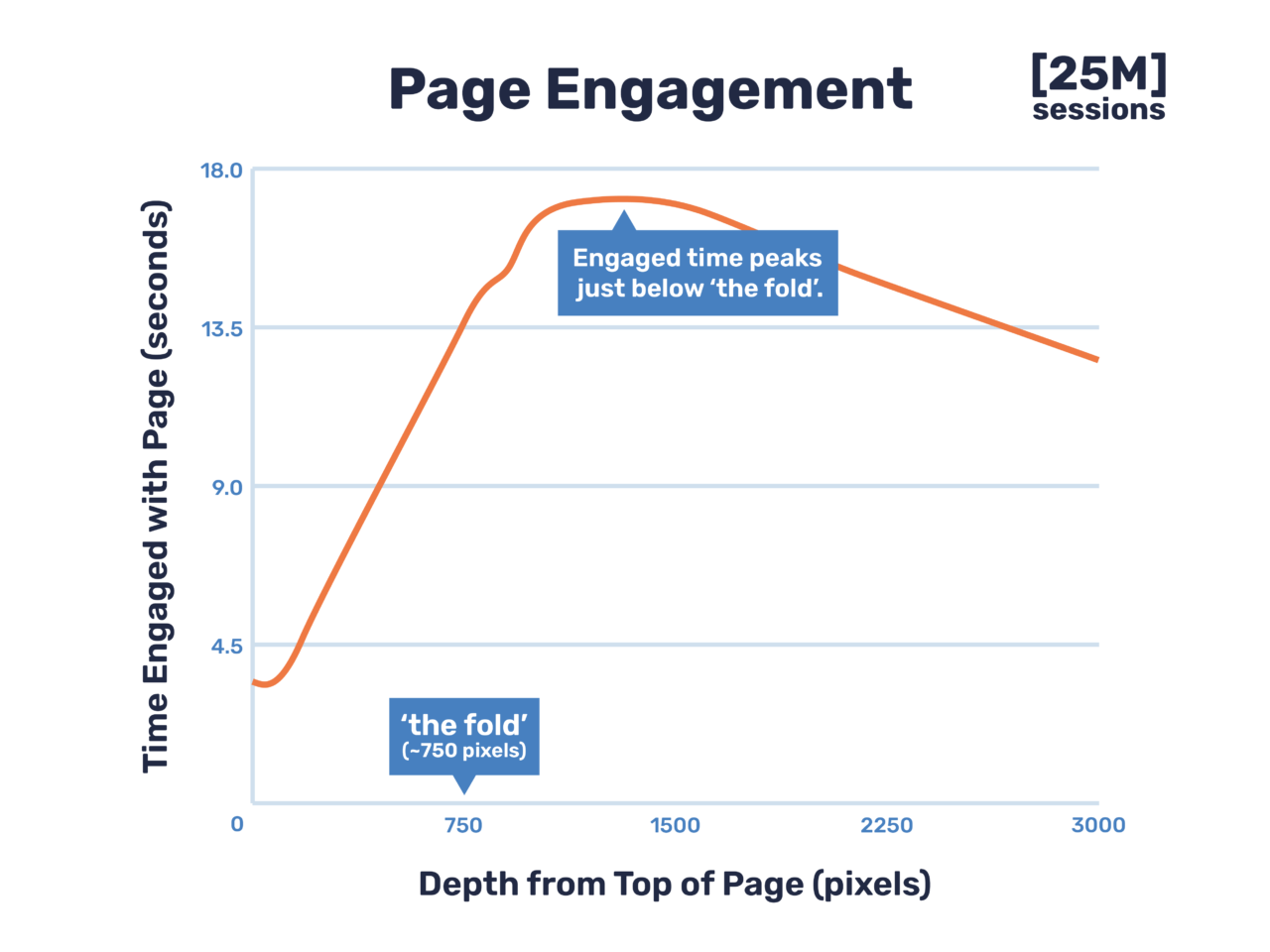
In fact, in the same Chartbeat study of scroll behavior on the web, researchers found that people view the section right below the fold for nearly three times as long as the section above the fold. This means for users who scroll, below the fold content carries equal, if not more, value.

3. Drive Your Message (and Your Conversion Rates) Home
Lastly, place your most important call to action where people are most convinced to take action: the bottom of your web page. You’ve led them through your best service offerings, testimonials, credentials, and stories. Now is the moment to get results with a well-placed CTA that drives your message home.
Conclusion
“Above the fold” is a saying from the past and outdated in the context of current digital experiences. Today, people scroll through long-form content—thanks to the popularity of mobile devices and newsfeeds—and responsive web layouts adapt to different screens. With strategic content organization and data-based design decisions, you can optimize your site for your business needs.


