Our Grammy Predictions Based on Album Covers
WANT TO SEE MORE LIKE THIS?
Sign up to receive an alert for our latest articles on design and stuff that makes you go "Hmmm?"
We’re judging an album by its cover and calling this year’s Grammy Winner
You may have read some of our previous blogs on Oscar picks, but after dancing into the new decade, we decided to challenge various members of the Glantz team with analyzing the cover artwork of the 2020 Grammy nominees for ‘Album of the Year’. The covers of these outstanding collections of musical talent were evaluated based on their execution of imagery, tone, composition, and impact.
![]()
![]()
With that, here are your 2020 Glantz votes for Best Album Cover Artwork:
8. Vampire Weekend – FATHER OF THE BRIDE
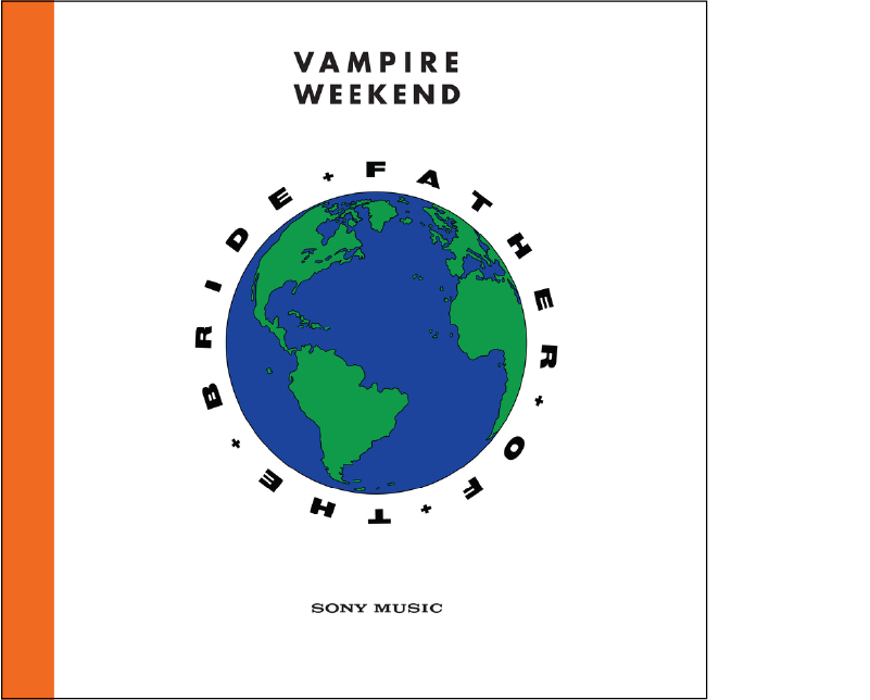
While the cover artwork for Father of the Bride did not wow the Glantz critics, and earned last place, Design Apprentice, Riley Nakagawa applauded the meaning behind the work:
“When looking at Vampire Weekends Father of the Bride album cover, I noticed it is more simplified than its earlier LPs and its message is a little unclear until it is pointed out. In an article with Pitchfork, Ezra Koenig, Lead Singer, mentions that he was influenced by 90’s environmentalism and over all 90’s theme. Although some fans don’t see the tone or impact of this on the album cover, Koenig incorporates the meaning through its music videos and audio videos, such as ‘Sunflower‘ and ‘This Life‘.”
7. Lil Nas X – 7

Lil Nas X exploded into the music scene in 2019. While his album cover came in 7th place, his hit “Old Town Road” broke the single-week song streaming record with over 143 million streams. Hear what Junior Designer, Angela Fong, had to say about the cover of 7:
“Like Nas’s music, the cover of 7 is a successful blend of two seemingly disparate worlds: dark, dystopian rural ruins and a bright, urban future; country music and rap.
The EP cover is abound with subtle symbolism; the foreground features the back of lone cowboy on horseback, perhaps Nas himself? Perhaps a nod to his childhood home of Georgia and his gospel-singer father? Meanwhile, the background is a stark contrast – a brightly lit, urban skyline. And if you look close enough, one of those buildings has a rainbow flag, which Nas insisted should be incorporated into the cover as his way of coming out to the world.”
6. Lana Del Rey – NORMAN F***ING ROCKWELL!
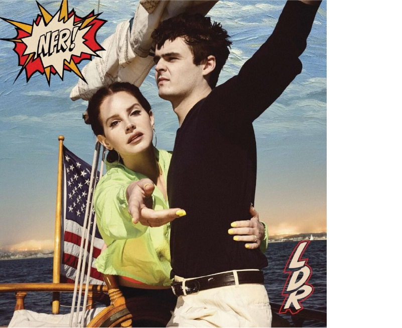
Lana Del Rey’s album cover came in 6th place in the eyes of the Glantz team, but there is no doubt the music behind the cover was a hit. Here’s what Associate Creative Director, Holly Leach had to say about her vote for the album’s cover art:
“Lana Del Rey describes the title of her fifth album, Norman Fucking Rockwell!, as ‘an exclamation mark: so this is the American dream, right now. This is where we’re at—Norman fucking Rockwell. … But it’s not a cynical thing, really. To me it’s hopeful, to see everything as a little bit funnier.’
This cover beautifully balances the irony and hope she describes. The imagery is pure Norman Rockwell, who spent his life creating idyllic illustrations of life in America. Yet her expression and gesture seems to break the fourth wall, almost as if she’s inviting us into the painting as an escape from a chaotic world. The result is an eager pastiche that respects the past and celebrates the present.”
5. Bon Iver – i,i
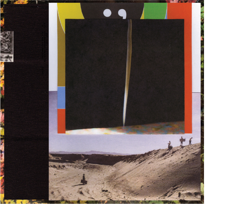
While this album cover came in 5th place according to the critics of Glantz, we definitely enjoyed some of the songs on i,i in the office this past year. Here’s what Designer Ricardo Lisboa had to say about his vote for the album:
“Having worked with Bon Iver to establish his brand over the last two albums, artists Eric Timothy Carlson and Aaron Anderson collage countless assets and supercuts to meticulously craft a visual identity for the musician that feels as layered and conceptual as the music found within. With many quirks and intricacies found only by those willing to take a closer look, i,i resonates with Bon Iver’s audience of loyal listeners who find pleasure in the details.”
4. Ariana Grande – THANK U, NEXT
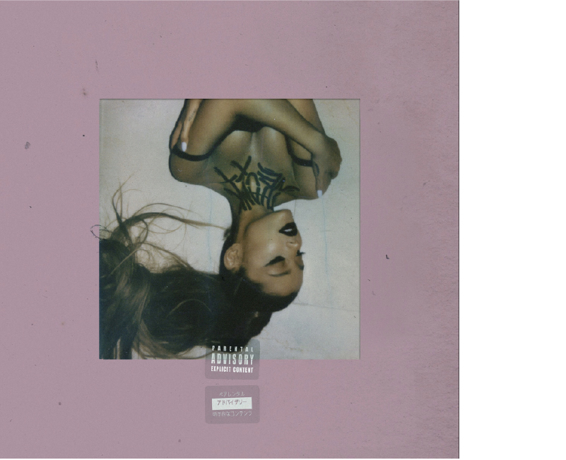
Ariana Grande’s Thank U, Next was an album to remember — for us and Grande. The cover placed fourth in our Glantz competition, but was successful in catching the eye of Design Apprentice, Riley Nakagawa:
“For the past couple of years Ariana Grande has dealt with a lot of tragedy and heartbreak. From Manchester’s suicide bombing, to her partner, Mac Miller, passing away from an overdose, to getting engaged and then later calling it off, Grande has put every feeling and thought into this album. By having her image upside down and being the main focal point, it seems she is pointing to the idea that these events have literally turned her whole world upside down and made her look at life through a different perspective. Having the album name written in an edgy tone across her neck in black and only having her makeup in a dark color shows the hardship she has gone through.”
3. Billie Eilish – WHEN WE ALL FALL ASLEEP, WHERE DO WE GO?

At the young age of 18, Billie Eilish’s unique voice graced the ears of people around the world, and quickly found its way into their hearts. Her album cover for When We All Fall Asleep, Where Do We Go? placed third in the 2020 Glantz competition, but Design Apprentice, Daniel Aberra, thinks it deserved the win.
“The image accurately evokes the horror-inspired tone that Billie Eilish aimed to capture in her album’s design. When We Fall Asleep, Where Do We Go explores the young singer’s fascination with the world of dreams, nightmare and surrealistic imagery. The album cover features no graphical elements as well as minimal photo alterations to keep the focus on the composition and imagery. The white garments and vignetted lighting create a harsh contrast that focuses the viewer’s attention on Billie Eilish’s terrifying gaze.”
2. H.E.R. – I USED TO KNOW HER
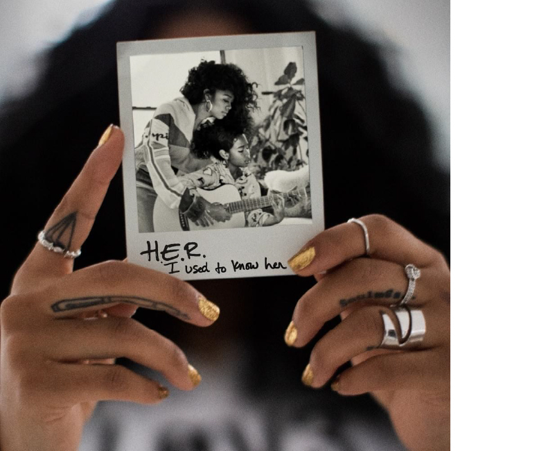
The emotional lyrical content and mellow beat beyond the cover of H.E.R.’s album I Used to Know Her made its way around the world and back and was widely praised, with “Hard Place” also being nominated for Best Record. President and Chief Creative Officer, Keith Glantz, gave the album cover top votes in each of the four categories.
“While I have no idea who H.E.R is or the type of music this album even reflects, I feel very drawn into this album cover. It takes me back to art school trying to interpret the deep meaning behind the Polaroid and its composition. While I have no idea of the accuracy of this statement, I want to believe that based on the caption it’s likely this. In the black and white photo it’s a reflection of H.E.R. that is teaching her younger self how to play guitar and be a performer before the “industry” jaded or changed her. I may be completely wrong, but either way it’s a very powerful image that really is quite simple.”
1. Lizzo – CUZ I LOVE YOU (DELUXE)
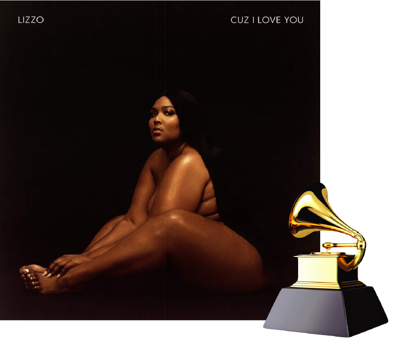
Lizzo’s album Cuz I Love You was a powerful collection of songs exuding confidence and attitude. Studio Lead & Creative Director, Jen Lemerand, had high praise for the winning album cover in the 2020 Glantz competition:
“2019 was truly the Year of Lizzo, and our office was 100% on board for the ride. Her music has been heard in films and television shows such as Booksmart and I Feel Pretty, Blackish and Broad City (closing out the finale!), and countless commercials. She won Time Entertainer of the Year and is on the road to (fingers crossed) be a Grammy winner with eight nominations. Having attended two of her concerts in 2019, I can say the hype is real. And her album cover design is no exception.
Lizzo stands for being unapologetic, putting herself first, encouraging every human to exude confidence. The cover has a deep sense of emotion, showing her vulnerability and power in one fell swoop. The negative space created by her wig and the background, along with the pyramid shape she is posed, draws you in. It creates insight into the power of her lyrics, and an illusion of a personal bond. The typography is understated to balance the visual. Truth hurts… she is our winner!”

