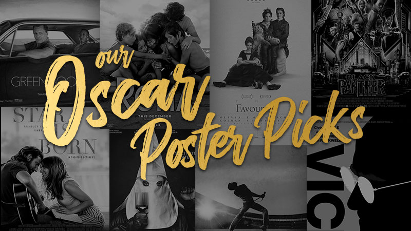
And the Oscar for Best Poster Goes To: 2019 Edition
WANT TO SEE MORE LIKE THIS?
Sign up to receive an alert for our latest articles on design and stuff that makes you go "Hmmm?"
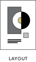
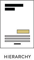
Last year, in the lead up to the 2018 Oscars, we did a design analysis of some of the Best Picture nominees’ official movie posters. Our designers graded the posters using four agreed-upon criteria: hierarchy, focal point, tone, and layout.


However, whereas last year’s post was in more of a “give everybody a Glantzified swag bag” vein, this year things got a little more cutthroat: six Glantzers (four designers, one creative director, and one client happiness officer) pored over the posters, evaluating and ranking them. The result? Glantz Design’s definitive rankings for the 2019 Oscars’ Best Picture nominees’ official movie posters, or OBPNOMPs. That’s right, folks: one of these posters is going home with an orange Oscar figurine.
The Rankings
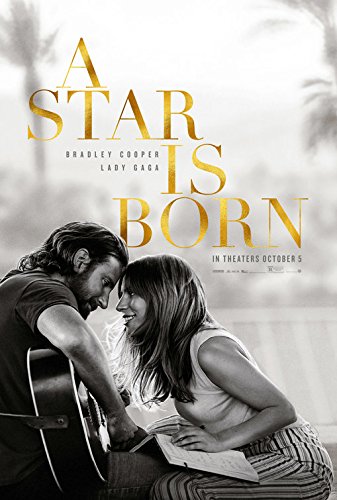
8. A Star is Born
“You know by the poster that this is a romance. The black and white imagery creates the intimacy of a moment frozen in time. The two main characters look lovingly into each other’s eyes. The modern, gold typography, cascades down the poster dramatically. It gets across its intended voice, it’s just not very imaginative.”
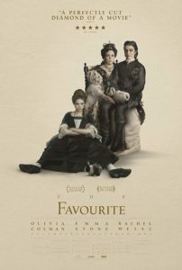
7. The Favourite
“I love how offbeat this poster feels. Everything about it is a little bit challenging. Take the portrait, for example. Its composition is asymmetrical—see how the women are arranged on a diagonal?—yet it’s vertically centered with the text. It makes the whole poster feel slightly off-kilter in a way that piques interest. The typography also contributes to this feeling with single words—like “The” in the title—to stretching to fill the width. This makes the words a little hard to read, just like a satire.”
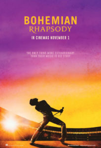
6. Bohemian Rhapsody
“While I’d argue the movie doesn’t meet Oscar-worthiness, the poster keeps up with the pack. Bohemian Rhapsody is about the purposeful dramatization and marketing of a band. And the poster is a well-executed embodiment of it–nice hierarchy, strategic contrast of san serif and stylized serif fonts, a rhapsodic color palette and an ultra-choreographed pose of the singer as focal point.”
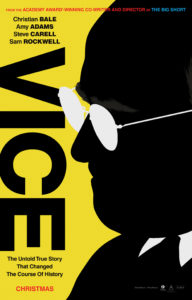
5. Vice
“What I love most is the simple, striking contrast of the black and yellow–a palette appropriate for a satirical comedy. The dark outline of Cheney’s face hiding behind those opaque glasses has such powerful meaning. The boldness of the headline ‘VICE’ laid vertically is another great nod to everything that went sideways in this era.”
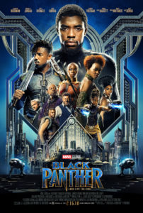
4. Black Panther
“Marvel has a formula for success in a superhero movie poster: a stacked character pyramid. ‘Black Panther’ was a historic opportunity to depict a black super hero and showcase a talented cast of black actors who are often not the centerpiece of Hollywood films. The hierarchy and tone of each character’s facial expression communicate the tenor of the plot and gives a glimpse into the world of Wakanda, celebrating the hero’s heritage.”
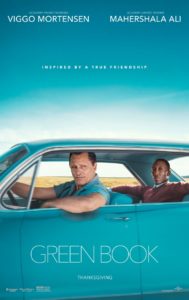
3. Green Book
“Hinting at the tumultuous friendship at the center of the plot of ‘Green Book,’ the poster puts us in the perspective of speculative—and perhaps judgmental—drivers passing the unlikely duo on the open road. Splitting the poster in thirds, the sparse and elegant typographic treatment gives focus to the scene. Thin-weight fonts add to the softness of the color scheme. The smaller yet bolder tagline anchored on the top third of the poster provides an immediate understanding of the story.”
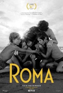
2. Roma
“This poster feels historic and emotional. Previewing the masterful use of light and shadow in the film, the sunlight here is a clear focal point, dousing the group in contrasting shadows. To counter the grayscale, the romanticist composition is framed in a diamond shape by pops of yellow, guiding the viewer from top to bottom. The title’s typeface is tall and romanesque, adding to the same vintage atmosphere conveyed by the colors—or lack thereof.”
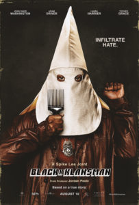
1. BlacKKKlansman
“A punch in the gut. That’s the subconscious physical reaction I have to this poster. Immediately you’re drawn to the man’s eyes behind the white hood. As your eye travels around the poster—taking in details like the simple typographic tagline, the police badge around his neck, the 70’s era leather jacket and comb that add a sense of comedic relief— the retro typographic treatment of the film’s title brings the rest of the story together. The sequential K’s bookended in the block type don’t overpower, rather adding to the controversy. Seeing ‘based on a true story’ is a small detail in an unassuming font, yet it carries important weight to bring this poster’s design home.”
In a nail biter, “BlacKKKlansman” edged out “Roma” to claim the top spot. A big thank you to all the posters that participated, and a big “break a leg!” to the eight films competing for Best Picture this weekend!

Ricardo Lisboa blends his business expertise with a passion for anything creative, approaching design with an analytical mindset. Outside of work, you can find him playing piano, going on weekend hikes, or painting while blaring Tokyo Sunrise by LP on repeat.