The World's Best Designed Metro Maps

WANT TO SEE MORE LIKE THIS?
Sign up to receive an alert for our latest articles on design and stuff that makes you go "Hmmm?"
As a directionally-challenged designer who loves to travel, I can appreciate a well-designed map. When traveling to a new city, transit maps often represent the first impression of that destination. If a map is cluttered, disorganized and confusing, then I judge that city accordingly. Conversely, if a rail map is easy to navigate and pleasing to look at, it makes exploring that city much more enjoyable. Not to mention, the design of the subway map can directly influence ridership numbers and can indirectly have an effect on traffic congestion and pollution.
Designing a transit map for one of the biggest cities in the world is no easy task. However, Harry Beck, mastered the art of communicating a complex system into a minimalistic diagram when he designed the London Underground map in 1931. Pushing geographic accuracy aside, Harry laid out underground routes using beveled edges turning at clean 90- and 45-degree angles. London’s transit map set the bar for succeeding maps around the world. It combines functionality with beauty, and survives as an inspiration to designers today.
Over the years, transit maps have evolved from geographic representations to simplified diagrams. In effect, modern maps have been exponentially easier to navigate and much better looking.
Below is a collection of transit maps that top the list in both beauty and utility.
The Map that Revolutionized Transit Design—LONDON
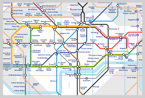
Harry Beck’s London Tube Map is arguably the most famous map in the world. The map’s iconic status is due in part to its exemplary design principles and its utility for easy journey planning. Although geographically inaccurate, its timeless design has become the prototype for most of the world’s transportation systems.
Soft and Simple—MADRID
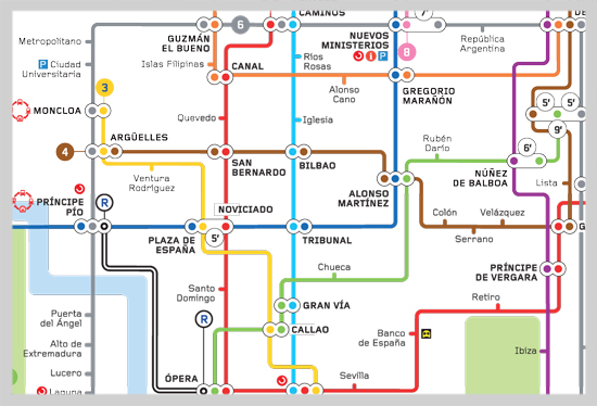
Its soft color palate, thin line weights and use of white space make Madrid’s metro map very pleasant to navigate.
Brightly Colored—WASHINGTON D.C.
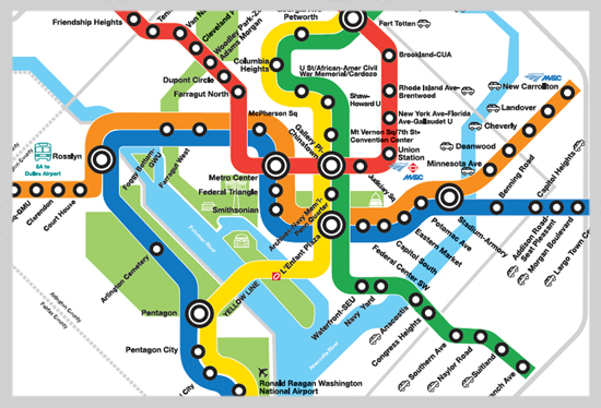
D.C.’s metro system map is wonderfully designed with transfer points that really pop out against its thick and brightly colored lines. I also appreciate the icons that direct tourists to important sites (Arlington Cemetery, the Smithsonian), while others direct locals to commute options (parking lots, buses, and light rail stations).
Pretty in Plaid—BANGKOK, THAILAND

Bangkok’s metro map resembles a plaid shirt that I want to wear. I love everything from its soft color palette to its faintly transparent rivers and streets.
A Bold Background that Works—MONTREAL
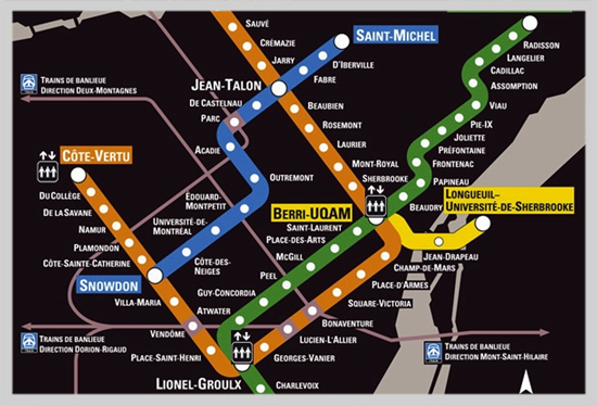
Montreal stands out amongst the rest with its intense choice of background. Because the city’s rail is pretty simple (with only four lines running in a small area), a black background suits this map, making it extremely easy to navigate routes and transfers.
Magnifique!—PARIS
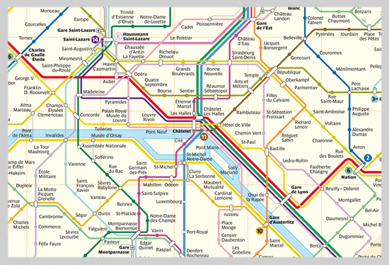
If only the actual trains in Paris were as clean and beautiful as this map.
Naturally Pleasant—AMSTERDAM
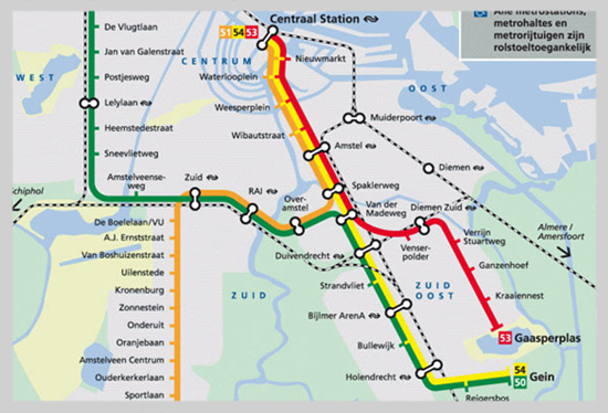
Amsterdam’s green and blue topography complement the geometric representations of the rail system. Its balance between nature and modernity is characteristic of the Dutch city.
The Romantic—LISBON
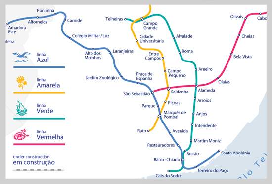
This map feels very soft and romantic in comparison to the popular geometric maps we are used to seeing. The routes flow more in correlation to their actual paths and the lines have icons that add character, almost as if the map is telling a story.
The Ring Leader—MOSCOW
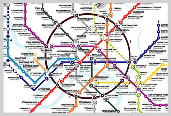
The circular line pops out immediately, drawing your eyes to the center of the city. The weights of the circles for each station are thicker than the lines, helping give more white space to the map. This design clearly takes inspiration from the London Underground Map.
A Much Needed Map Makeover—NYC
New York City is referred to as the “biggest,” “best” and “trendiest” city for a variety of reasons. However, when it comes to “beautiful map design”—the “Big Apple” falls flat. NYC’s subway is one of the oldest and most extensive public transportation systems in the world. And its map design is continuously in the limelight for all the wrong reasons. Many feel it attempts to convey too much information in a single diagram—resulting in a congested, overall ugly design.
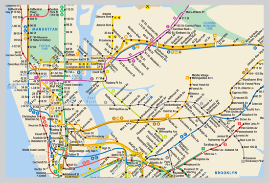
Over the years, several artists have taken a crack at redesigning the NYC transit map. Perhaps the most prominent and most talked about design is that of Massimo Vignelli. Vignelli simplified New York’s complex subway system into a clean graphical diagram, using bold bands of color that turned at 45- and 90-degree angles. The subway map was published by the MTA between 1974 and 1979. However, the over-simplification of geographical elements left many New Yorkers confused, and the MTA replaced Vignelli’s map with a more traditional, typographic map that persists in revised form to this day.
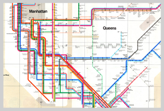
Take a look at the collection of revamped NYC maps below. Most aren’t practical in functionality, but all are uniquely interpreted through beautiful design.

ZERO PER ZERO, a design duo of two graphic designers in Seoul, Republic of Korea, were inspired by the shape of heart from Milton Glaser’s ‘I Love NY’ logo.
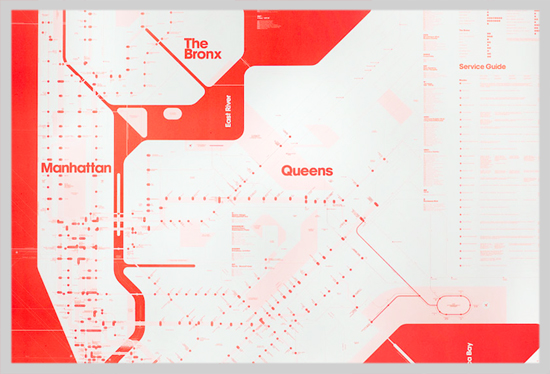
New York-based design duo David Heasty and Stefanie Weigler of Triboro Design builds upon the Vignelli-style map using only one color—Florescent red.
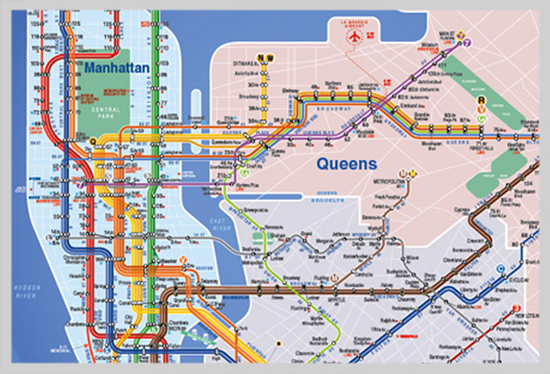
Eddie Jabbour designed the KickMap with ease of use to encourage more people to ride New York City’s complex subway system. The subway map acts as a hybrid combining both diagrammatic and topographic features. Jabbour felt strongly about offering his design as the official map to replace the current MTA map. Unfortunately, the MTA was quick to reject his design.
Disappointing Design—CHICAGO
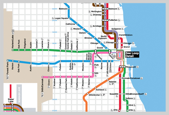
We can’t forget about our own city of Chicago’s transit map. Though the Windy City’s map isn’t “I-want-to-scratch-my-eyes-out” awful, it doesn’t quite make our list of greatest designs. Yes, it’s simple to navigate. Yes, it adheres to most of the visual rules we see in most systems. But, nothing sets it apart from other maps, nor does it visually do justice to the great city of Chicago.
Glantz Design has its own opinion on how the Chicago transit map could be improved. If you are reading, CTA, give us a call and we would love to show you how your map could look.
How would you change the design of Chicago’s CTA map?


