B2BTranslation services
Multilingual Connections
Multilingual Connections: Website Redesign & UX for Lead Growth
Launch Website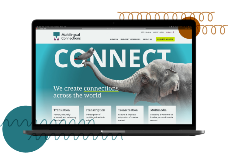
When Multilingual Connections launched 15 years ago, the company primarily provided translation services. Since then, the company expanded its offering to include complex, multichannel language services. Multilingual Connections came to Glantz for help repositioning its brand and website to reflect its growth.
How did Glantz develop a visual strategy for Multilingual Connections using images?
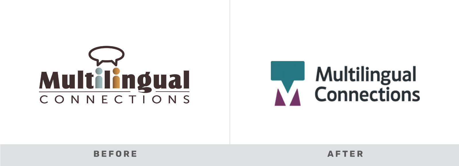
A refreshed brand identity was not originally in the plan. But as we outlined the website strategy, both teams realized it was essential. Multilingual Connections needed a visual language that instilled trust and established expertise.
Instead of starting from scratch, we remixed the logo. The new icon retains the speech bubble from the original mark and uses negative space to create an M monogram.
Connecting use of images with strategy
Multilingual Connections’ new website needed to reposition the company as more than just a translator. It needed to speak to an audience that needed multichannel language services.
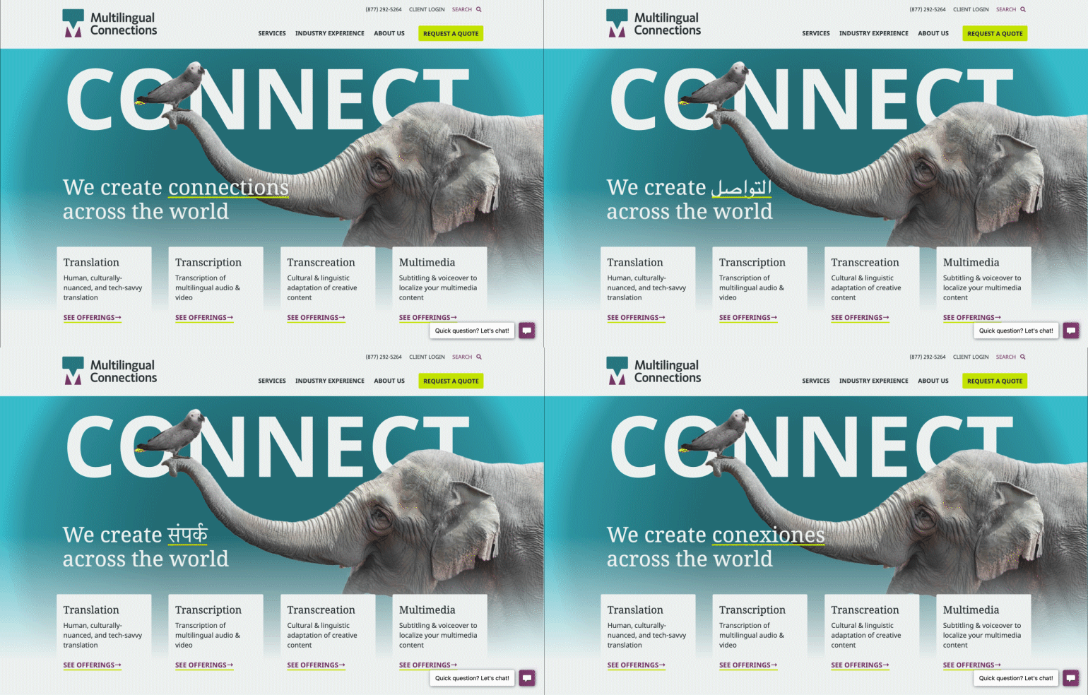
We developed messaging that explained the heart of what Multilingual Connections does: make connections. To convey this cross-cultural connection, we employed the metaphor of animals bonding, a universally understood image, boosted by a multilingual headline.
After a strategic workshop with the team, we learned their linguists don’t simply translate word-for-word. Instead, Multilingual Connections translates the cultural nuances that language software often misses. We used this unique insight as the foundation of our visual strategy. Human elements that dynamically overlap and interact with words express the important role culture plays in communication.
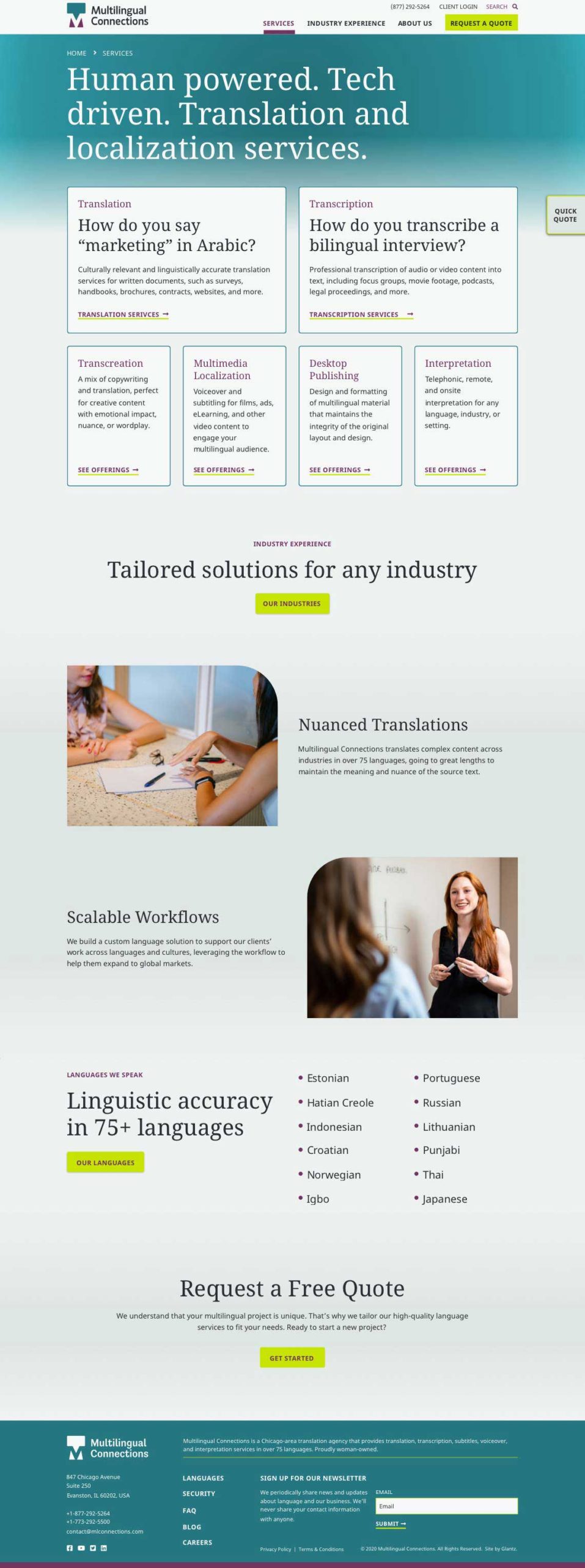
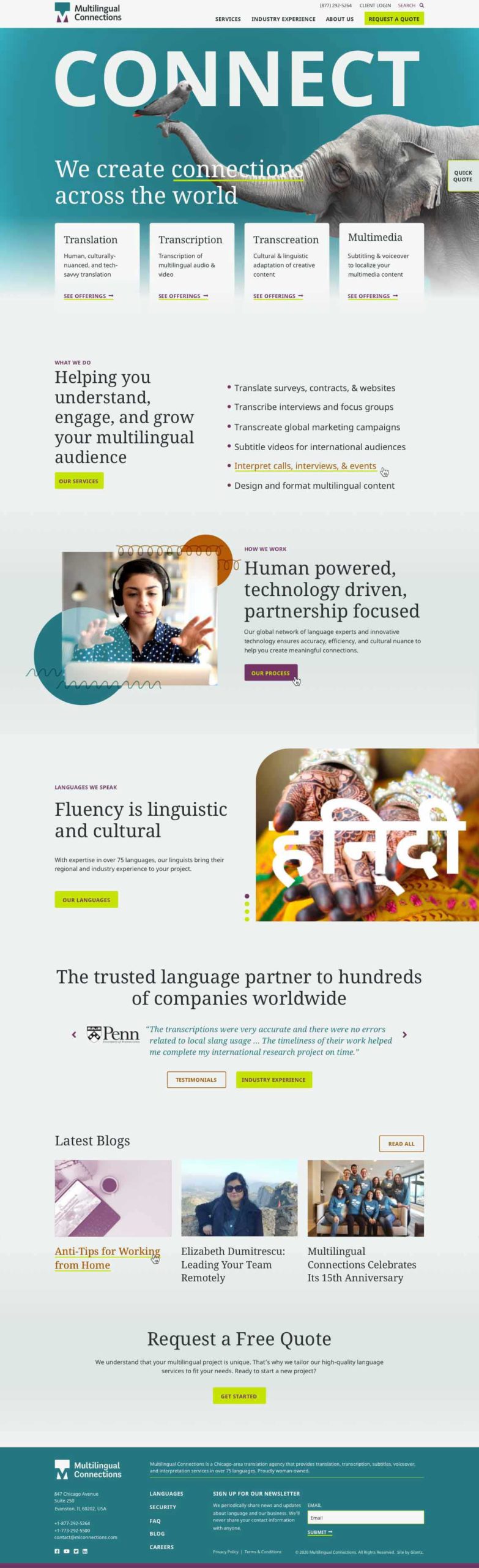
Multilingual Connections speaks over 100 languages, and its website needed to also. Our typeface selection, Noto Serif and Noto Sans, was strategic: Noto is available in 582 languages. This ensures the site can be fully translated, whether it’s in Arabic, Hindi, Russian, or Taiwanese.
How did Glantz educate Multilingual Connections' users about their services?
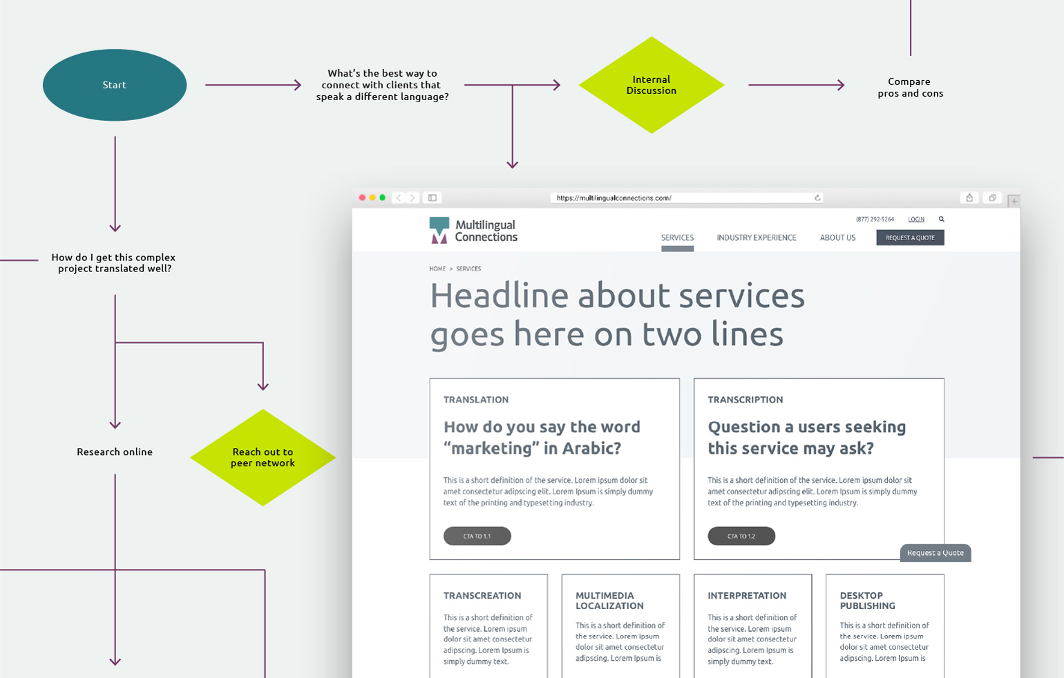
Multilingual Connections has grown in size and complexity, and they wanted their new site to convey their growth. We began the project with an in depth analysis of MLC users to understand how a potential client would research the firm and reach out. We had to re-organize the information architecture so that it improved those experiences.
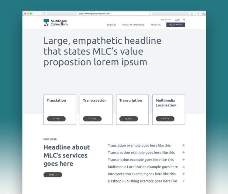
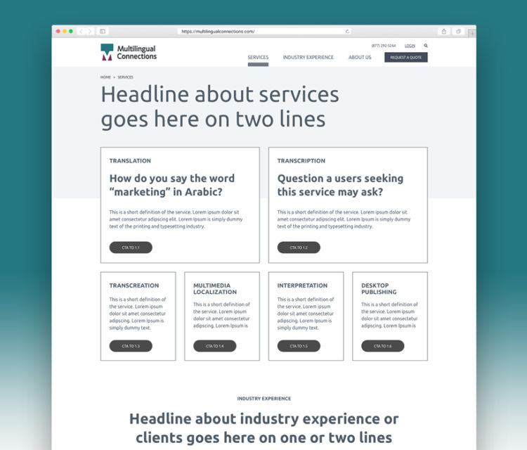
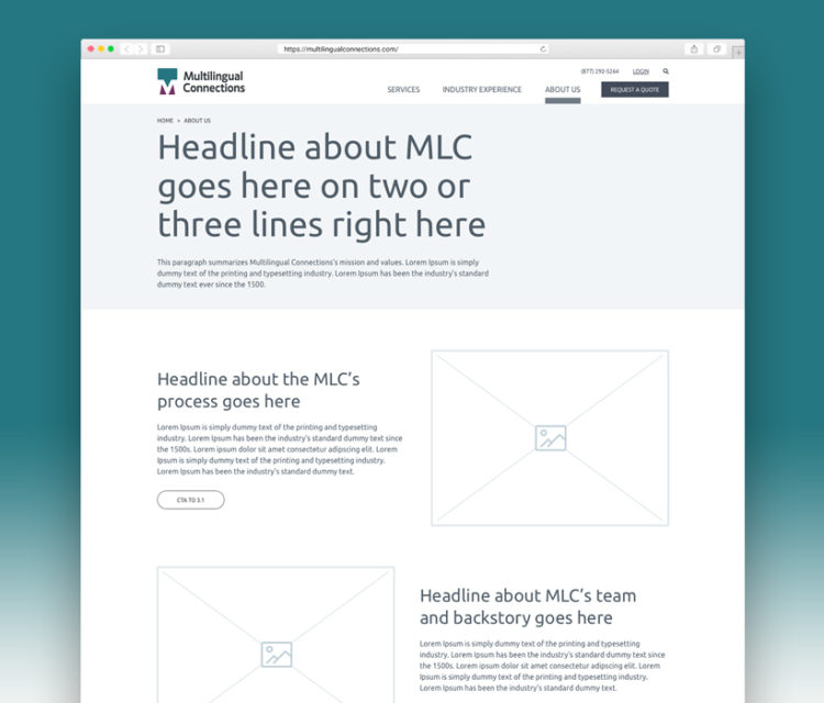
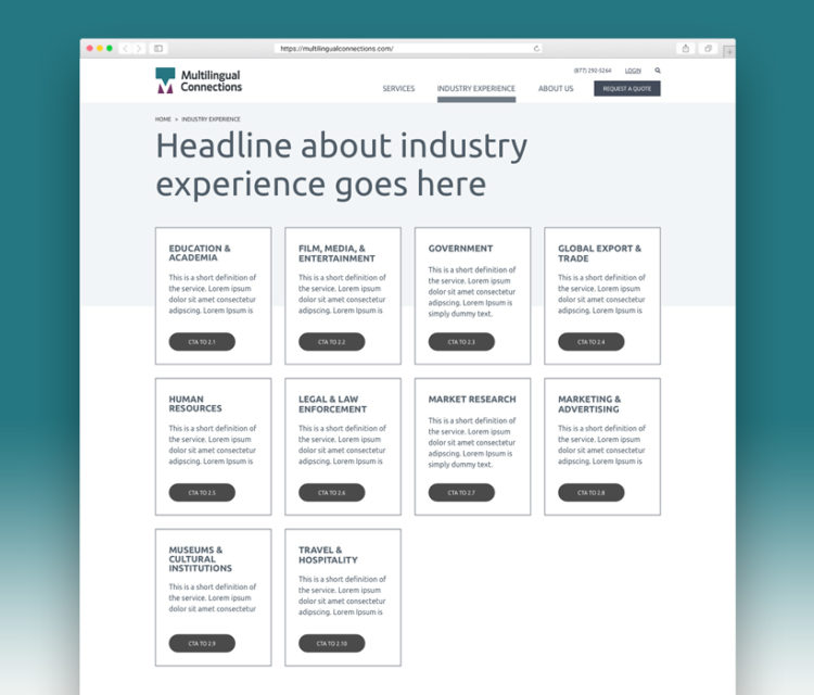
We paid special attention to messaging throughout the user experience. A conversational tone was essential for explaining the nuanced differences between their services. We built spaces for descriptive and scannable lists and directly presented user’s questions, like “How do you transcribe a bilingual interview?”
Throughout the site, we ensured quick access to requesting a quote. This was accomplished with a flow that directed users to fill out a form, and with a pre-footer and navigation CTA not to be missed.