BioscienceR&D
Stemloop
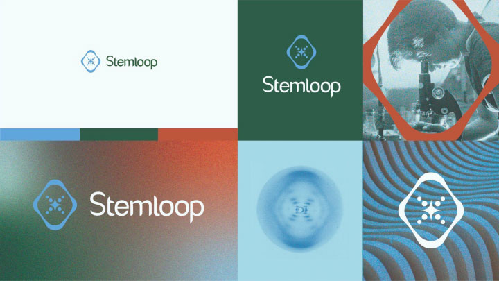
A sophisticated brand identity system for a bioscience startup that creates biosensors for environmental monitoring, human health, and biomanufacturing.

Stemloop is a bioscience startup that develops “cell-free” biological sensors. They came to Glantz needing a brand evolution. Their logo lacked purpose, credibility, and sophistication. But with a new brand identity system, the founders could pitch their technology and secure funding.
Collaborating with the bioscience startup team
Stemloop came to Glantz with a solid brand position and broad vision, including 40+ adjectives to describe their business. In a working session, we helped them hone their focus and be deliberate with their vision. We narrowed their adjectives to five: Forward-looking, Responsible, Determined, Resourceful, and Adventurous. These qualities became our acid test for all branding work moving forward.
We begin conceptual projects with loose, restriction-free sketches. Our team reviewed dozens of rough ideas. Some were an evolution of the current Stemloop logo mark; others were completely new ideas. We also leveraged AI technology to help us envision paths we had not explored.
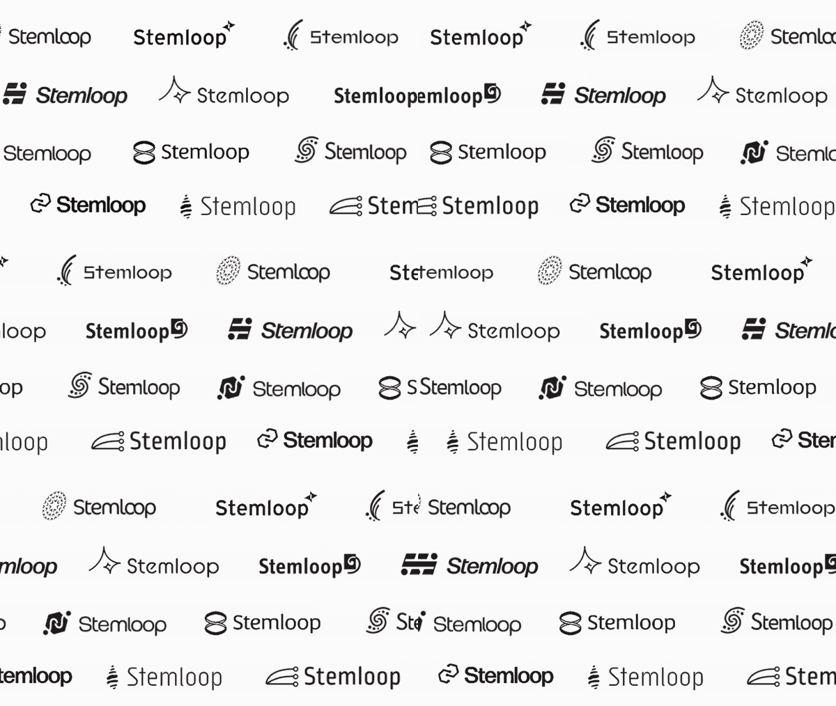
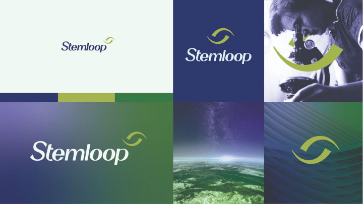
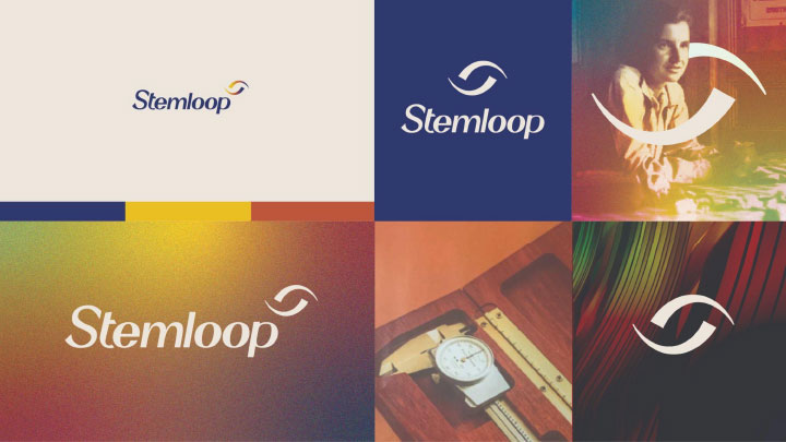
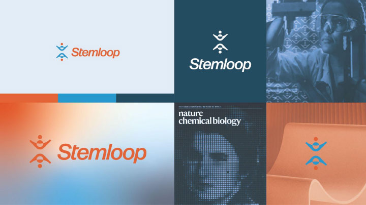
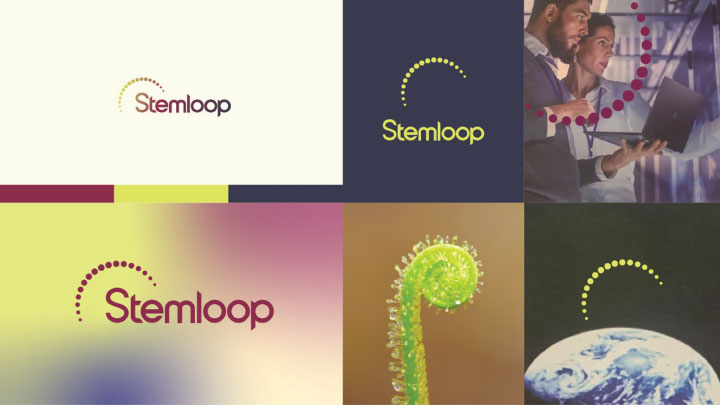
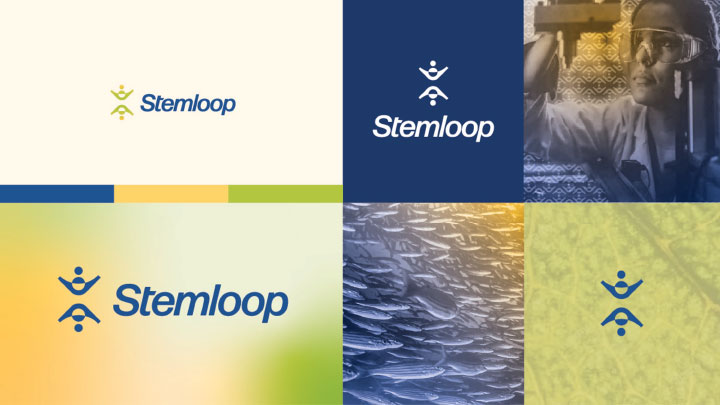
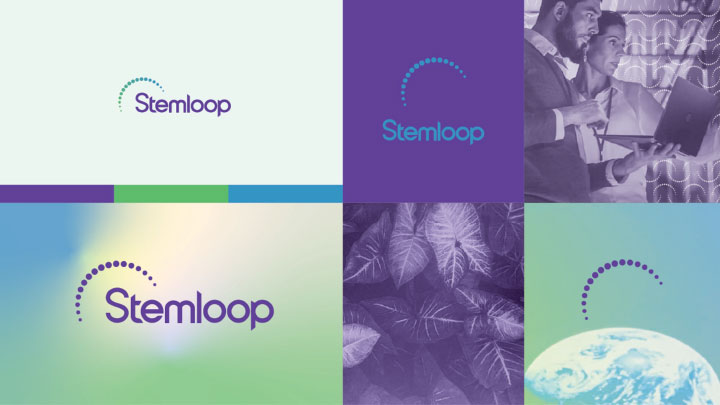
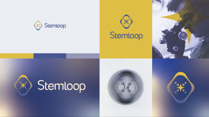
We closely collaborated with Stemloop to discuss each approach’s potential. Together, we cut ideas, mixed and matched them, and created completely new ones. This joint effort produced four potential brand directions that captured Stemloop’s vision. We tested these concepts with different color theories and visuals. The tests helped the startup founders visualize how each option could drive the bioscience startup’s storytelling.
The logo design process
The Stemloop and Glantz teams landed on a refreshed version of the logo. This approach allowed the bioscience startup to retain brand equity while re-calibrating it to the refined brand tone.
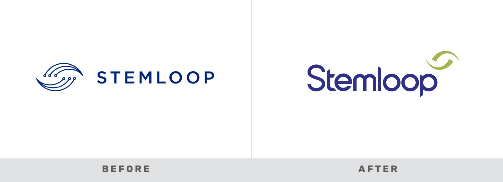
Our refresh corrected several issues with the startup’s original logo. For example, the previous logo was problematic with thin lines and dots that did not scale down to smaller sizes. The typography felt impersonal. The blue was cold and expected.
The new Stemloop logo is elevated with custom typography. It’s anchored by a mark with horizons that twist in space to showcase accuracy and action. It has blue tones that represent loyalty, truth, and seriousness, while greens instill natural harmony and growth.
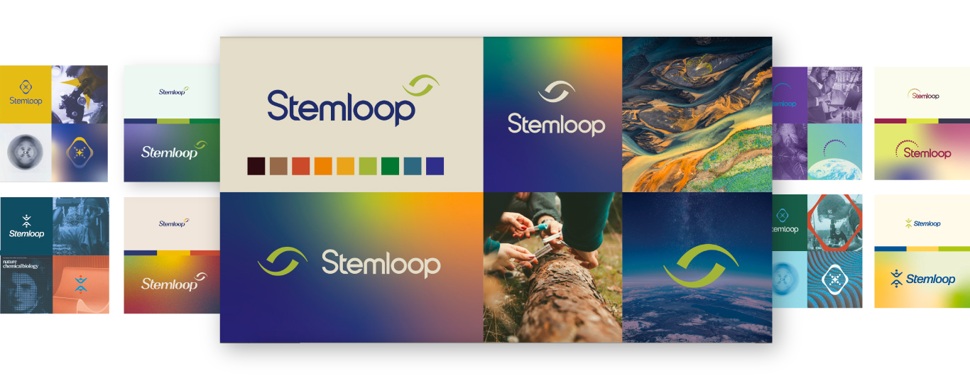
Yet the new mark still retains the concept of the cyclical scientific loop. It also preserves a connection to nature, a powerful message for the Stemloop founders. Still, they felt wary of saying goodbye to the old logo. To build their confidence, we tested more color theories with visual brand boards. With collaboration and conversation, we guided them through the nerves of embracing change.
Building the startup’s brand identity system
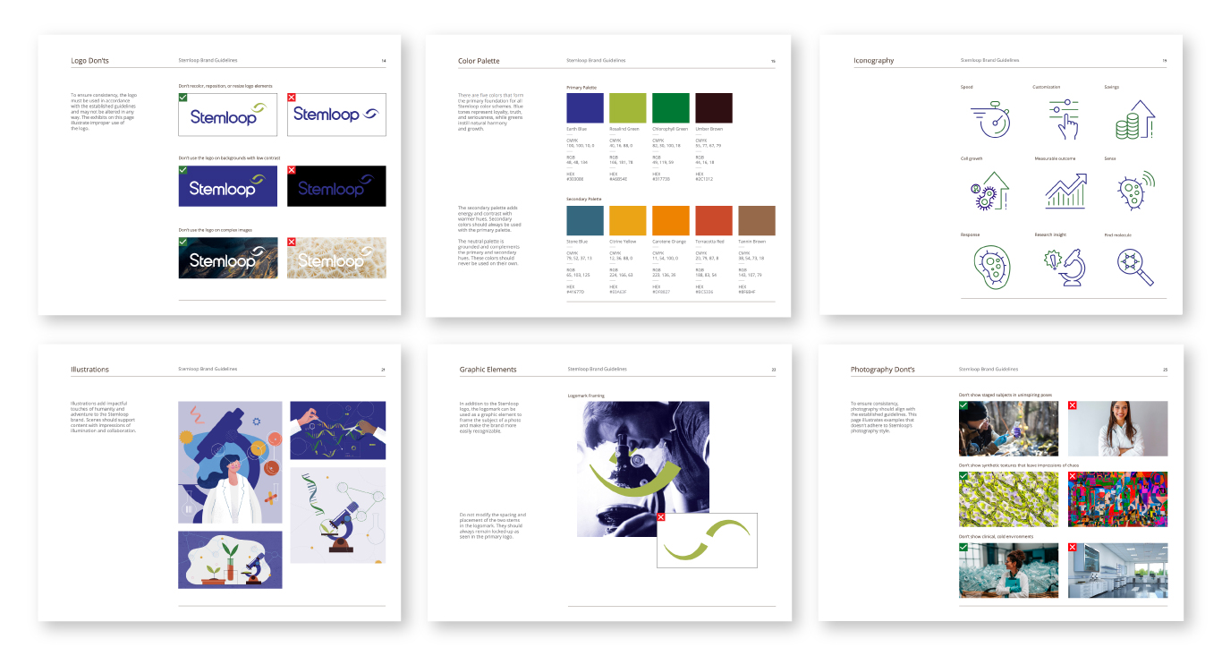
To help Stemloop put its new branding into action, we created a cohesive identity system and brand guidelines.
The identity system leverages their previous work on company positioning, personality, mission, and tone. Our guidelines also offer best practices for logo use, color, accessibility, fonts, icons, illustration, and photography. This tool ensures anyone can execute the bioscience startup narrative with consistency.
Creating the Stemloop pitch
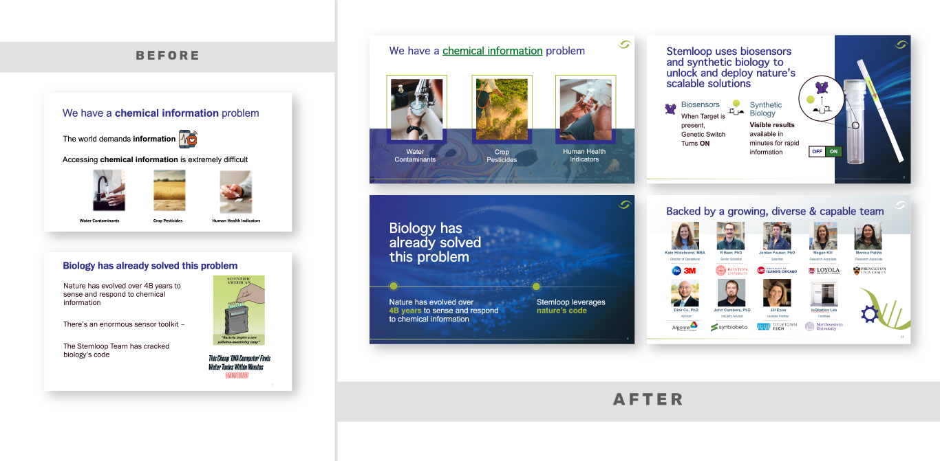
We applied the brand guidelines to a PowerPoint pitch presentation for Stemloop investors. The original PowerPoint was heavy in text and had inconsistent graphics. The new presentation is dynamic, clear, and captivating. It helps the Stemloop founders create a narrative around their work, and acts as an outline to guide their new website and future marketing.
