educationReligion
Garrett-Evangelical Theological Seminary
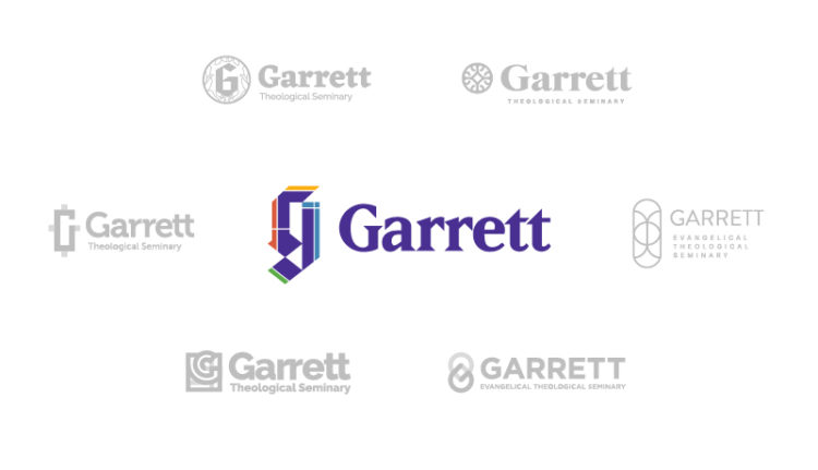
A revitalized brand embodies the school’s progressive educational experience and highly respected status as a theological institution.
Launch Website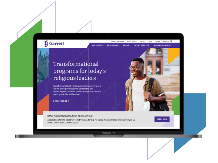
Garrett-Evangelical Theological Seminary, one of the nation’s preeminent graduate theological schools located in the heart of Northwestern’s campus, came to us desiring a new logo and website that would jumpstart an identity evolution for the institution.
We were challenged with creating an identity that would embody both the 166 years of tradition that is central to the history of the school, as well as the innovative, forward-thinking nature of both the students and faculty. Additionally, we had to create something that conveyed both a sense of spirituality and higher education, as both are key components of the student experience at Garrett.
The Branding Process
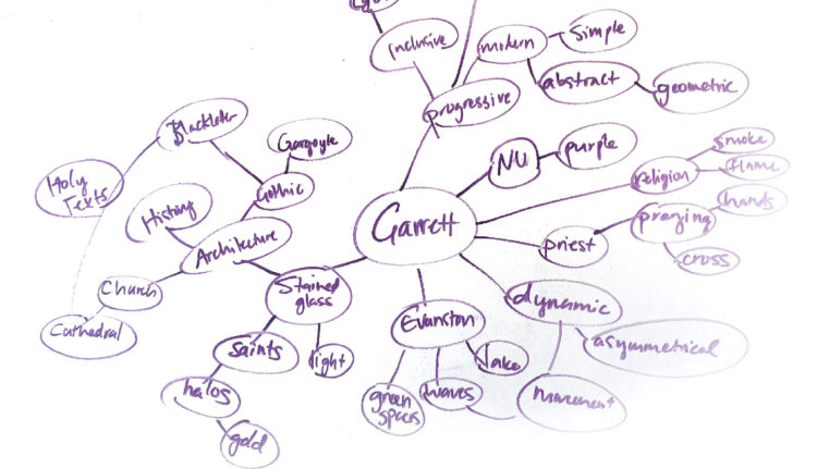
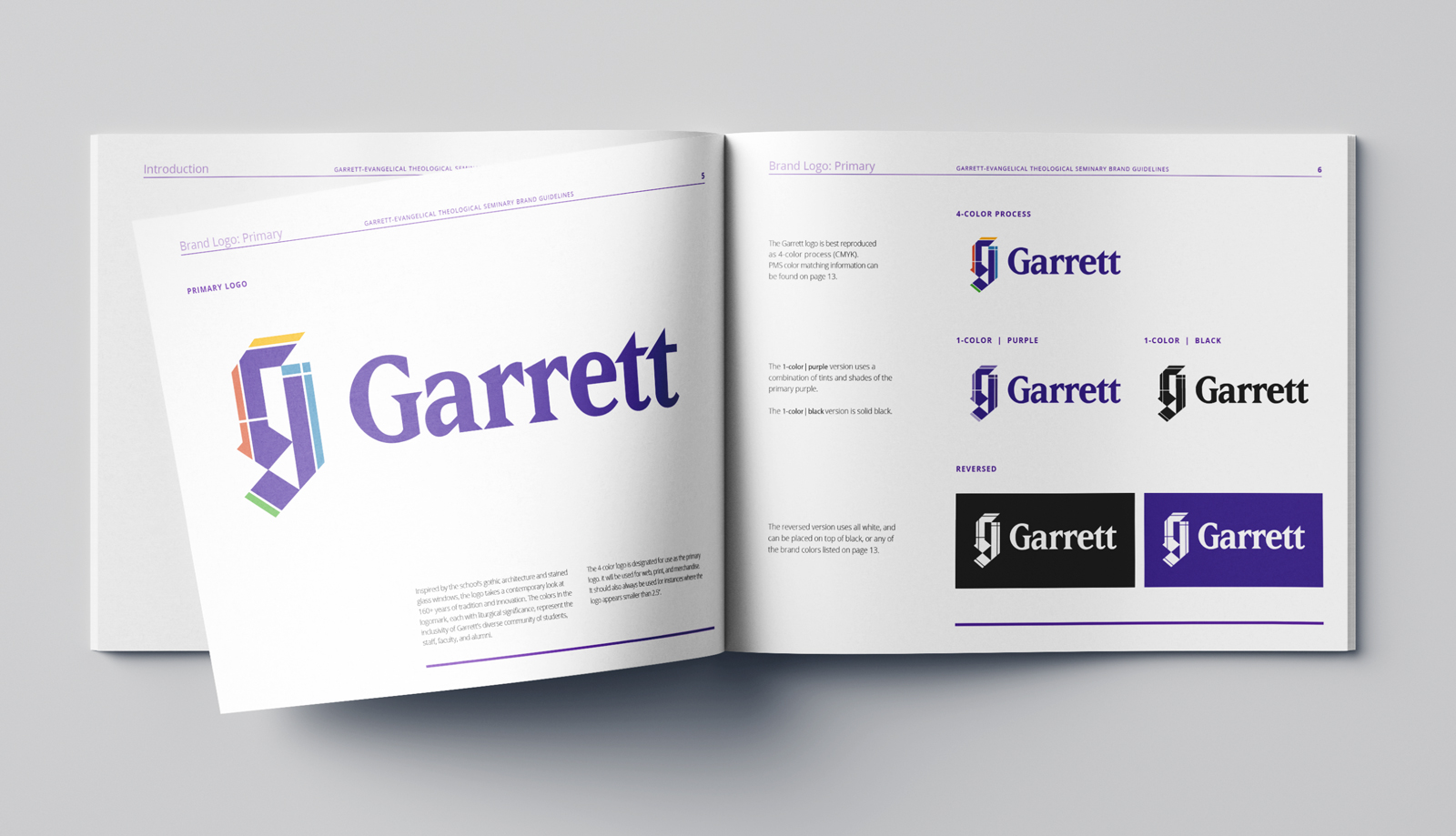
The Garrett team came to us with three points of potential inspiration in order to spark our creative process: the stained glass “G” in the former Academic Dean’s office; the cross emblem on top of the school’s prolific tower; and three stained glass windows in the school’s main chapel, the Chapel of the Unnamed Faithful. With these references in mind, our team went to the drawing board, creating a mind map of ideas to help narrow our approach to the strongest ideas.
The Results
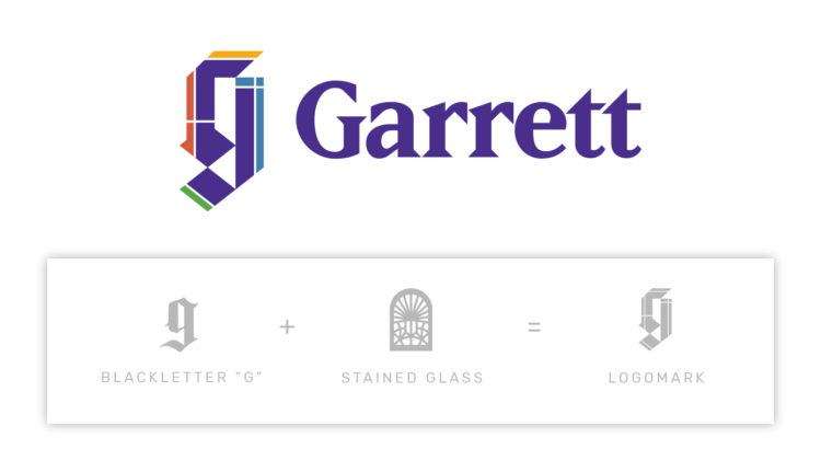
After the synergetic brainstorming session, the Glantz design team got to work and began creating concepts that best epitomized the profound Garrett story. The finished product embodies tradition and innovation by reimagining the classic Garrett “G” and updating it with dynamic elements and fresh colors, inspired by the iconic stained glass G in the former Academic Dean’s office. We kept the long-established Garrett purple as the primary color in the logo in order to formulate a connection between the history and tradition that speaks to the highly valued Garrett Alumni base, and the prospective students who will shape the future of the institution.
A website that converts
Garrett-Evangelical Theological Seminary is among the nation’s top graduate seminary schools. The university asked Glantz to redesign and redevelop its website so that it:
- Generates more applicants
- Generates more donations
- Increases alumni engagement
Each goal spoke to a different type of person visiting the website: a prospective student, a potential or current donor, and an alumni. Crafting a website that suited each of them required a research-driven approach.
Step 1: Identify what we *think* users need
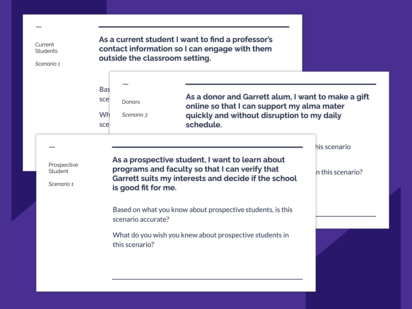
We started with hypotheses about what content and functionality the audiences would need. Using Garrett-Evangelical’s recent market research, we crafted user stories for each type of website visitor. User stories are short, realistic descriptions of how a person might use a website to complete a task, such as researching degrees offered at Garrett-Evangelical.
Each assumption was vetted with the Garrett-Evangelical team and edited to make sure that the hypotheses rang true.
Step 2: Bolster and debunk (!) our assumptions with research
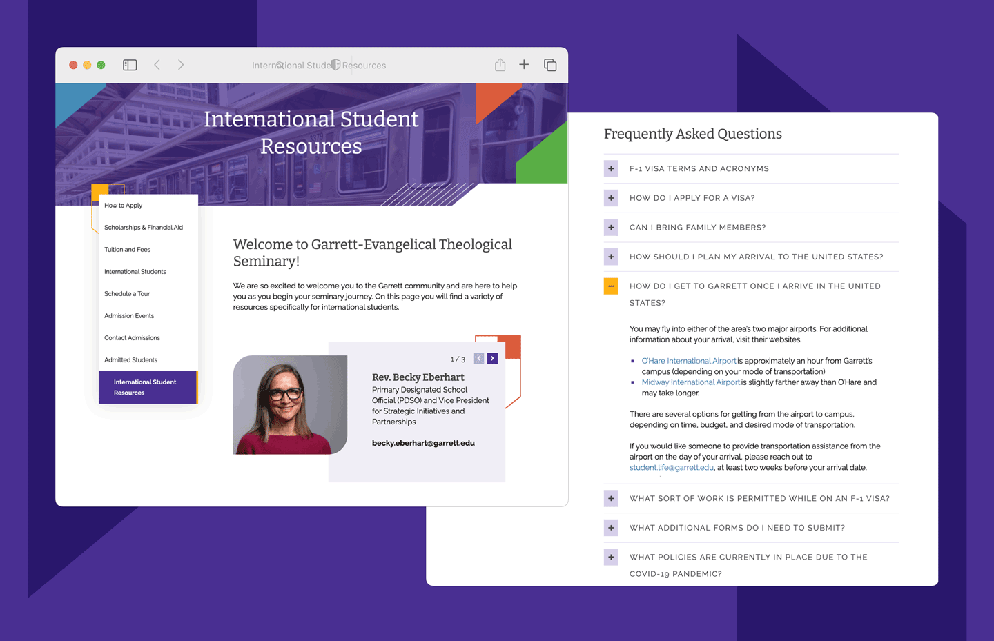
Our user stories, or our hypotheses, were our starting points for deeper inquiry. We began with a series of interviews with Garrett-Evangelical students, admissions staff, and alumni. In each conversation, we uncovered insights about how people use the website. We also learned about what types of information are valuable or expected on the websites. International students, for example, are expected to find detailed information about visa applications and directions to the university from the airport.
We supplemented this first-hand research with qualitative studies from respected research firms. We also incorporated data from a survey executed by Garrett-Evangelical’s marketing team.
Step 3: Organize the information and craft a user experience
With these insights, we reorganized Garrett-Evangelical’s site architecture to make information findable. The main menu categories were reduced to five and re-ordered to give the Academics section prominence. Its position directly responded to student and university priorities. Students said their first priority on the site was to verify the school offered their preferred course of study. University staff touted the seminary’s reputation for academic rigor.


Step 4: Test and Iterate
Our research gave us confidence in our proposed information architecture and wireframes. Yet some decisions begged for confirmation. We needed to do further testing.
Testing with real website visitors allowed us to answer remaining questions before moving into development. We turned our wireframes into a robust prototype and asked recent college graduates to use it to research the university.
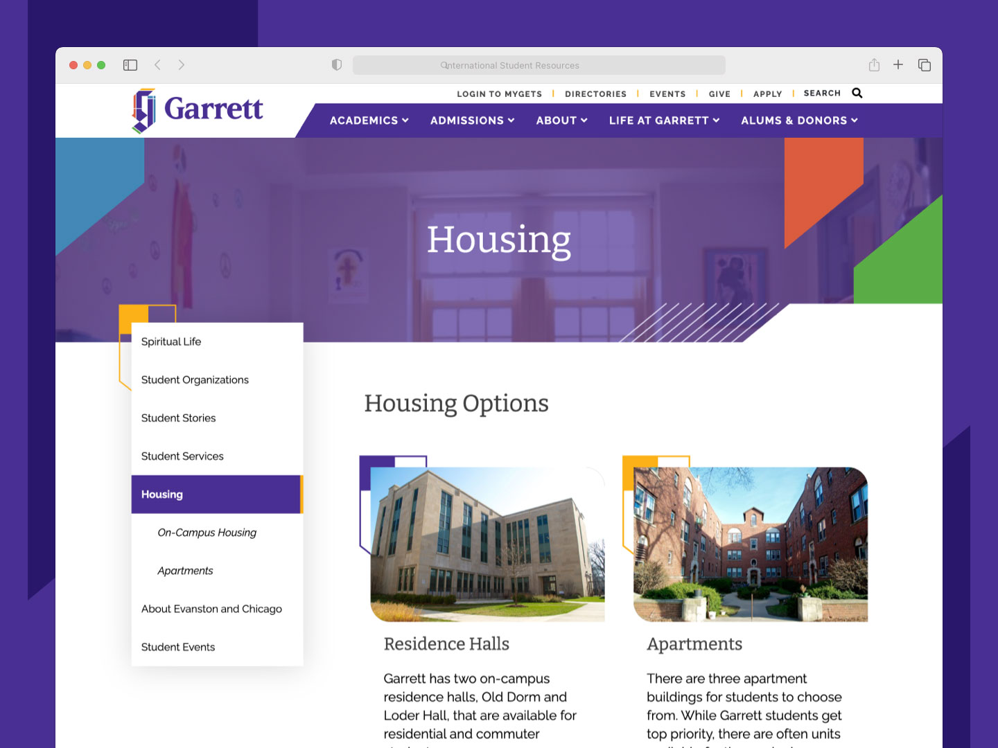
In particular, we focused on university housing, another important input to a student’s decision to apply. The test validated the Housing page’s placement in the menu and informed the page’s content and layout.
Invest in research to reach goals
At Glantz, we believe research-backed and human-centered designs result in high-performing websites. Our partnership with Garrett-Evangelical helped us understand their website visitors and craft an experience tailored to their needs.


