A Briefing on Typography
WANT TO SEE MORE LIKE THIS?
Sign up to receive an alert for our latest articles on design and stuff that makes you go "Hmmm?"

Typography—or the appearance of numbers, letters, and symbols—plays an important role in design, and a sense of typography is a necessary skill for successful designers. We may not think twice about our ability to choose from thousands of fonts when typing up a document or designing print and digital materials; however, there is a long history that has led up to the range of options we now have. The available choices all carry different meanings and do different things for the designs in which they are used. We all use fonts frequently, but are we sure we know the basics?
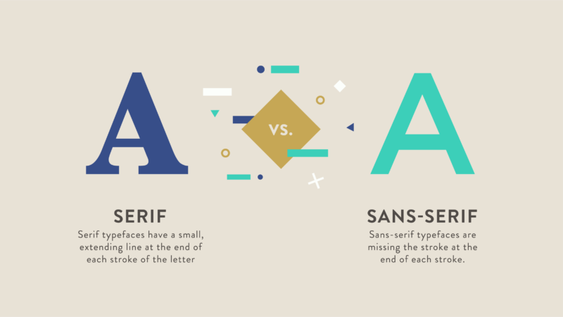
First, let’s start with some general background on the different classifications of typefaces. What we typically think of as fonts (Calibri or Times New Roman, for example) are technically typefaces, and, for the most part, these can be broken into 2 basic categories: serif and sans-serif. Serif typefaces have a small, extending line at the end of each stroke of the letter, while sans-serif styles are missing this portion. There are many variations on these two basic classifications that have multiplied throughout the course of history.
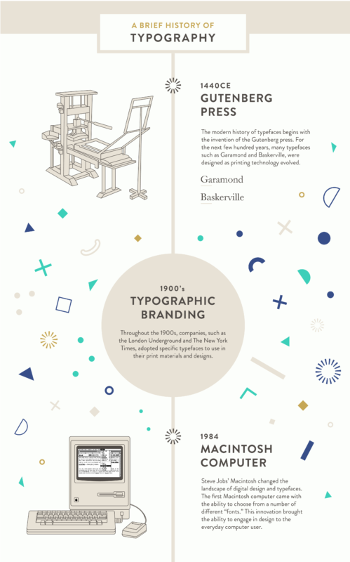
The modern history of typefaces goes back hundreds of years beginning with the invention of the Gutenberg press around 1440CE. The advent of moveable type led to the world of printing that we know now, as it facilitated the proliferation of printed materials. For the next few hundred years, many typefaces such as Garamond and Baskerville, were designed as printing technology evolved.
Throughout the 1900s, companies, such as the London Underground and The New York Times, adopted specific typefaces to use in their print materials and designs. These typefaces continued to be updated and redesigned. In the 1980s and 1990s, typeface design began to change again. Just as Gutenberg’s printing press had a massive impact on printed design in the 1400s, Steve Jobs’ Macintosh changed the landscape of digital design and typefaces. The first Macintosh computer came with the ability to choose from a number of different “fonts.” The capability to change the appearance of text on a computer was revolutionary. Even more groundbreaking was that the text would appear on one’s computer the same way it would on paper. This innovation brought the ability to engage in design to the everyday computer user.
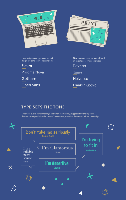
The proliferation of different typefaces has led to interesting trends in the use of certain styles. One of the most popular fonts in past years, especially in the graphic design world, has been Helvetica. It has been used in web and print design, newspapers, and even the logos of numerous brands, including Jeep, The North Face, and Crate & Barrel. However, as Helvetica has become so extensively used, people have started to depart from the popular, sans-serif standard. The trend in more recent years has been towards geometric fonts, such as Futura and Proxima Nova, which crop up in promotional materials for TV shows and movies as well as throughout web design.
While typefaces such as Futura, Proxima Nova, Gotham, and other sans-serif styles are most popular for web design, newspapers tend to favor a blend of serif and sans-serif such as Poynter, Helvetica, Franklin Gothic, and Times. Newspapers also tend to use these popular styles, but make slight changes to customize the typefaces for their particular needs.
Typography is an essential component in design and can significantly influence the appearance of digital and printed materials, but there are some basic mistakes one should avoid. Typefaces evoke certain feelings and when the meaning suggested by the typeface doesn’t correspond with the tone of the content, there is a disconnect within the design. For example, you shouldn’t print a serious news article in Comic Sans, or an ad for a high-tech corporation in Papyrus. A strong sense of typography is essential for the success of a digital or print design.
While the decision to use a certain typeface is a stylistic choice, the typeface’s creation is design within itself. When you choose to use a specific “font” you are using an artist’s work as a means to communicate. Typefaces may have changed drastically since the days of Gutenberg’s printing press, but their influence on our communication continues to be immense.