Where Fonts Meet AI: Creating Better Experiences for Reading

WANT TO SEE MORE LIKE THIS?
Sign up to receive an alert for our latest articles on design and stuff that makes you go "Hmmm?"
New Findings On How Fonts and AI Can Improve Readability
Can swapping a font improve your reading experience? Can readability be measured? And can artificial intelligence change the way we read?
Yes, yes, and yes. Adobe and academics published two studies in 2022 that proved fonts and readers each influence readability. Since multiple factors influence reading outcomes, AI can help improve reading performance. In one study, researchers examined how fonts can affect reading performance. In a later study, they explored how AI can suggest fonts for better reading performance.
How Do You Test if a Font Is Readable?
Participants were asked to read short passages of text in one of these 20 fonts:
- Arial*
- Avant Garde
- Avenir Next
- Calibri*
- Franklin Gothic*
- Garamond*
- Georgia*
- Helvetica*
- Lato†
- Merriweather†
- Montserrat†
- Noto Sans†
- Open Sans†
- Oswald†
- Poppins†
- Poynter Gothic
- Roboto†
- Source Serif Pro†
- Times*
- Utopia
*System fonts. †Google fonts.
Reading experts regularly recommend these fonts. They also often appear in print and digital media. In fact, a majority either come preinstalled on computers or are available for free. For example, seven are system fonts, which means they are safe bets for support across PCs, Macs, and emails. Almost half are Google Fonts, which are open source and free to download.
Since these fonts are so commonly used, designers often avoid them. Critics call these fonts “bland” or “fatal to your credibility.” But the world runs on these fonts. Is this critique fair? Do common fonts actually provide users with the best possible reading experience?
To answer these questions, the studies assessed the average adult digital reader while reading a short passage, similar to website or social media content. Both studies had large sample sizes — more than 250 participants — with 75% representing adults ages 20-39.
How Fonts and Readers Impact Readability
Both studies measured readability using comprehension and speed. In both, font selection did not have a significant impact on comprehension. Reading speed was a different story.
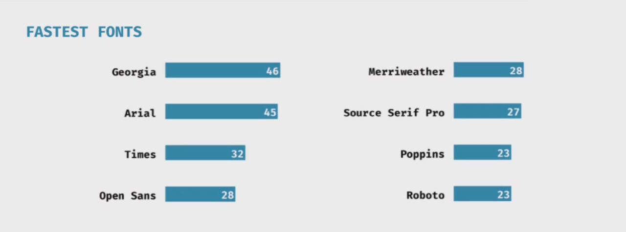
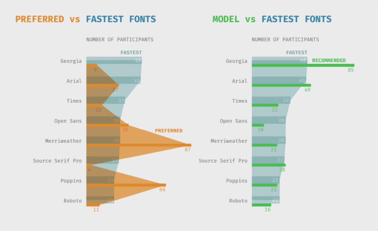
By selecting a different font alone, readers increased their reading speed by 35%. Most participants read fastest using Georgia and Arial. Great news, since both are system fonts! These two fonts are what the researchers suggest for general audiences.
Researchers noticed age had a significant impact on readers’ experiences in both the reading performance and AI studies. Participants over 35 had slower reading speeds: -3 WPM (words per minute) as their age increased.
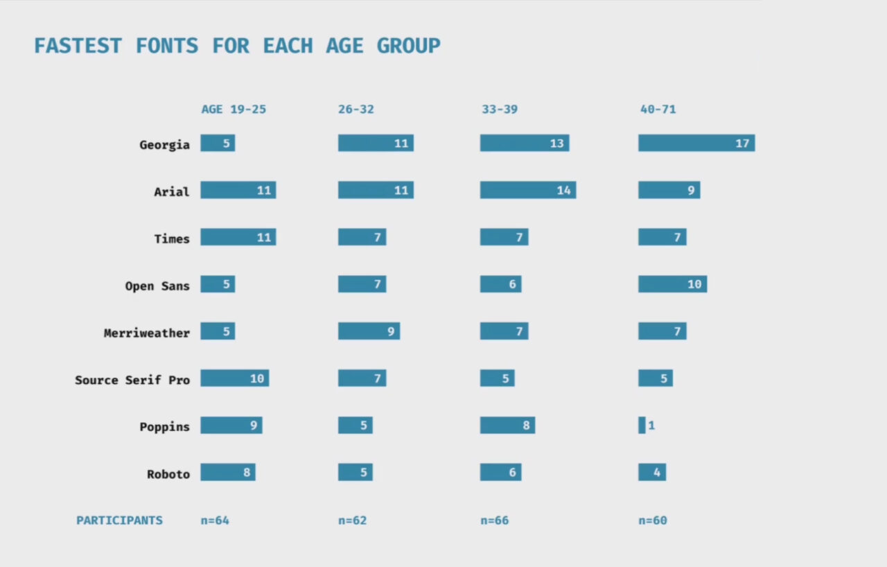
Fonts also appeared to have a larger effect with age:
- A majority of readers 19-25 years old read fastest with Arial and Times. Source Serif Pro, Poppins, and Roboto were close behind.
- Most readers ages 26-32 and 33-39 read fastest with Georgia and Arial by a wide margin.
- For readers 40-71, the fastest font was Georgia, by an even bigger margin.
So what makes a readable font?
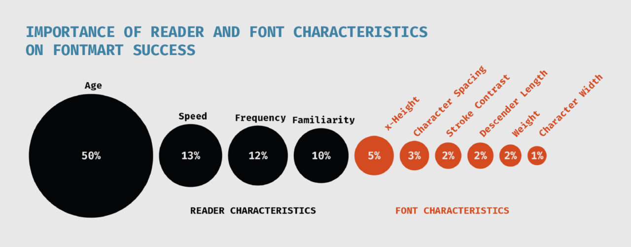
The AI and reading performance study concluded that several reader and font characteristics are at work:
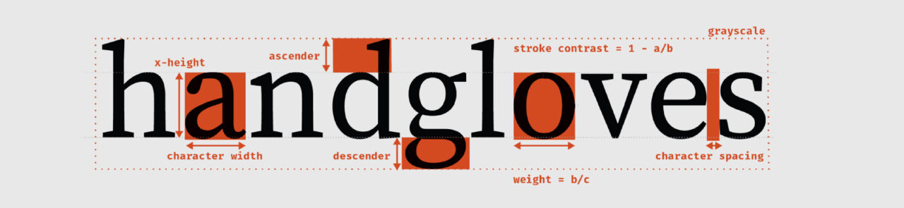
- X-heights: Readers under 21 years old, self-reported as slower, or occasional readers benefitted from smaller x-heights. Fonts with small x-heights include Times, Source Serif Pro, Georgia, and Arial. The reverse applied for those over 35: Times and Source Serif Pro were the worst performers.
- Descenders: Participants under age 22 read faster with longer descenders. The reverse was true for participants over 22.
- Font weight: Lighter fonts, such as Times and Source Serif Pro, performed worse with participants over 35. For those under 30, font weight had minimal effects.
- Spacing: Fonts like Georgia with narrow spacing performed better, contrary to common typography beliefs. Researchers interviewed five type designers, and all said they used wider spacing for readability.
- Font familiarity affected readers’ experiences. “Moderately familiar” fonts improved reading outcomes while “extremely familiar” fonts did the opposite.
How AI Can Help Readers Pick the Best Font for Them
That was a lot of typography jargon! Now we need an accessible way to match readers with their fastest font. How about using readers’ own preferences to guide their selection?
It’s been over 20 years since the Nielson Norman Group wrote,
To design the best UX, pay attention to what users do, not what they say. Self-reported claims are unreliable.
Turns out the same applies to readers. Researchers asked participants which font was easiest to read. Almost 75% of readers believed their preferred font was their fastest.
Understandable, right? But this was true only 20-30% of the time. In fact, their preferred font was as likely to be their slowest as their fastest. On average, preferred fonts were 71 WPM slower than readers’ fastest.
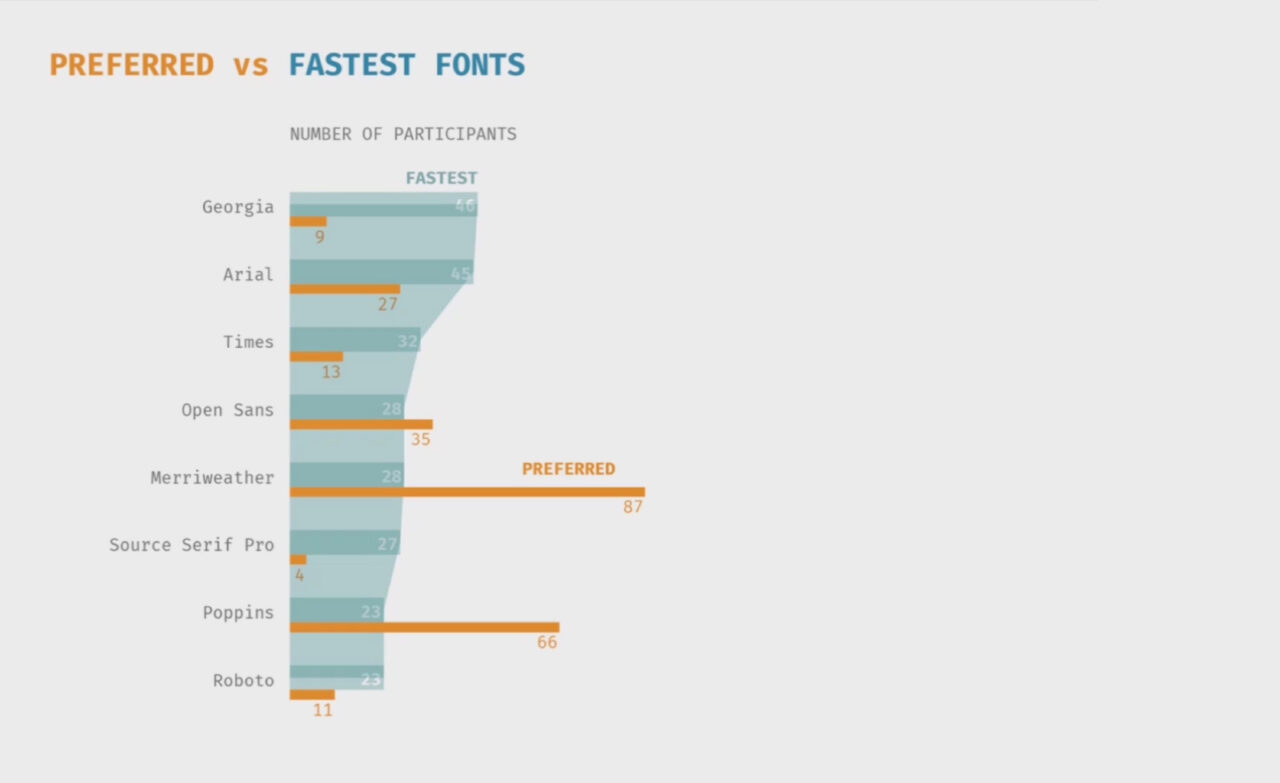
Remember Georgia and Arial, the fonts researchers suggested for most audiences? Looks like neither of them is well-liked. In contrast, Merriweather and Poppins (fonts with tall x-height) were quite popular. But rarely the fastest.
Since user preference isn’t related to performance, researchers turned to artificial intelligence. The result was FontMART: a machine learning rank model. It uses font and reader characteristics to create a custom list of the most readable fonts. The resulting AI-generated suggestions were far more accurate compared to users’ own preferences.
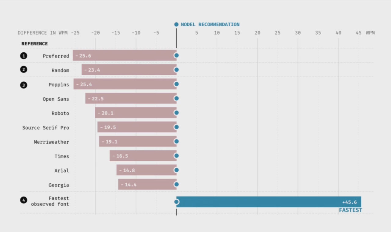
For reference, the average adult reads 238-260 WPM. FontMART increased speeds by 23 and 26 WPM compared to a random and readers’ preferred font, respectively.
Using FontMART data, researchers were able to measure the impact of several factors on readability. Readers themselves, especially their age, had the largest influence on reading outcomes. This reinforces the need for custom-tailored font recommendations that AI can provide.
Like other AI tools and similar emerging technologies, FontMART has room for improvement.
- It rarely recommended Open Sans when it turned out to be a reader’s fastest font.
- AI recommendations were 46 WPM slower than readers’ fastest font.
Seeing how machine learning can benefit everyday readers is promising and exciting. 90% of participants in the AI and reading performance study believed using a different font would help them read faster. And 86% would trust a computer to complete the task. Unprompted, readers voiced their willingness to choose efficiency over preference. One said,
I’m all about how to do things in the most efficient way… if there’s a quick way to reformat things to make me more efficient, like hitting a few buttons and changing everything perfectly, I would totally do it.
Fonts, AI, and Your Every Day
These two studies present three interesting ideas to contemplate:
- There is no universal “best” font, and readers’ preferences are not always in their best interest. To untangle the two, usability testing is key. Regardless of budget, project phase, or timeline, testing is always appropriate. As web usability pioneer Steve Krug put it,
If you want a great site, you’ve got to test. After you’ve worked on a site for even a few weeks, you can’t see it freshly any more. You know too much. The only way to find out if it really works is to test it.
- Customized reading experiences informed by AI will improve reading outcomes for everyone. Right now, these findings can inform our font selection as readers and designers. Web browsers’ “reading mode” and eBook devices already give users typographic control. Soon, AI will be able to provide research-backed suggestions that optimize reading experiences.
- Workhorse fonts deserve respect. Next time you have a limited font selection and audience insights, try Arial and Georgia.