From Spooky Fun to Seriously Scary: 10 Halloween Movies and the Design Behind Their Posters
WANT TO SEE MORE LIKE THIS?
Sign up to receive an alert for our latest articles on design and stuff that makes you go "Hmmm?"
Not all Halloween movies are created equal. Some are packed with nostalgic fun and just the right amount of spooky, while others deliver the kind of psychological horror that keeps you up at night. But before the opening credits roll, there’s one thing that sets the tone: the movie poster.
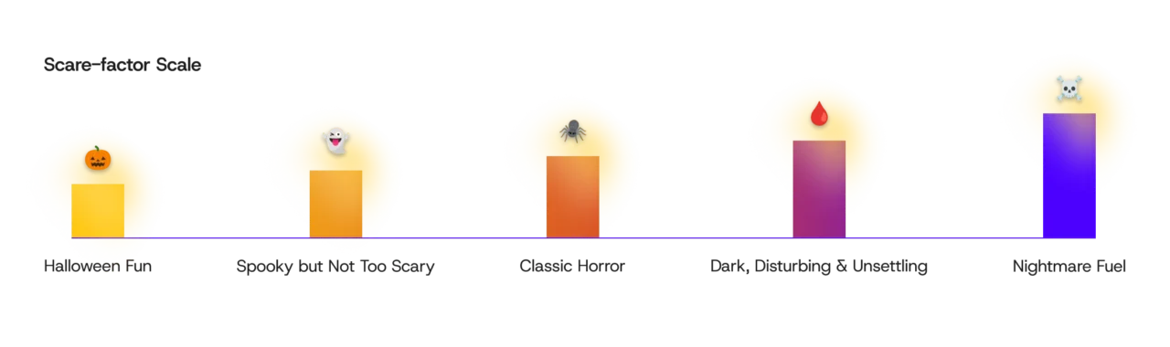
This Halloween, as the resident spook-master at Glantz, I picked my 10 favorite scream-worthy horror films and Halloween movies—from lighthearted to terrifying.—and interviewed the design team to break down the visual language behind their posters. From color palettes and typography to composition and visual storytelling, we’ll explore how great movie poster design gives audiences a taste of what’s to come. If you’re interested in watching any of these after hearing our list, we’ve ranked each movie by its scare factor, from family-friendly Halloween fun to full-blown nightmare fuel.
Halloweentown
Scare Factor: 🎃
Halloweentown is a fun portrayal of what Halloween would be if it were a physical place with townspeople who looked like the costumes that humans wore. Sprinkle in an evil warlock and traveling through portals, and it’s a perfect introductory spooky season film for the full family.
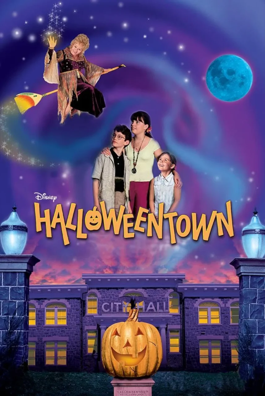
Movie Poster Design: Upon first look, you can see that the cover art design is essentially being used as a medium for the camp, adventure, and whimsy of the movie itself. The playful colors, sparkles in the clouds, smiling jack o’lantern, and bold, but tilted typography portray the fun and excitement to expect.
Fun fact: The real-life Halloweentown is St. Helens, Oregon, located about 45 minutes northwest of Portland. Every fall, the historic downtown area transforms into the set of the film during the Spirit of Halloweentown festival.
Hocus Pocus
Scare Factor: 🎃👻
The Sanderson Sisters are a spooky-season staple for a reason. With witchy Salem lore, a talking black cat, a headless zombie, and a spellbinding musical number, Hocus Pocus is the perfect pick for a Halloween movie night that leans more fun than frightening. It’s a total showstopper.
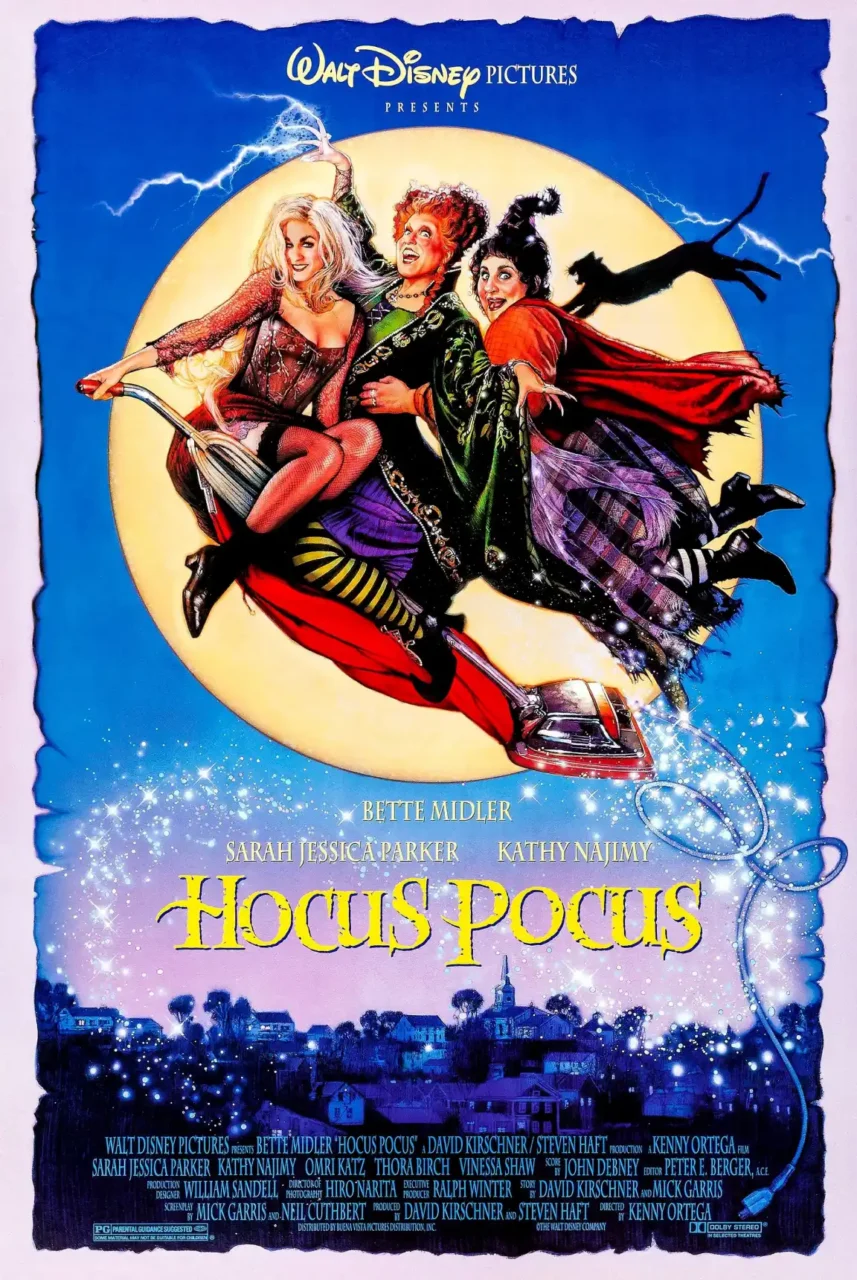
Movie Poster Design: Over the years, Disney has become a master of adapting horrifying medieval tales and harsh themes like witches to audiences, making it very palatable without losing the whimsy that informed the genre. This cover art’s typography in particular stands out because it has since been readapted and modernized for a tremendous amount of witchy media posters—Wicked, Harry Potter—but made more 3D with the same worn treatment. This evolution of form modernizes something that we still associate with classics.
Fun Fact: The moths that crawl out of zombie Billy Butcherson’s mouth are 100% real. The actor kept them inside a specialized latex mouth pocket during filming. Talk about commitment!
Good Boy
Scare Factor: 👻
What happens when the hero of a supernatural horror movie is a dog? Good Boy follows Indy as he senses a sinister presence that the humans around him can’t see. With emotional storytelling and a fresh perspective on supernatural scares, this indie release is worth adding to your watchlist.
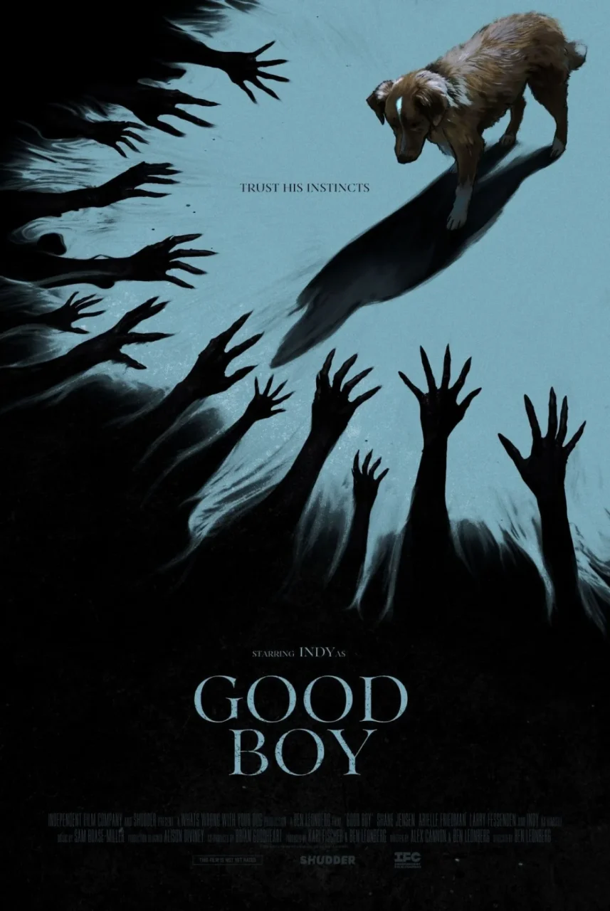
Movie Poster Design: Good design is not always about more is more. This cover art scales back, really focusing on the hands from the dark space reaching into the light space towards the subject, drawing your eye to the top right corner. It’s a simple, effective, and striking composition, like this Oscar poster winner, telling the story with a three-word tagline: Trust his instincts. Between the taglines and the cover art, we instantly understand that this dog senses something that the humans don’t.
Fun Fact: The star role happens to be the writer-director’s actual pet companion. You can read a full interview with Ben Leonberg about what the process was like filming with Indy.
Scary Stories to Tell in the Dark
Scare Factor: 👻🕷️
Based on a series of horror short stories written by Alvin Schwartz between 1981 and 1991, the 2019 adaptation of Scary Stories to Tell in the Dark definitely takes it up a notch in the spooks and scares department. Produced by Guillermo Del Toro, known for Oscar-worthy creature dramas like The Shape of Water and Frankenstein, it helps to bring these beloved illustrated monsters to life with meticulous design. If you’re looking for a little extra adventure, chills, and thrills, this is a great watch!
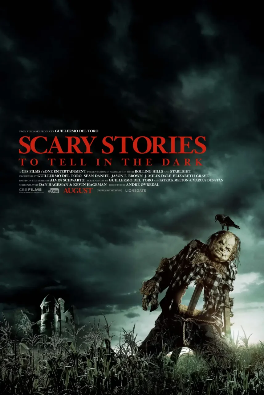
Movie Poster Design: The art shows a really brooding composition similar to the Three Billboards poster. Lots of darkening sky hints at an incoming storm, foreshadowing the incoming onslaught of monsters and creatures the kids in this story are about to encounter, with the Bellows mansion looming in the background as the place where the nightmares begin. The bright light also leads your eye to focus on the subject and the giant hole in its stomach. It piques your curiosity and leaves you thinking, “What the heck is this monster and what’s about to happen?”
Fun Fact: Both the scarecrow Harold and the Pale Lady were played by the same stuntman and creature performer, Mark Steger, who is also famous for playing the Demogorgon in Stranger Things.
Now, we get into some of the horror heavy hitters. Don’t say we didn’t warn you.
The Conjuring
Scare Factor: 🕷️☠️🩸
James Wan brought us his first 2 iconic horror films, Saw and Insidious, and knocked it out of the park again with The Conjuring (which still holds up as a demonic possession and haunted house classic). The cinematography, storytelling, and pacing are perfection. The scariest moments? The Hide and Clap game. Truly sends chills down the spine. This is for more intermediate horror lovers looking for a film that will take you on a bone-chilling ride.
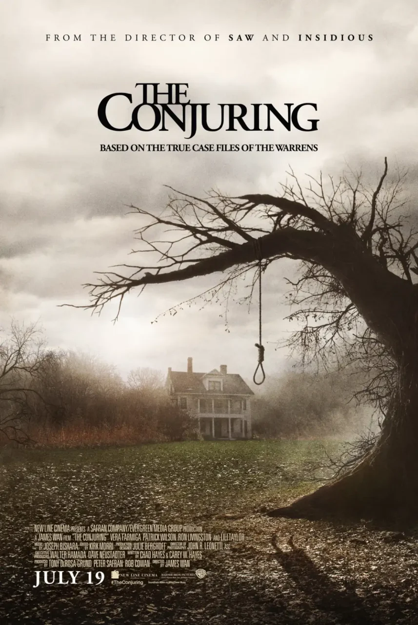
Movie Poster Design: The cover art is a great example of an asymmetrical symmetry layout that conveys dissonance through harmony, tension through balance, where something is off, but all other weights counterbalance it, like the thickness of the tree. Or the angled silhouette of the body on the ground, leading your eye inward toward the house and making it less gory, keeping the noose on the tree isolated. These concepts of hierarchy and directionality, like the gaze cueing effect, are used frequently in design to lead the user’s eye to the subject and what’s to come.
Fun Fact: This is the film that introduces Ed and Lorraine Warren’s demonology cases in a cinematic format, opening up the entire Conjuring universe, including Annabelle and The Nun.
Trick ‘r Treat
Scare Factor: 🕷️🩸
Trick ‘r Treat is an underground anthology horror classic. I first saw this film in college after finding it in the $5 movie bin, and it quickly became a spooky season favorite. A mix of slasher and supernatural with some unexpected humor and gore, it checks all the boxes for anyone who loves a good jump scare. The entire film takes place on Halloween between several different characters, and events take a turn as the night unfolds.
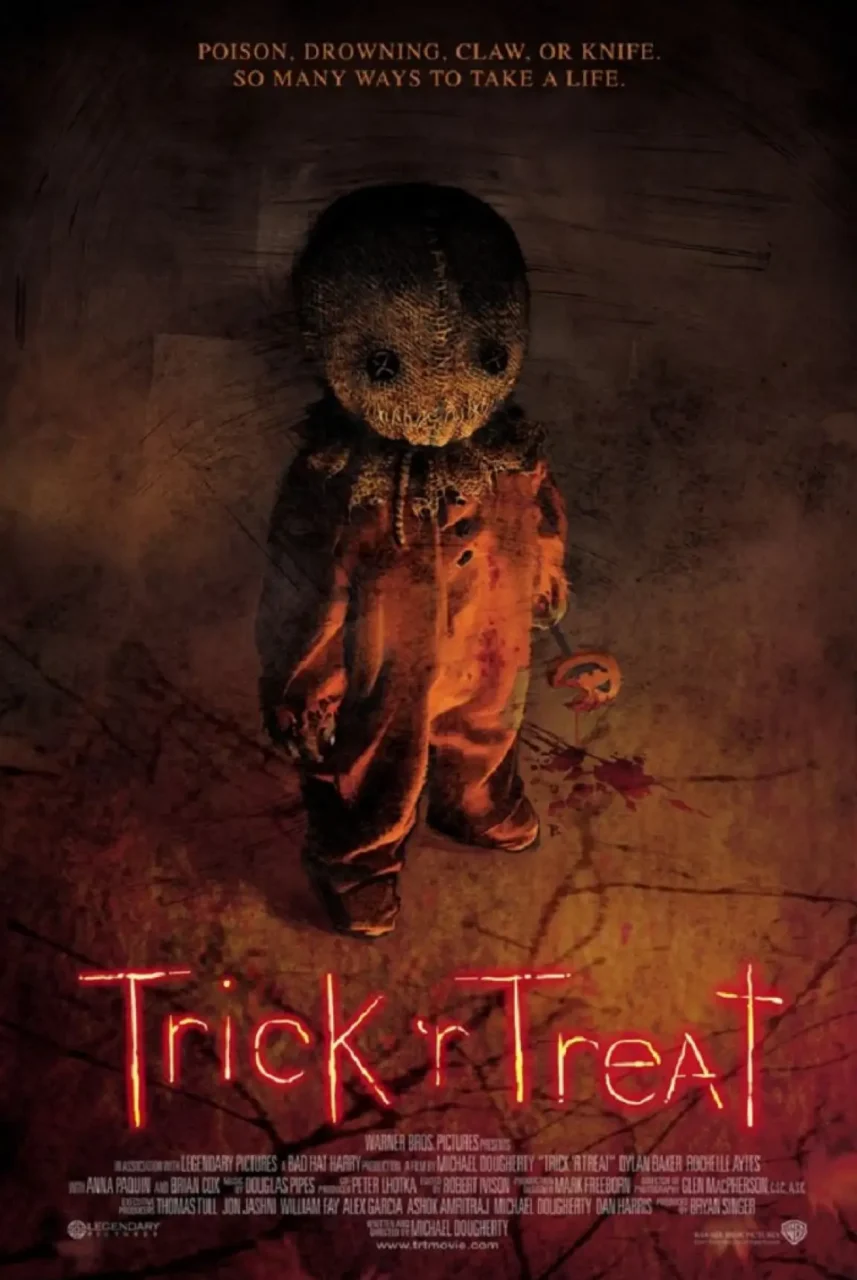
Movie Poster Design: This is a great example of when camp meets gore. The subject in the cover art gives total Chucky vibes—it might look like it’s for kids at first glance, but the visual indications of dark and gritty lighting, dirty footie pajamas, blood stains, and the menacing burlap sack-stitched smile say otherwise.
Fun Fact: The cult classic character of Sam was first introduced in the 1996 animated short film, Season’s Greetings.
Oculus
Scare Factor: 🩸🩸
From writer-director Mike Flanagan, Oculus blends supernatural horror with a deeper story about family, grief, and trauma. Its unsettling atmosphere and psychological twists make it a great pick for viewers who want more than jump scares—and a movie that stays with them long after the credits roll.
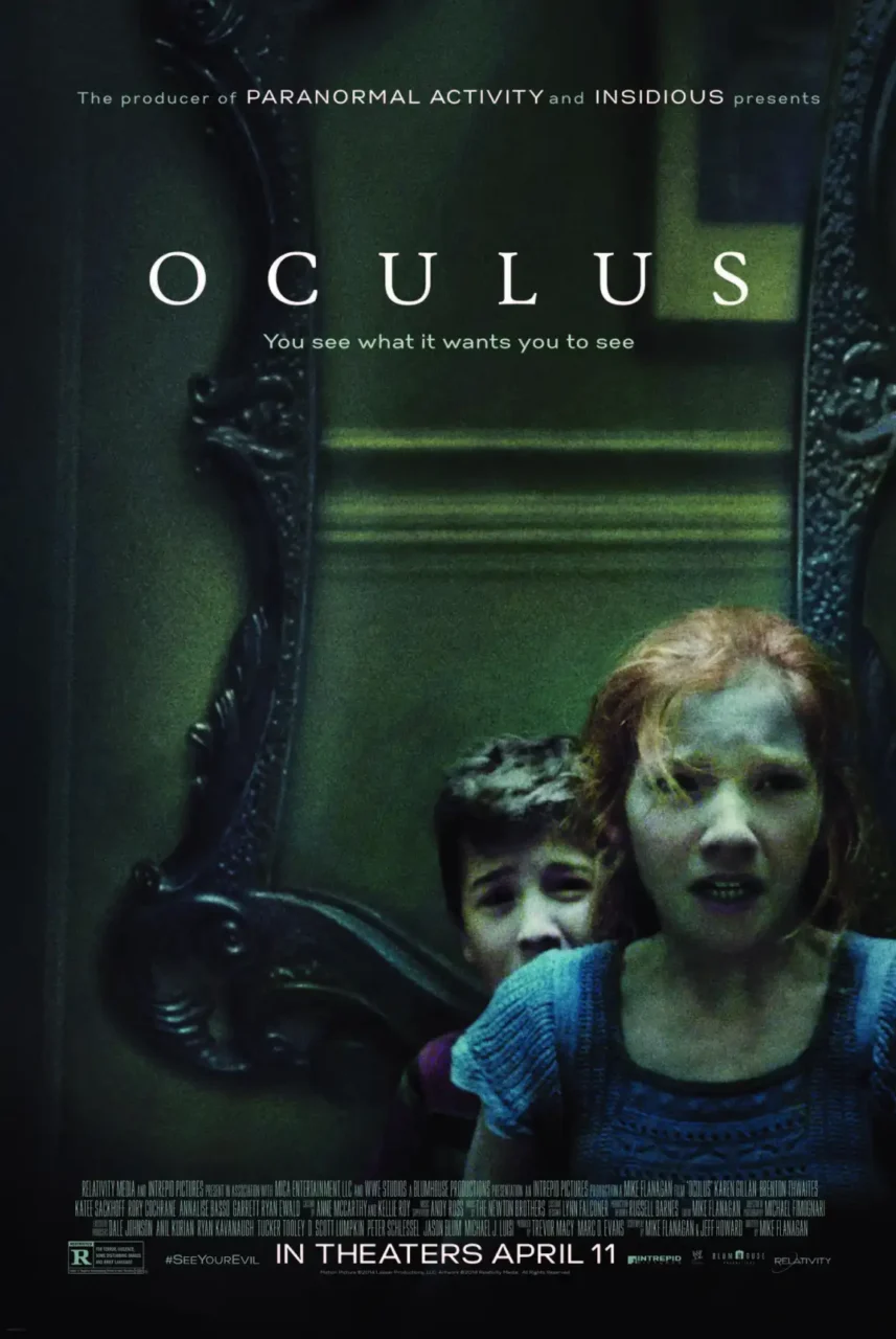
Movie Poster Design: This cover art also plays with symmetrical asymmetry to make things feel “inverted” or “cursed.” Harmony and symmetry are often associated with the divine—the perfect balance of all things. So breaking that rule is an indication of the antithesis of it.
The way they positioned the mirror on the right edge as if imposing on the cornered siblings—and the order the siblings are shown—really matters as foreshadowing for the movie itself.
Fun Fact: The haunted mirror in this film also appears in Mike Flanagan’s horror drama miniseries, The Haunting of Hill House, which is ranked #9 on Rotten Tomatoes’ list for Best Horror TV Shows of All Time. And my personal #1 series of. all. time.
Us
Scare Factor: 🩸🩸☠️
Writer-director Jordan Peele is THE GOAT of creating compelling plots that can be summarized by 1 simple visual or phrase, and in our opinion, it’s why they resonate so universally as horrors of the human experience. Doppelgangers have been explored endlessly in the horror genre, but he brings it to life in such a deliciously terrifying narrative. Us is equally horrifying and gory, with moments of humor and levity. The cast is top tier, and the performances are absolutely memorable. You’ll be taking a second look in the mirror and over your shoulder for a while after this one.
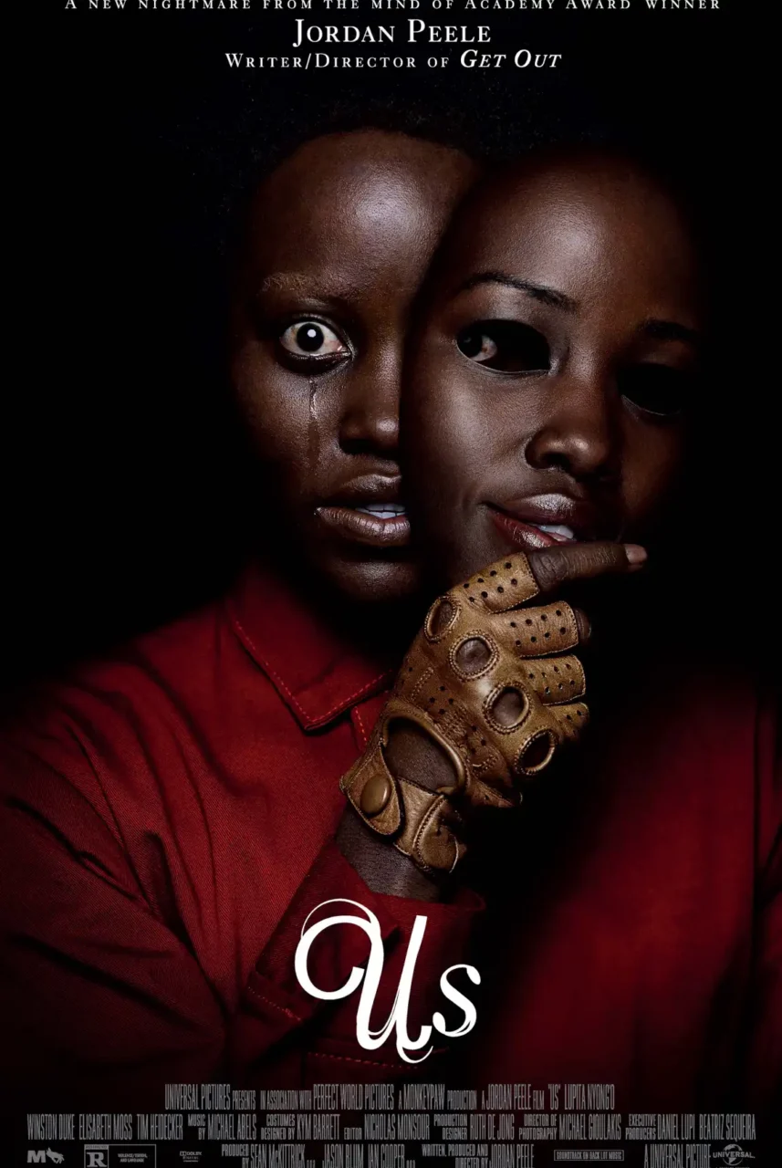
Movie Poster Design: To start, the cover displays a great use of negative space to lead the eye downward and make things feel doomy and tense. Even the typography has a double stroke—the original script and the “clone” interwoven together. Tears lead the eye down to the title type, bringing back the gaze-cueing effect. Finally, the mask is the perfect visualization for the theme of this movie, reminding us of the classic comedy vs tragedy masks—likely where this archetype was created as a symbol of someone who sees both sides of life: Thalia, the smiling/laughing mask, is the Muse of comedy (representing joy, festivity, and flourishing). And Melpomene, the frowning/crying mask) is the Muse of tragedy (representing grief, suffering, and the depth of human drama. Is Jordan saying life is a theatre? Food for thought!
Fun Fact: The title Us stands for both the characters and the United States, reflecting a theme that Americans’ greatest enemy is a reflection of themselves.
Hell House LLC
Scare Factor: 🕷️🩸🩸☠️
Hell House LLC is an underground found footage film that you will not forget. It combines the well-known tradition of Halloween haunted house attractions and takes it deeper and darker than ever before. Thanks to found footage classics like The Blair Witch Project and Paranormal Activity, this one stands with those giants. The storyline is mockumentary-style, the atmosphere is very tense, and the scares feel very real, especially if you’ve ever been in one of these pop-up attractions. Turn off all the lights and grab your popcorn for this one because it’s a true dive into horror, and it’s deeply disturbing.
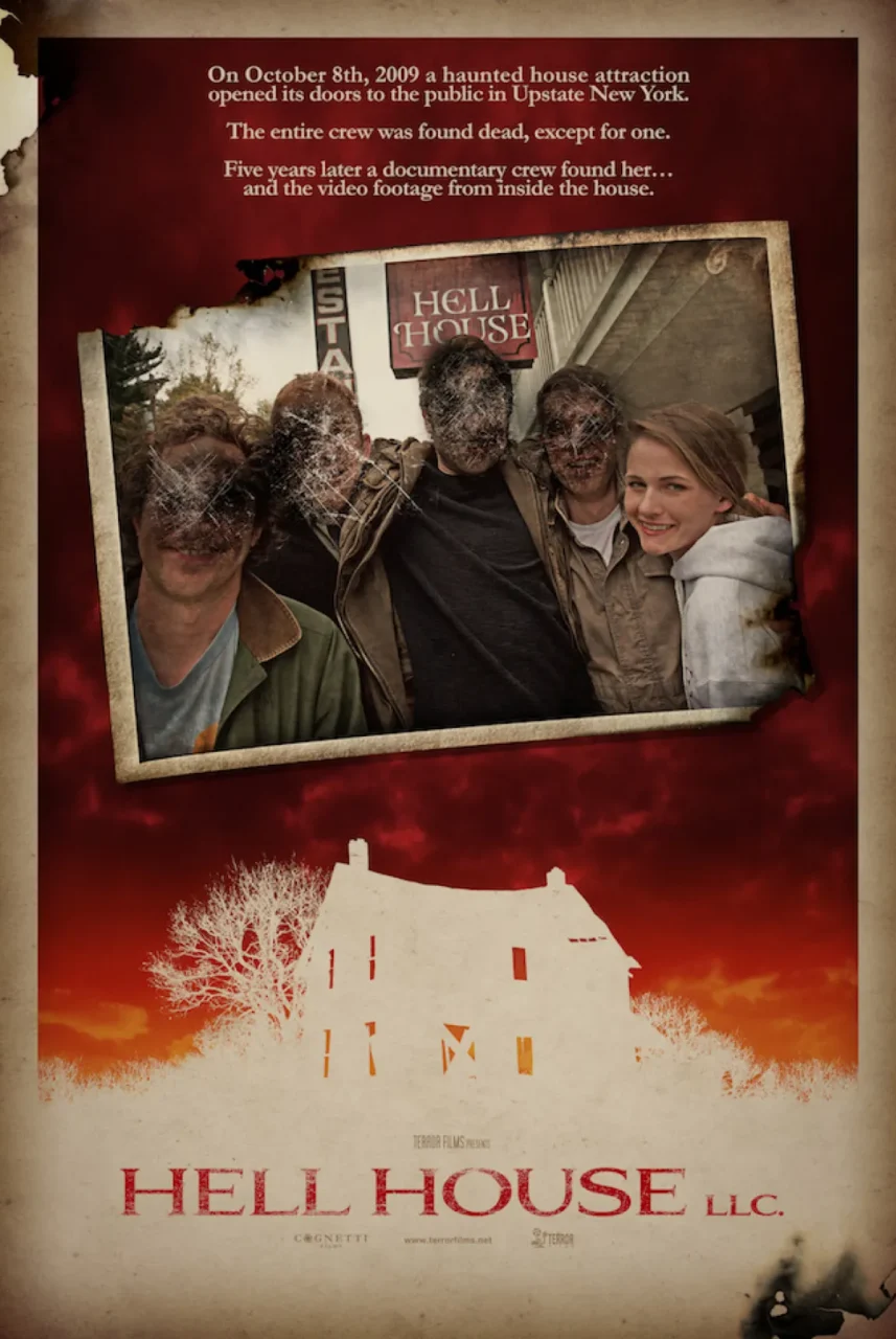
Movie Poster Design: The color toning, worn Polaroid framing, hints at revisiting the old tapes that began symbolizing good times, but turned into something much darker instead, very similar to the Memento movie poster.
The choice to fully overexpose the house and scenery is seen a lot in horror—as an homage to “ghost cams” or maybe inspired by a flashbang— subverting the “safety” of light. We naturally associate darkness with danger and light with safety, so flipping the expectation leaves us feeling exposed and defenseless, like there is nowhere left to hide.
Fun Fact: The film was shot at a real haunted house attraction in Towamensing, Pennsylvania called the Haunting at the Waldorf Hotel.
Hereditary
Scare Factor: 🩸🩸☠️☠️
Last, but not least, this psychological horror film has lived rent-free in our heads since its release and is considered one of the best elevated horror films of all time. Ari Aster’s Hereditary takes family trauma and grief into deeply unsettling territory. Beneath its disturbing imagery lies a carefully constructed story about inheritance, control, and the darkness passed between generations. It’s a film that rewards close attention—and leaves plenty to unpack after the credits roll. I promise you, it will stay with you forever.
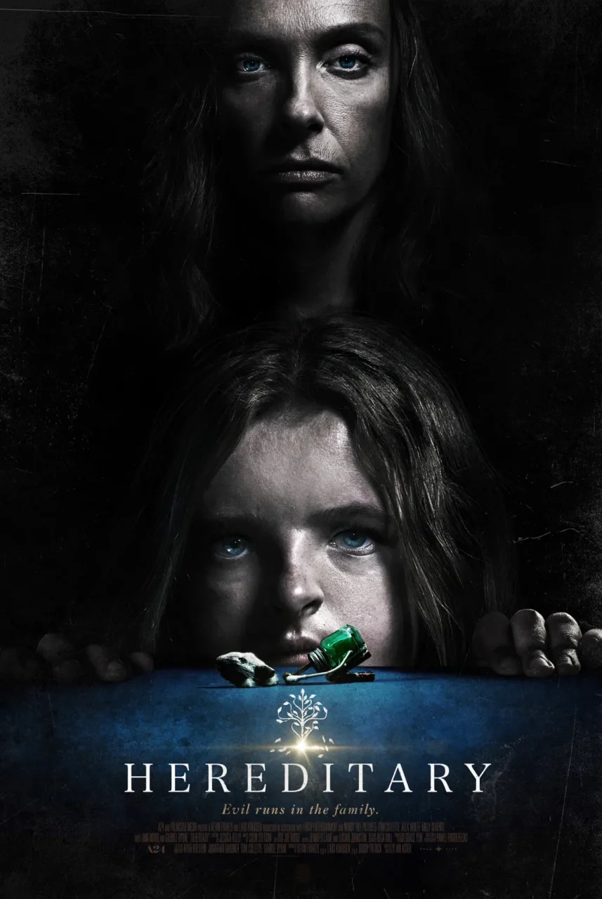
Movie Poster Design: The tiny tree in the cover art feels like a gift, a light being passed down the generations, but everything else about the poster (and movie) is more like a curse. The movie centers around this—when a curse for one becomes a gift for another. The framing and positioning of the heads foreshadow the plot, and the central figure—the brother—is only depicted as a miniature. Hinting at the fact they’re NOT in control of their own story.
Fun Fact: An Australian movie theater accidentally played the terrifying trailer for Hereditary ahead of a screening of the PG-rated family film, Peter Rabbit. The families left immediately after.
More Than Just a Scary Movie Poster
Whether it’s the playful typography of Hocus Pocus or the unsettling imagery of Hereditary, a great movie poster does more than promote a film. It sets expectations, builds intrigue, and tells a story before the first scene even begins.
This Halloween, pay a little closer attention to the posters behind your favorite scary movies. You might be surprised by just how much thought goes into making you laugh, shiver, or sleep with the lights on. And if you’re looking for more inspiration, check out our take on the art of Oscar-winning movie posters.