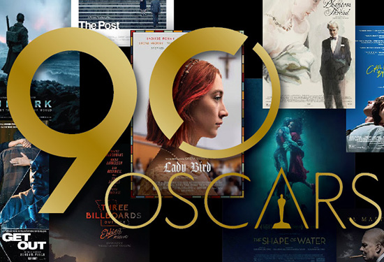
And the Oscar for Best Poster Goes To…
WANT TO SEE MORE LIKE THIS?
Sign up to receive an alert for our latest articles on design and stuff that makes you go "Hmmm?"
With this Sunday marking the 90th Academy Awards®, everyone is abuzz about Best Picture– but what about Best Poster? Our office voted for our favorites among this year’s Best Picture nominees, and interviewed our senior designers to find out what makes or breaks a successful movie poster in their book.
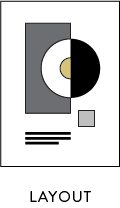
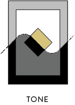
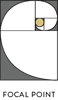
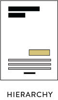
Together, our team identified the four main components that make these award-worthy titles stand out. Combining typography, imagery, and layout, our favorite posters convey their respective tones perfectly, drawing us closer to the story that unfolds on the silver screen. To judge the success of this year’s nominees, we looked for the following:
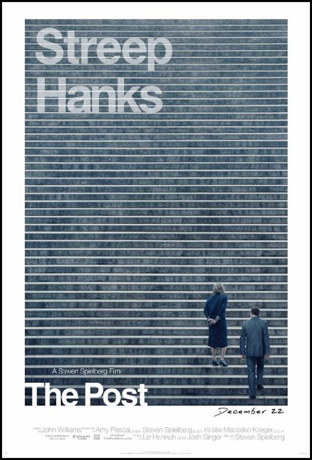
This poster got a lot of buzz in the office, why do you think people were drawn to it?
R: This is my favorite one.
E: I like the simplicity, but the balance throws me off.
R: See, we disagree on this one. I like how it has their names up on the top and [the people] are down below so it helps keep it balanced.
E: Maybe it’s the lack of symmetry.
R: I like that it’s not symmetrical because it creates that dissonance—I haven’t seen the movie but I have a feeling there’s a lot of that in it. I love the repetition of the stairs and how overwhelming it looks, there’s so much for them to climb.
E: And the detail, they balance it out because the typography is so simple but then you’ve got the texture of all the stairs and the repetitive line structure. It’s an interesting poster in those regards.
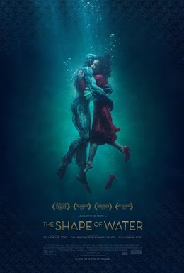
 E: It’s really beautiful. The lighting, the spotlight effect, it’s very eye catching. There’s a lot of detail — At first, I didn’t even notice the texture behind it. The messaging is very well organized through a strong hierarchy.
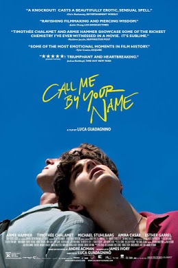
R: The lighting is definitely executed very well here, and even seeing their embrace tells you it’s going to be a story about romance but also maybe a little conflict because they’re under water too. It’s very deep, no pun intended.
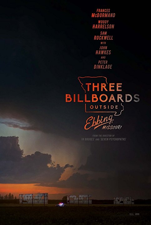
 R: The imagery and color palette in this poster is haunting, it’s insinuating that something is brewing. It’s an interesting approach that the emphasis is on the location of the movie through the focus on the storm, and the 3 billboards get much less attention at the very bottom of the poster. I also like that they actually gave the name a logo treatment, which we haven’t really seen in any other posters. The names in the top right balance the poster out with the lightest part of the poster appearing in the bottom left and they are both connected with the nice sunset texture.
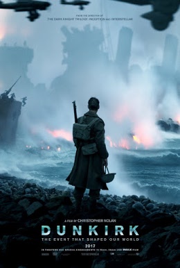
 E: It feels very ominous.
E: I like the balance, and backlighting of the subject. It shows the turmoil that’s occurring.
E: They definitely are highlighting “from the director of the Dark Knight Trilogy, Inception, Interstellar” in a prominent spot as to suggest this movie is on par with the others by Christopher Nolan.
 R: This one definitely has an Indie vibe to it.
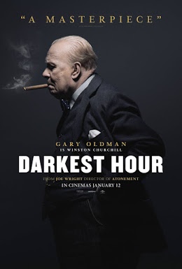
E: The photography is really beautiful and I like the balance of this and also the transparency.
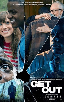
E: I like the composition on this one a lot, it’s very compelling. I like how it shows you the slices of their life, that they’re all going to intersect, and then something bad is going to happen. The only nit picky thing is that their text is a little crammed in the little quadrant they gave it, but it is really successful.
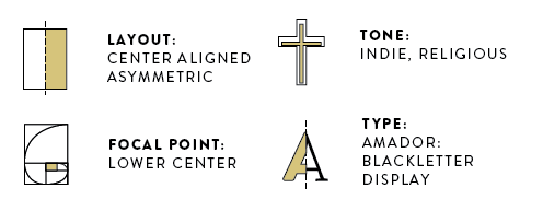
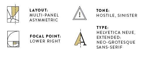
R: I love this. Especially the typography of the name because it takes place in a Catholic school so it gives you a sense of the place. The movie is a character study about this one girl and you definitely get that from looking at her portrait view.
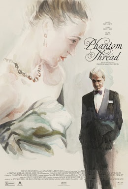
E: The watercolor effect on this poster is really beautiful. And the likeness to Daniel Day Lewis is pretty amazing. I wish that they hadn’t overlapped the bottom print, that really muddies it up, especially because you can’t read it over his legs, but the typography is really beautiful.
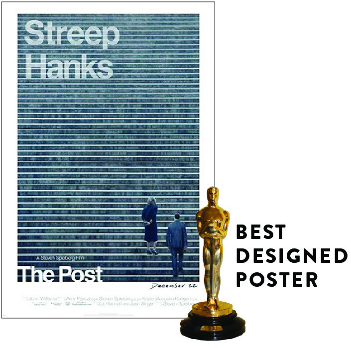
This poster hit the mark on all four of our measures.