The Difference Between a Logo, an Icon, and an Identity System
WANT TO SEE MORE LIKE THIS?
Sign up to receive an alert for our latest articles on design and stuff that makes you go "Hmmm?"
“We need a logo!” is a familiar refrain we get when we pick up the phone or open our Glantz inbox. While we have a clear idea of what defines a logo, we often find that a simple request like this belies deeper expectations for the scope of work. Does the client just want a logo, or would they like us to actually rebrand their identity? Create a small symbol for a service on a website? Develop a sub-brand for an internal corporate initiative?
To try and cut through some of the confusion, we’ve defined three critical, but often confused terms in the design and marketing world—a logo, an icon, and an identity system.
LOGO
A company’s “coat of arms,” a logo is the primary visual representation of a brand. It offers consumers a visual first impression, and its goal is to both convey the company’s message and be immediately recognizable. Logos typically consist of a text treatment and often (but not always) a symbol, called a “mark.” They may be small, but, much like worker ants, logos carry a lot of weight.
“I always say that your corporate identity/logo is your mugshot. It could be good or bad, but it will always remain with you.” – Keith
A few logo-related terms:
Mark: Think of the swoosh, the golden arches, or the multi-colored peacock. Since it contains no type, a mark has to pull double duty as a standalone graphic as well as a part of a logo lockup (we’ll explain in a moment).
Logotype: A logo’s mark may get the most attention, but the logotype, the lettering designed specifically for a company or product, is another critical element and one that is often overlooked.
Tagline: A tagline is a snappy refrain (Got Milk, anyone?) that, together with a logo, fills out a brand’s personality. Even if a tagline is sometimes an add-on, it shouldn’t look like one. It should be seamlessly incorporated with the rest of the logo.
Logo lockup: When the mark and type treatment come together, it becomes the logo lockup. Often the tagline can become part of this lockup as well. Logo lockups are usually executed vertically and horizontally to give the brand versatility in different applications.
A good logo should follow three simple rules: [1] is it scalable? [2] is it simple? [3] is it unique and authentic? [BONUS] does it play with negative space?
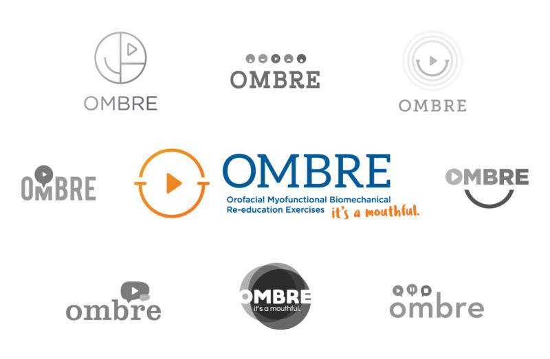
OMBRE (Orofacial Myofunctional Therapy, Redefined) is an online service that treats people with orofacial myofunctional disorders by instructing easy exercises for the face, mouth, and tongue. Once we had a full understanding of OMBRE services, we set to work on logo ideas that incorporated the idea of speech, mouth expressions, and videos. That led to various logos incorporating iconography for smiles, talking, and the play button in various forms. We presented the client with a small handful of logos. They selected the final option, which, by incorporating the play button and a smile, captures the essence of the brand by being simple, friendly, and playful.
Learn more about our work with Ombre by visiting this case study.
ICONS
Think of icons as a brand’s stylistic extensions. Once the big picture of a brand’s messaging has been established, icons serve as visual tools that help carry out this message. Distinct from the singularity of a logo, icons can vary depending on their function, such as representing different categories or sections on a company’s market materials, illustrating (like in our case study below) the different phases of a company’s work processes, or visually denoting different divisions within an organization. So long as their visual details—line weights, art style, colors, and legend fonts—derive from the identity of the overarching brand, icons are useful elements that can be consistently used across diverse platforms.
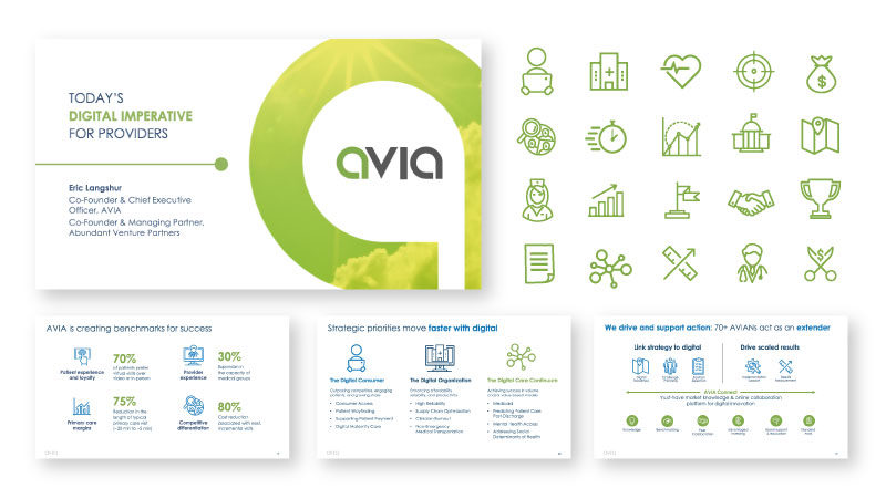
AVIA is a healthcare innovations company that brings together medical systems by leveraging digital solutions. AVIA’s brand is modern and slick to convey innovation in the healthcare industry, but also has a playful energy that differentiates it from competitors. We worked with them to enhance their brand through presentations that showcased their services and solutions. Creating new icons to carry out their message, our goal was to achieve a visual style that could then be applied consistently across diverse channels. To convey the professional yet playful tone of the brand, we found that an outlined icon style worked best. With thicker line strokes, rounded ends and edges, and cartoon-styled illustrations, we created an icon library to portray the brand as modern and sophisticated, but also playful and friendly.
IDENTITY SYSTEMS
Having a strong identity system gives you the foundation you need to speak to your audience in a consistent and strategic way.
An identity system is a flexible library of assets that a company uses to communicate the essence of their brand with consistency. The umbrella is wide for an identity system, encompassing unifying elements such as the logo, the mark, tagline, color palette, typography and fonts, the visual language found in photography, icons and illustrations, and the brand voice and tone. All of these pieces of the puzzle are organized in a style guide, which is then used to guide key deliverables such as business cards, presentations, self-mailers, brochures, email campaigns, and websites. The identity system gives our team and the client a clear sense of how the brand will be experienced.
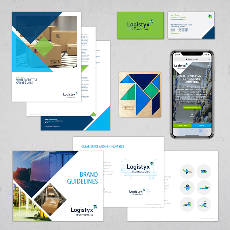
Logistyx Technologies helps companies large and small reduce shipping costs across the globe. A merger of multiple companies into a new brand, they entered the market as the leader in the industry from day one. To convey their vast expertise in a fluid identity system, we created the name, the brand identity with a logo and mark made of a tangram puzzle to showcase multiple shapes representing their services, and the story for their brand. This was elevated with a strong color palette, typography pairings, and photography that were woven into their full suite of sales tools. With a unified identity system, their marketing materials had a consistent look and tone from print to web that launched the next stage of their business.
Learn more about our work with Logistyx by visiting this case study.
CONCLUSION
Using all of the previously discussed elements (logo, icon, and identity system), the strongest brands always find the right way to show their audiences who they are and what they do. Stay tuned for upcoming posts that dive into the many elements of a company’s branding. In the meantime, if you have more questions, or if you want to begin working together, holler at us here.