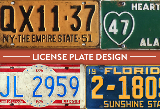
Design on the Road: What Makes a License Plate Good?
WANT TO SEE MORE LIKE THIS?
Sign up to receive an alert for our latest articles on design and stuff that makes you go "Hmmm?"

Although cars started appearing as early as 1884, they did not become widely available until the first decade of the 20th century. As more people started driving, local governments saw a growing need to regulate the road, which led to car registration. In 1901 New York became the first state to require license plates on automobiles. Not only did the early days of registration require owners to display a metal verification disc on their dashboard, but each car owner had to provide their own license plates, the earliest made from leather.
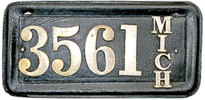
As registration numbers soared, state governments took over the responsibility of issuing these license plates, and the need for a mass quantity of the plates in a short amount of time strongly influenced the essentials of their design. In order to keep costs down, many states passed along platemaking responsibilities to their prisons, a practice still in place today. The numbers and letters are stamped onto cut metal sheets, then painted with reflective ink and a protective coating. A single facility operated by the Michigan Department of Corrections produces 8,000 license plates a day.
Since each state was responsible for their license plate manufacturing, there has never been an official state license plate font in the United States. Thus, font design took on a very mechanical approach even early on— straight lines and arcs that can be drawn out and replicated by drafting tools. Several variations that have developed over the years have done so based on how individual manufacturers chose to approach characters with naturally rounded characteristics. To ensure more accurate license plate identification, many states use oval arcs on curved numerals, and square-ish arcs on alpha characters – this way, O’s could be distinguished from 0’s and B’s from 8’s among others, all while still maintaining a condensed, fixed width on the plate. License plate font design has inspired several digital fonts, such as Driver Gothic.
The addition of reflective ink allowed for easier plate identification by law enforcement against the glare of a headlight, as well as better overall safety for drivers. With that in mind, actual plate colors have always placed emphasis on contrast: common color combinations are white with blue or black lettering, or black with bright, vibrant lettering in a color like yellow or orange.
Look at the journey license plates have taken over the years…
1901:
New York becomes the first state to require license plates, which car owners had to supply and maintain themselves.
1903:
Massachusetts becomes the first state to manufacture their plates.
1916:
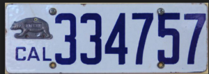
California license plate features a lead “validation tab” shaped like the state animal, the Grizzly Bear.
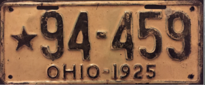
1925:
States begin releasing veteran-themed license plates, this one in particular from Ohio, for households of those killed or wounded during WWI with a star decoration. Today there are a huge variety of specialty plates available in each state, many specifically honoring the military, police and firefighters.
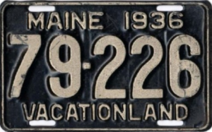
1936:
Maine is the first state to put a slogan on their license plate (“Vacationland”). It remains their license plate slogan to this day.
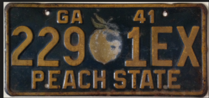
1941:
Georgia issues the first plate made with a reflectorized ink to make the plates more readable by car headlights. This plate also featured the first colored decoration: a Georgia peach.
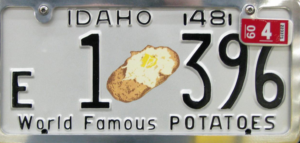
Other states began placing greater emphasis on design and decoration soon after…
1948:
Idaho features their “World Famous Potatoes”.
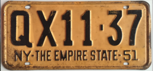
1951:
New York dubs themselves “the Empire State”.
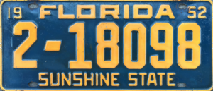
1952:
Florida takes on their famous “Sunshine State” moniker.
1956:
The Federal government officiates a standard plate size (6 x 12 inches).
Although technically a subjective matter, some designers at the Glantz office have strong feelings about their favorite and least favorite home state license plate designs…
Staci: My favorite Wisconsin license plate has to be their “Endangered Resources” plate. It’s one of the only plates from the state that has any design and aesthetic. Eagles are beautiful and there’s a lot of wildlife in Wisconsin. The colors make it very easy to read. It also looks much more modern than almost all of the other plates.

My least favorite has to be the Medal of Honor plate. Was this designed in Microsoft Word? The colors are so gaudy, and really compete with each other. It also just looks like the medal and flag were copy/pasted into the design instead of visually integrated, like the bald eagle plate.

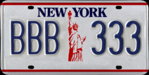
Keith: While I’m proud to be from New York, their history of plate design is just so-so at best. The 1986-2000 Statue of Liberty design might just be the best of the worst. It’s simple, patriotic, and quite legible with the red, white and blue color scheme.
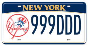
My least favorite design is the New York Yankees specialty plate. No explanation needed.
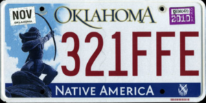
Eryn: The current Oklahoma license plate is the most visually interesting one the state has had to date. They’ve done a nice job using colors that complement each other and tie into the tones of the statue. The position of the statue helps guides your eye through the layout and up to the state name.
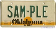
This Oklahoma license plate, in use from 1982-1988, utilizes a sunrise/sunset visual—not really a unique feature to our state. That boring visual, paired with these retro typefaces, gives the license plate a really generic, outdated look.
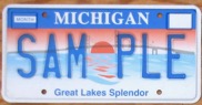
Kristin: The iconic imagery and bright colors remind me of many Michigan summers spent up north in Mackinac Island. This design showcases the beauty of the state and is instantly recognizable as Michigan.
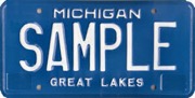
My least favorite Michigan plate would have to be the blue “Great Lakes” design. Simply white text on a dark blue background, it’s generic and plain. There are no design elements here to differentiate this plate from any other state.
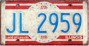
Jen: I like Illinois’ vintage plate from 1976. The colors, circle and red stripes and stars are fun and patriotic.
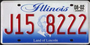
I don’t like the way numbers run over Lincoln’s face in the 2001 plate. The script font is dated and hard to read. Not a fan of the gradient either, because red and blue tend to vibrate against each other. Simple and readable would be a better approach.
License plates are a great example of design’s juncture between visual appeal and practical function – a facet we frequently encounter in our daily lives without even realizing it. Think of how many times you read a license plate, whether on the sidewalk looking for your Uber, in the passenger seat playing road trip games, or even driving behind the wheel yourself. The next time you’re on the road, no matter the capacity, see if you can discern your favorite and least favorite creations.