


Engaging Website Footers: Design Tips & Benefits for Your Site

The benefits of impactful and intuitive footer navigation
We are just going to put it out there: you have been missing out on a simple but crucial opportunity to engage with your website’s visitors and generate more sales for your company. Chances are, you’re not optimizing every inch of your web page—which means you may be due to improve your footer navigation.
Living at the bottom of a web page, the footer is often overlooked. However, you should not underestimate the power of a well-conceived footer. It keeps visitors engaged and helps them navigate a site. As the anchor, the footer helps structure content shown in the body copy while also presenting unique information such as the copyright and fine-print. A well-designed footer can extend a hand to users and prevent them from hitting the bottom and closing out the page (404 pages also serve this purpose, additionally on our blog).
The footer is a safety net: it can provide information visitors are looking for, invite them to a section they may have missed, or suggest what steps to take next. It helps create a lasting impression as it appears on every page and inculcates the brand identity onto the user. On another note, if the links and keywords are appropriately used, they can serve SEO purposes and create more traffic. As the text on the footer appears on every page, it adds more searchable keywords to the website.
Now we’ve established that footers are important. But just having a footer will not cut it. Here are different trends and tips we have found useful to keep an eye on.
How can footers cater to a secondary audience?
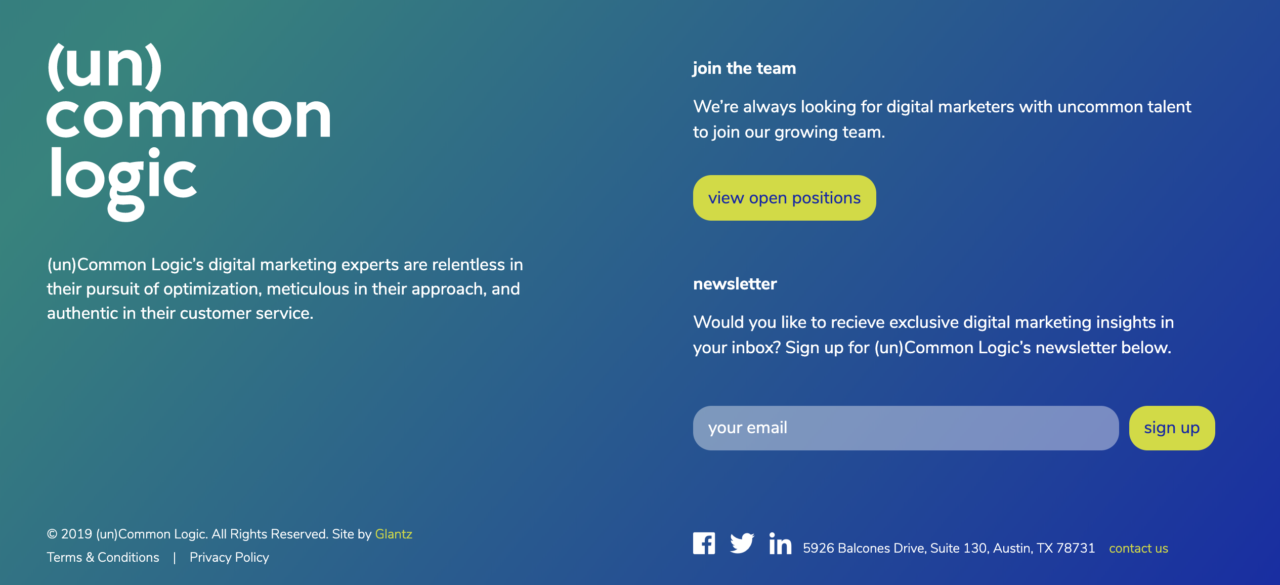
Many sites cater to more than one audience. And while the majority of the site might be devoted to the primary audience, the footer is a great way to grab a secondary audience. A trend in product and service industries is to focus the main navigation on the “what” & “who” for primary viewers, but to use the footer as a quick way for prospective employees to learn more about the inside of the company and any job listings. (un)Common Logic gives prime footer real estate to their secondary audience with a strong call to view current open positions.
Why place critical information in website footers?
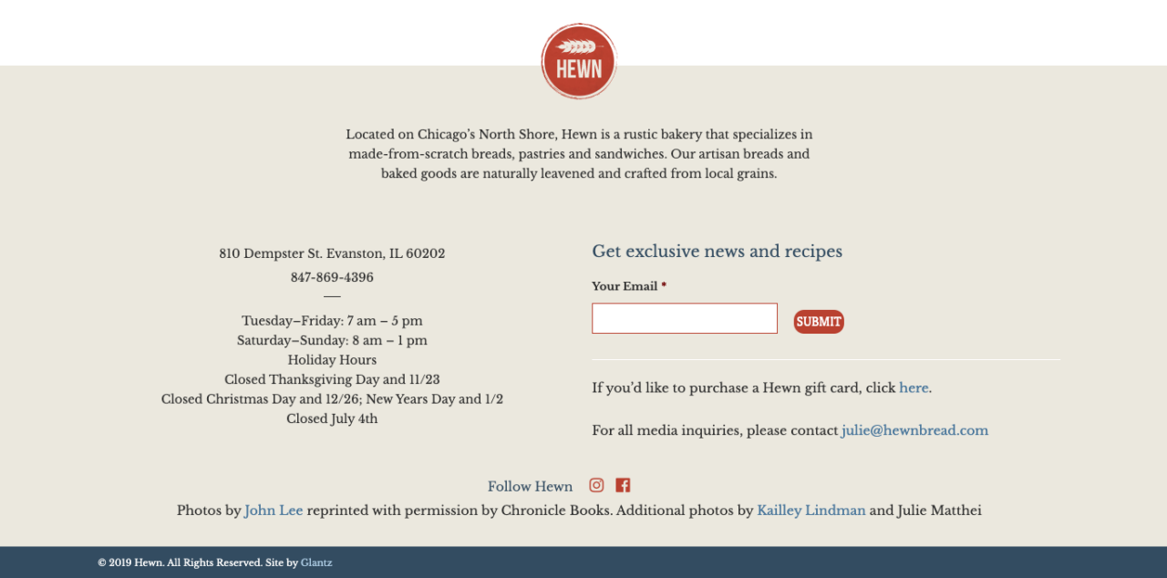
Hewn Bakery knows a thing or two about bread and butter, and fortunately, the footer of their website also excels at “bread and butter” information. Right where customers are looking for this critical info, Hewn displays their address, hours, and holidays. In addition, Hewn provides contact info, a quick link for gift cards, social media and newsletter sign up, as well as a brief description of their goods (which, we can attest only approximates their outstanding real-life taste).
How does color consistency in footers enhance brand identity?
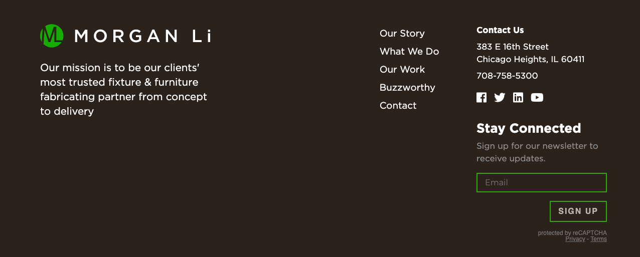
Reversing the colors is a good way to let visitors know that they have reached the end of the page. Here, the designers managed to stay consistent with the website’s style and character, creating a sense of cohesion emphasizing the brand identity from top to bottom.
What is a 'fat footer' and how does it improve website navigation?
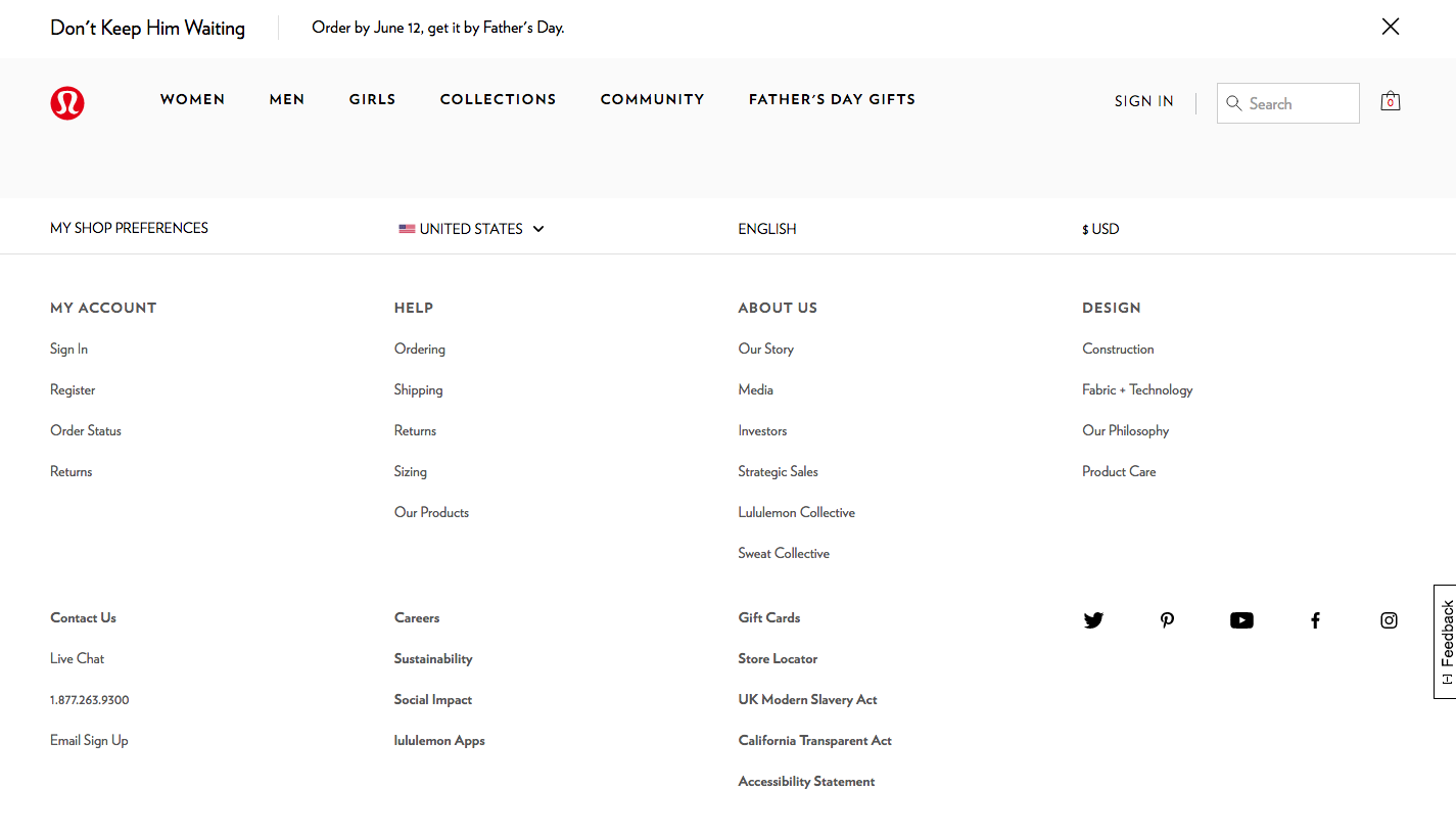
One of the growing trends has been to have a larger, thorough footer, also called, “the fat footer”. The Lululemon footer is wider than its standard counterparts and encompasses an entire site map with links to most of the pages on the website and footer-specific information. The strategy is to give users the simple tools to navigate the entirety of the website, particularly helpful in e-commerce.
How can originality and humor make website footers more engaging?
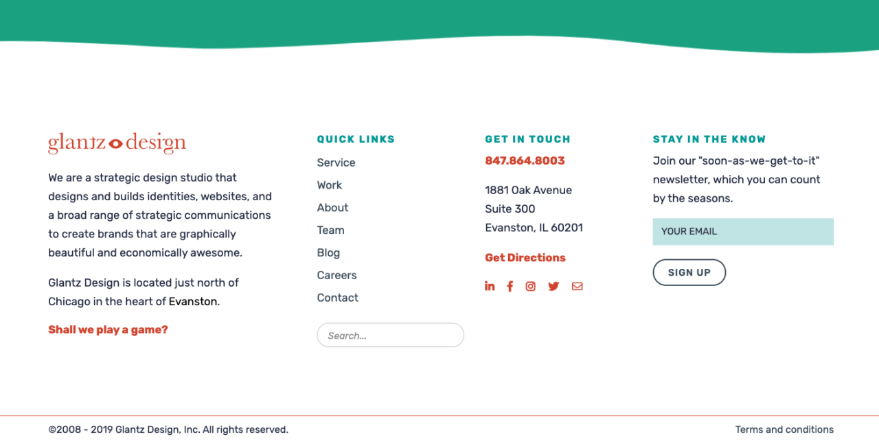
Finally, originality and humor can also keep the users entertained throughout their experience on the website. Adding an interactive piece, such as a game or an animation, will also make a difference. In Glantz’s footer, we include all the traditional elements while adding our own twist to it. Our “soon-as-we-get-it” newsletter and face matching, interactive memory game give you a taste of what we are all about.
Why is a well-designed footer crucial for user experience and business goals?
Having a well-designed footer is ending an experience by starting a new one. It is arriving at the bottom of a page and seeing a whole other world of possibilities, just a few clicks away. We hope that we have managed to convince you of the importance of footers, from a design and business perspective. Does your site need a head-to-footer refresh? We can help with that.