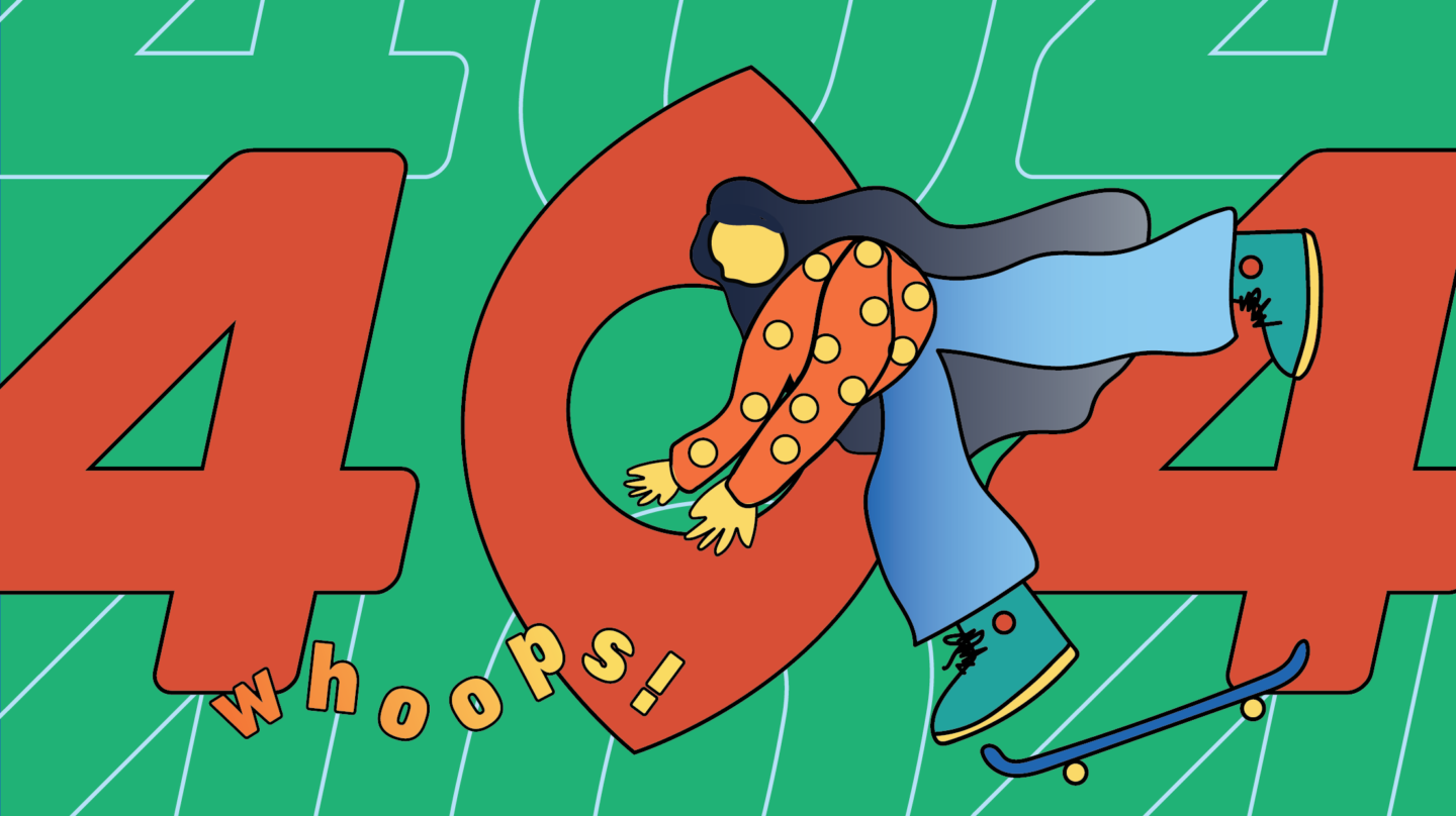
Error! Your 404 Page Could Use Some Work
WANT TO SEE MORE LIKE THIS?
Sign up to receive an alert for our latest articles on design and stuff that makes you go "Hmmm?"

The overlooked power and potential of the 404 page
Picture this: you’re searching online to find the perfect design firm that could create your new business cards for your start-up. You click the link that popped up on your Google search expecting to be able to read one of the famous Glantz Design blogs to give you some context to the culture of the company. Instead, you are greeted with a page that reads “404: Page Not Found” in a generic font against a blank white background with no links to turn to. Frustrated, you immediately click off the site and decide to take your work to a different creative team.
This is an issue that all users have come across: a broken link, a mistyped URL, or a downed server interrupt their browsing and send them to a 404 page. Web design and development teams often overlook 404 pages, considering them a necessary but ancillary addition to every new site. But boring, dead-end error pages contribute to a higher bounce rate, as frustrated users disengage and take the exit.
404 pages are actually supposed to keep users on the website by acting as a safety net that captures users before they click away, providing an onramp back to the content they want. Intended to increase traffic and search engine optimization, effective 404 pages offer links to the main site or add a humorous and joyful touch that creates meaningful connections with users and sets them back on the right track.
It’s easy to miss out on error pages’ potential for creativity, innovation, and strategy. We’ve compiled a brief list of 404 pages that we feel demonstrate creativity, keep users engaged, and convey and dimensions to their brands:
Amazon: Cute dogs and quick links to the rescue
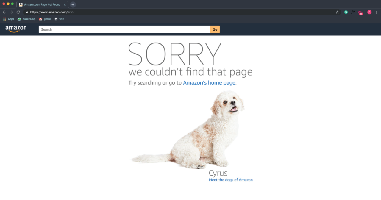
Amazon’s approach to their 404 page is simple but effective. A moment of potential frustration turns heartwarming, as an off-track user is greeted by an apologetic and adorable “dog of Amazon.” Meela and her fellow canine Amazon ambassadors give you the option to return to the home page, continue searching for products, or check out their very cute blog. Each 404 page features a different pup to encourage an extra level of engagement. You might even refresh the page a few times to meet more of this lovable tech support team. While a parade of 404 friends is not exactly central to Amazon’s business, this page adds a friendly touch to the potentially impersonal experience of online shopping and gives dimension to their well-known brand.
Glantz: Back to safety in the blink of an eye
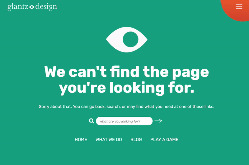
Our very own brand new 404 page gives users an array of entry points back into our site—some practical and some for fun. The simple animated blinking eye draws on our branding and adds a wink of humor. A search bar and links to key pages help users locate the information they are looking for, whether they know exactly what they want or just want to learn more about us. Finally, we invite our users to “Play a game” where they can get to know our team and take a small, well-deserved break from their day.
NPR: Learn from getting lost
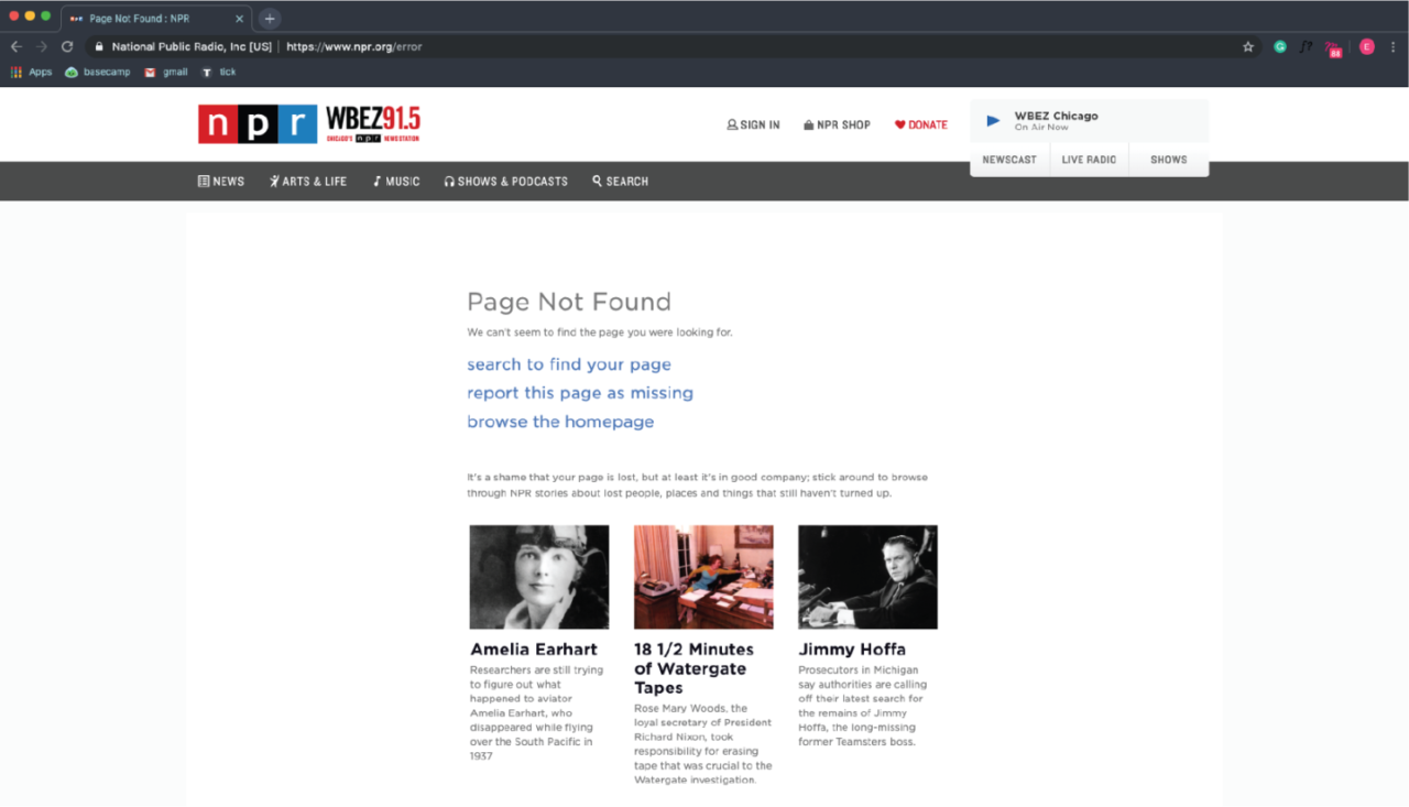
In true NPR fashion, the organization’s site brings humor and history into their error page. While notifying users of the missing page, this 404 directs them to learn about other famous missing things, from Atlantis to the Watergate tapes. This is a tongue-in-cheek way to urge users to spend time on the site and to display the expanse of topics in history, popular culture, and politics that NPR covers. While the design may be minimal, the content takes this 404 page above and beyond.
Dribbble: A creative’s paradise
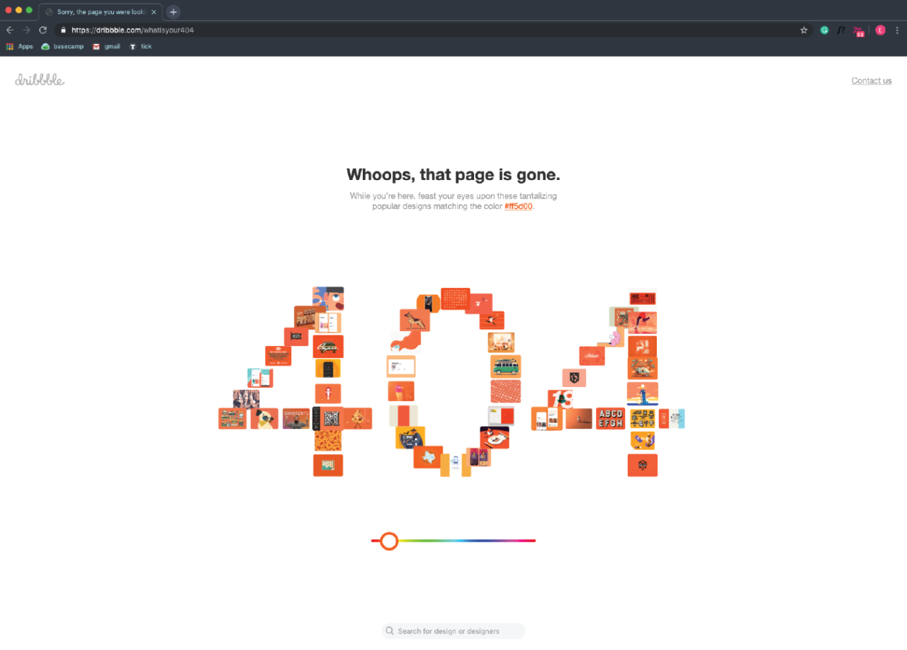
Dribbble (featured on our List of Links Every Designer Should Know) is an online resource for designers to find inspiration and showcase their work. It’s fitting that the site’s 404 page is not only highly creative but, much like NPR, a resource in and of itself. Dribbble’s interactive error page forms the numbers “404” with designs featured on the site itself. A lost user can click on each individual square and explore graphics, icons, and layouts that inspire. The page also includes a color slider that reveals even more designs as you change the color scheme. In this way, the 404 page acts as a miniature of the site itself. Even if the user encounters an error, the exploration never stops. Instead of just looping the user back to home, this clever interactive feature drives the user forward.
The New York Times: Uncovering where the user went wrong
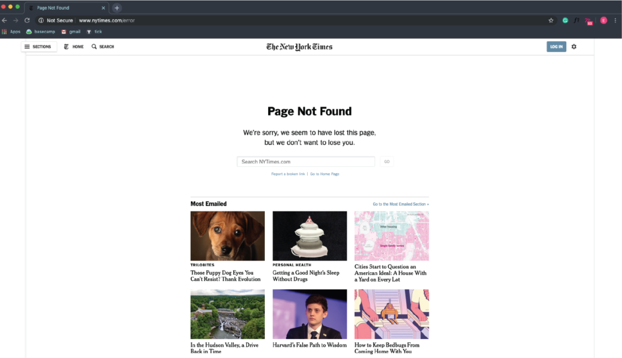
While the New York Times’ 404 page is visually fairly straightforward, it boasts some impressive functionality and strategy. Featuring links to the most emailed and most recent news stories, their error page accounts for the most likely reason someone landed on this page: a mistyped linked that was shared on social media or email. Instead of sending the user back to the front page to parse through each section, they make it easy for the user to accomplish their original goal.
Magnt: Never lose a chance to sell yourself
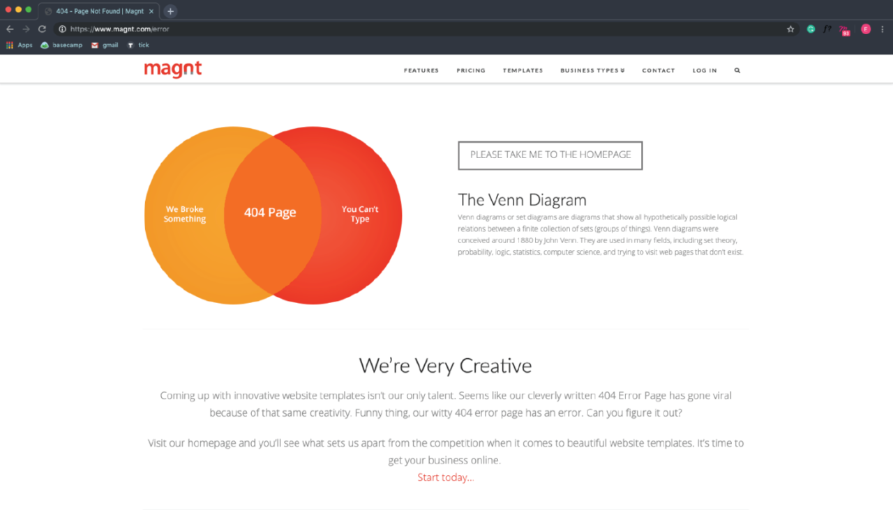
This 404 page from Magnt is funny and functional. They use their 404 page as another opportunity to communicate capabilities and advocate services to a potential client.
The 411 on 404s
A 404 page doesn’t need to be a dead end. In fact, if a user ends up on your error page, it’s a good indicator that they have a pretty high level of engagement with your site. It’s a shame to turn away an interested user with a boring or barely functional error page. Incorporating branding, thoughtful strategy, and a bit of personality into your 404 page can transform a site safety net into a real asset.