Why You Don’t Need a New Website

WANT TO SEE MORE LIKE THIS?
Sign up to receive an alert for our latest articles on design and stuff that makes you go "Hmmm?"
Simple changes can revitalize your site without a complete website redesign
When I moved into my first home, everything about it felt perfect. The quirks and crannies were all part of its character. They made the rooms feel unique and complete.
Years later, it’s lost some of its sheen. I’ve filled the corners with bookcases and plants, and the exposed brick has revealed itself to be a dusty chore. What once felt perfect now is cramped and tiresome. There are days when it feels like the only solution is to buy a completely new home.
Often, clients come to us feeling similarly frustrated with their websites. They’ve grown so dissatisfied that it seems the only way out is to start from scratch with a completely new site.
At Glantz, we specialize in website redesign and development. And we’re here to talk you out of that spanking new website.
Your website is not an immovable object
Let’s return to my crowded, dusty home. Sure, I could address my annoyances by moving into a new place. But that solution is neither practical nor rational. There are many lower-stakes improvements that don’t require taking out a mortgage.
Similarly, your website is not an immovable object. Rather, it’s a living document. It can grow and evolve with your business. Targeted, incremental changes can result in drastic improvements. You just have to be honest and strategic about your website’s needs.
There are several advantages to a small-scale approach:
Speed: A full website redesign and development can take 3-6 months, but an incremental change can be made in 2-3 weeks.
Lower-cost: A large overhaul comes with a large price tag. Small changes can help you make the most of your marketing budget.
Learning: Acting quickly and cheaply opens up opportunities for testing, learning, and adjusting. You’ll be able to uncover what resonates with your customers.
How to decide what changes to make
So, how do you figure out what your site really needs?
We like to employ a technique called the 3 Whys. It’s a variation on a problem-solving method developed in the 1900s by Japanese inventor Sakichi Toyoda. In the 3 Whys, you ask the question “Why?”—you guessed it—three times to get to the root cause of an issue. It goes a little something like this:
Joe, CEO of Business.com: I can’t stand my company’s website. It’s time for a new one.
Design Strategist: Why don’t you like the site?
Joe: It’s lost its sheen—it was so fresh when we first launched, but now it’s out of date.
Design Strategist: Why is it out of date? Has something changed?
Joe: Well, we pivoted a bit. We’re not the same company as we were when we launched two years ago.
Design Strategist: Why aren’t you the same company?
Joe: Our offering is so much more robust now. We launched a whole new vertical, and there’s nowhere to talk about it on the site.
Design Strategist: (silently, to herself) Bingo.
By asking why, our design strategist unearthed the specific issue causing Joe’s dissatisfaction: His website lacks a place to tout Business.com’s new capability.
Incremental solutions
Sure, Joe could solve the problem with a whole new website. But, a simpler, quicker, and more cost-effective solution would be to build a special page on his current site.
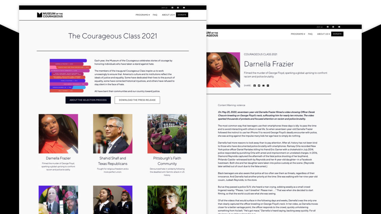
The Museum of Courageous shared that exact issue. In early 2021, the storytelling organization launched The Courageous Class, a program that honors individuals who have shown courage in the face of hatred based on race, religion, ethnicity, sexual orientation, gender identity, and ability.
It was an important new endeavor, but the museum’s website didn’t contain a space to recognize the honorees. So, we designed and developed a special section to add to their existing site.
Other Incremental Improvements to consider
Apply new fonts and colors
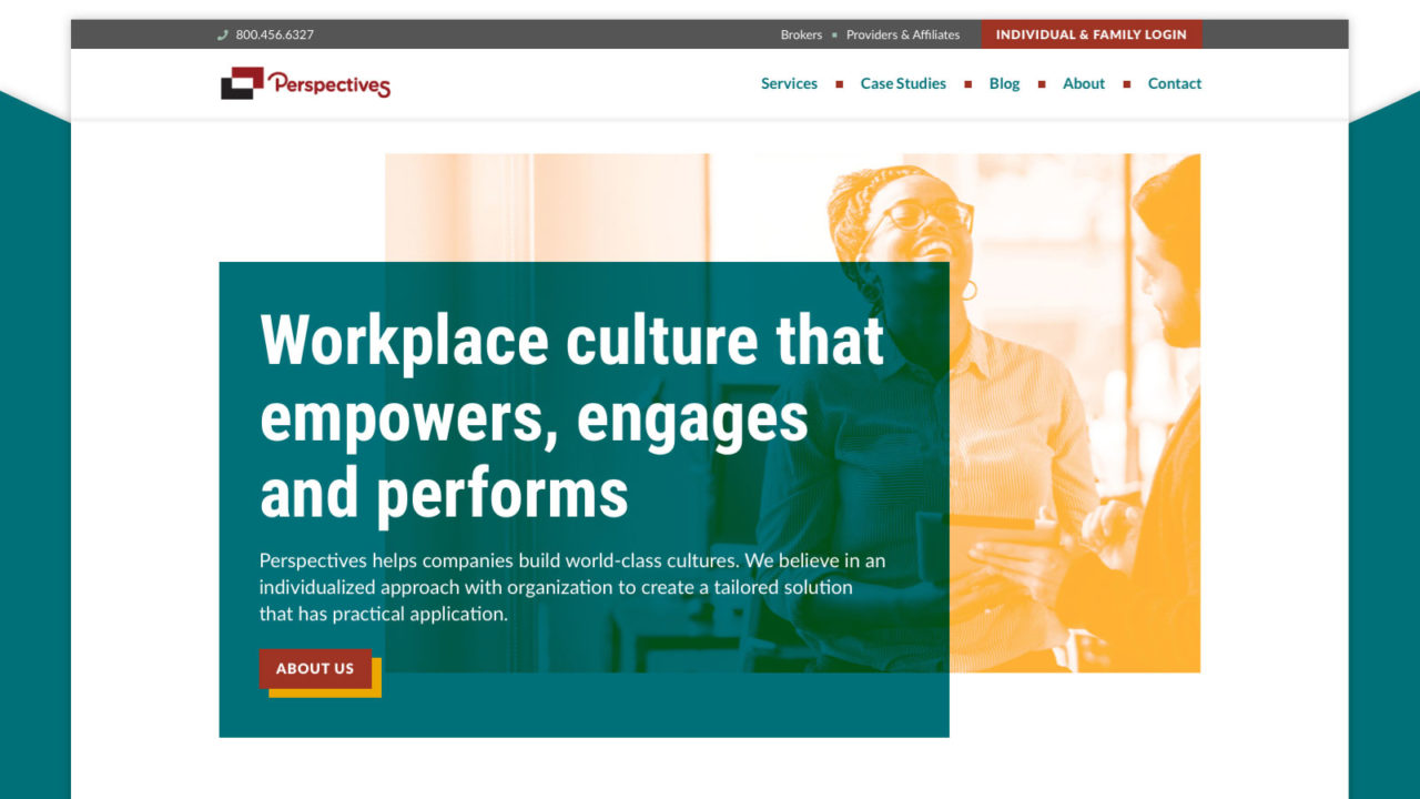
Perspectives, an employee assistance program provider, recently refreshed its brand. The company’s internal design team retooled the color palette and selected new fonts. It was an exciting makeover, and they wanted their website to match.
Instead of a full-on website redesign, we updated the fonts and colors used throughout the site. We also provided a library of photography to support the vibrant new brand.
Reorganize the information architecture
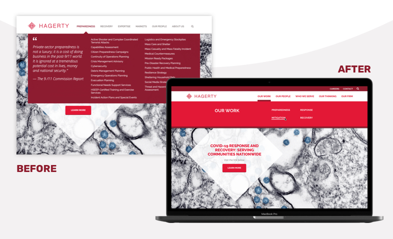
Hagerty Consulting loved the way its website looks. The disaster preparedness and response consultancy has a strong brand, and the website was a perfect representation of it.
But Hagerty Consulting did not love the way its website was organized. The firm’s business model had shifted and scaled since the site launched a few years ago. The information architecture no longer reflected Hagerty’s offerings, which made it hard for visitors to find what they need.
Simple updates to the sitemap and header navigation completely changed the user experience. Potential clients are now able to understand Hagerty’s capabilities and confirm the firm can help them with their needs.
Responsive design
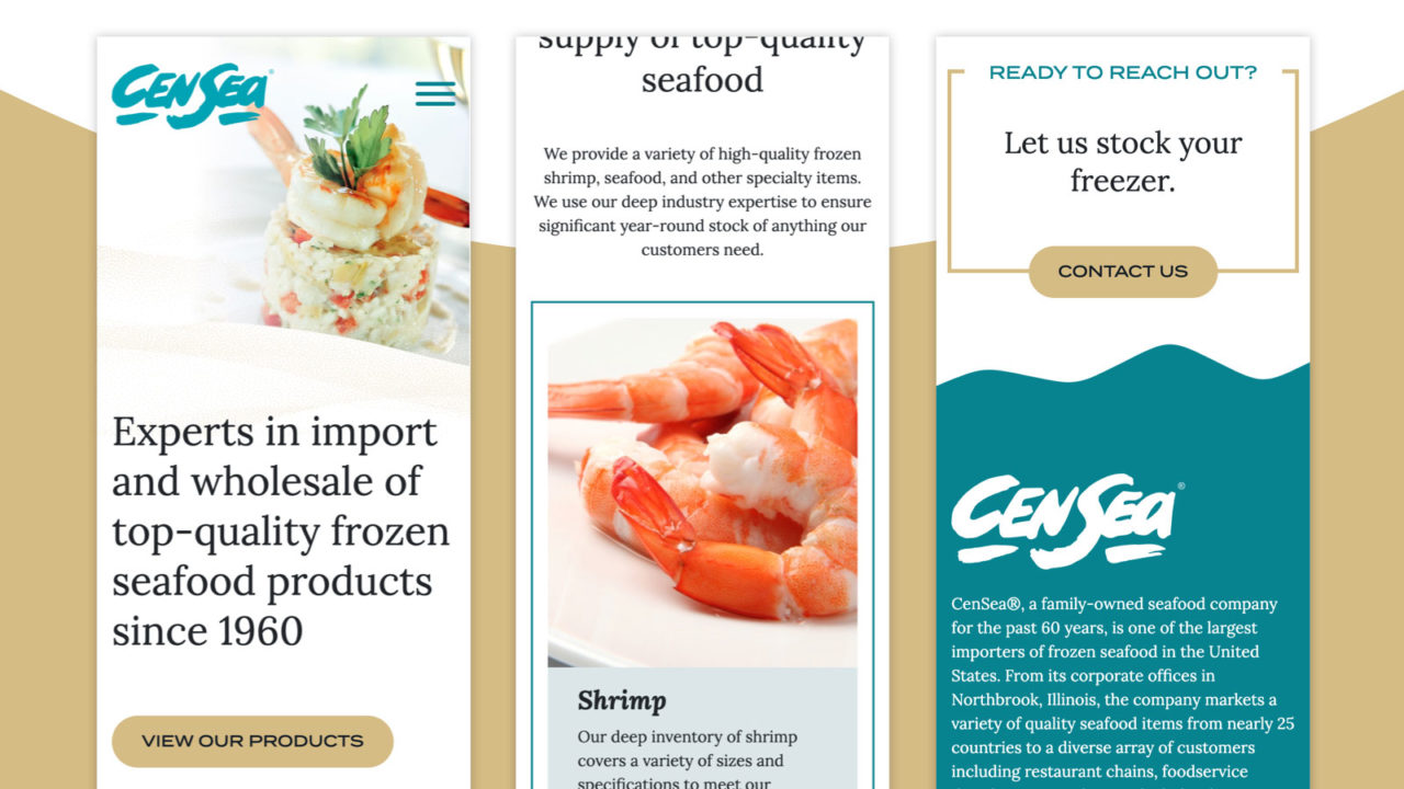
Many older sites were not built to be viewed on a phone or tablet. This not only hurts the user experience, but also the search engine optimization.
Often, an under-the-hood augmentation to the existing code can net large benefits. This is especially true for simple, informational sites. In these situations, we can adjust the existing design and content to make the site fully responsive.
Install a new content management system
Behind-the-scenes changes can make a huge difference. Take Questco, an outsourcing firm that provides HR services, which had a website but no content management system. We took Questco’s static HTML website and converted it to a WordPress site. This made keeping the site up-to-date considerably easier—no coding required.
The update was exactly what Questco needed at the time. It solved a problem and fit within their means. Six months later, with a renewed budget and larger goals, Questco came back to us for a complete website redesign and development.
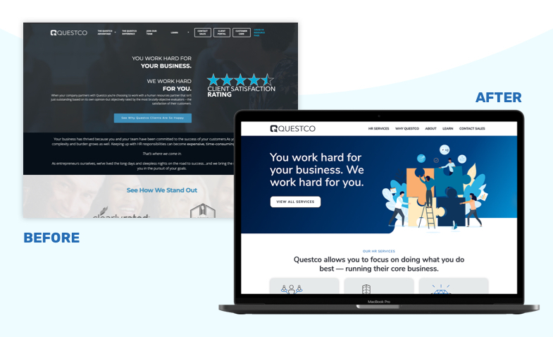
You don’t have to do it all at once
Questco’s strategy was a smart one. I’m taking a similar approach in my home. Last week, I started small and rearranged the furniture in the living room. Now there’s room to breathe (and walk and sit) while I save up for a larger renovation.
Incremental changes can have revelatory effects. They’re a helpful reminder that you don’t have to do it all at once.
Need help with a website update, or deciding what small changes to make? Drop us a line.


