Digital Marketing
120/80
Starting with a logo, we were asked to design a new identity system that was bold and eye-catching. From marketing collateral and flexible templates to a brand new, responsive website, 120/80 is a startup on its fast track to success.
Launch Website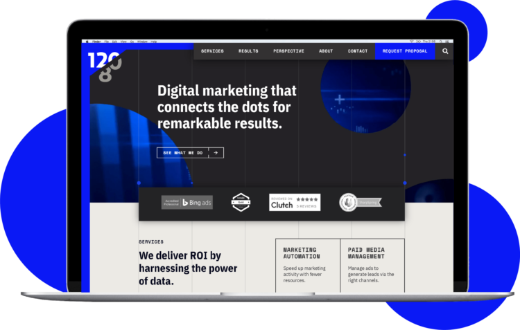
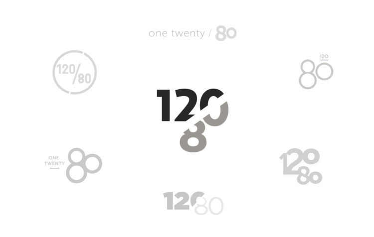
A Bold Logo with a Message
120/80 is an Evanston-based startup with an expertise in digital marketing and data analytics. Their audience is quick and results-driven, so the logo had to be bold and striking on a first impression. Additionally, we set out to strengthen the integrity of the meaning behind the name. For the agency, it represents the overall health of a company that requires consistent upkeep to stay healthy—much like the ideal blood pressure for humans.
Creating the Perfect Intro Package
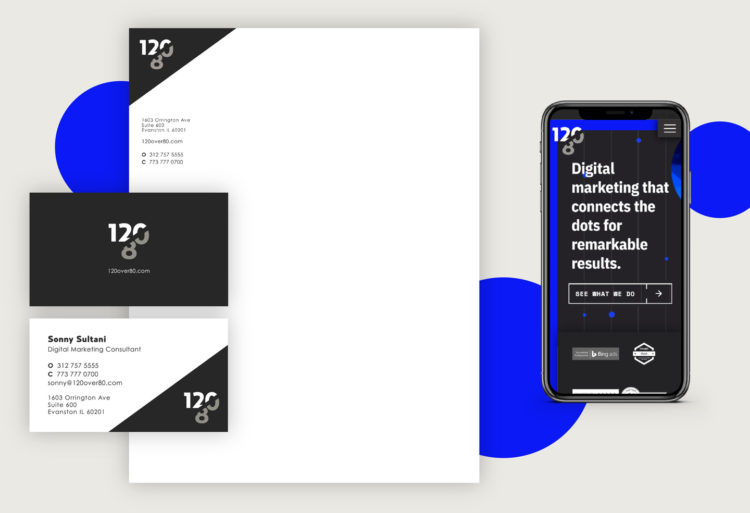
Using the newly-created logo, we extended 120/80’s identity system with marketing collateral. We designed letterheads and business cards that allowed the brand name to stand out. During this phase, we also started to develop ways to pack a punch with color and break away from grayscale with future materials.
Templates, Templates, and more Templates!
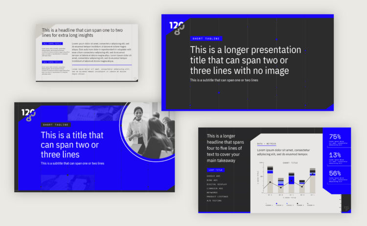
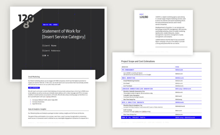
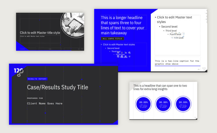
With the majority of the world working remotely during the global COVID-19 pandemic, templates were a must for a team that had to collaborate almost entirely through digital means. We made sure to account for all their needs (as well as follow our own rules), whether the templates were being used for proposals, client audits, or result studies. Our goal was to make them extremely easy to use without losing impact through its design.
Crafting a Data-driven Website
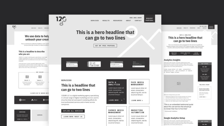
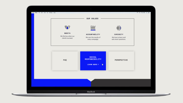
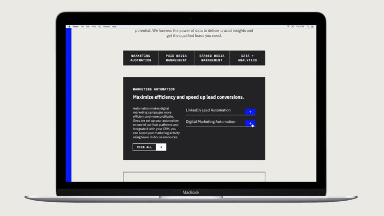
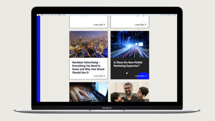
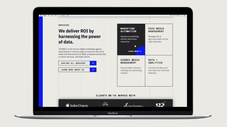
To tie it all together, every new brand needs a hub. That’s exactly what we set out to do with the development of 120over80.com. We create a striking first impression that felt powerful, objective, and laser-focused. The imagery, colors, and fonts used immediately told our users what 120/80 is all about: digital marketing that connects the dots for remarkable results.
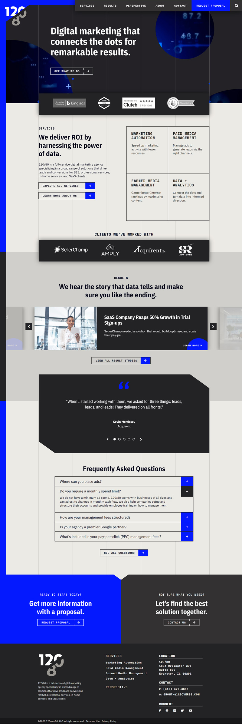
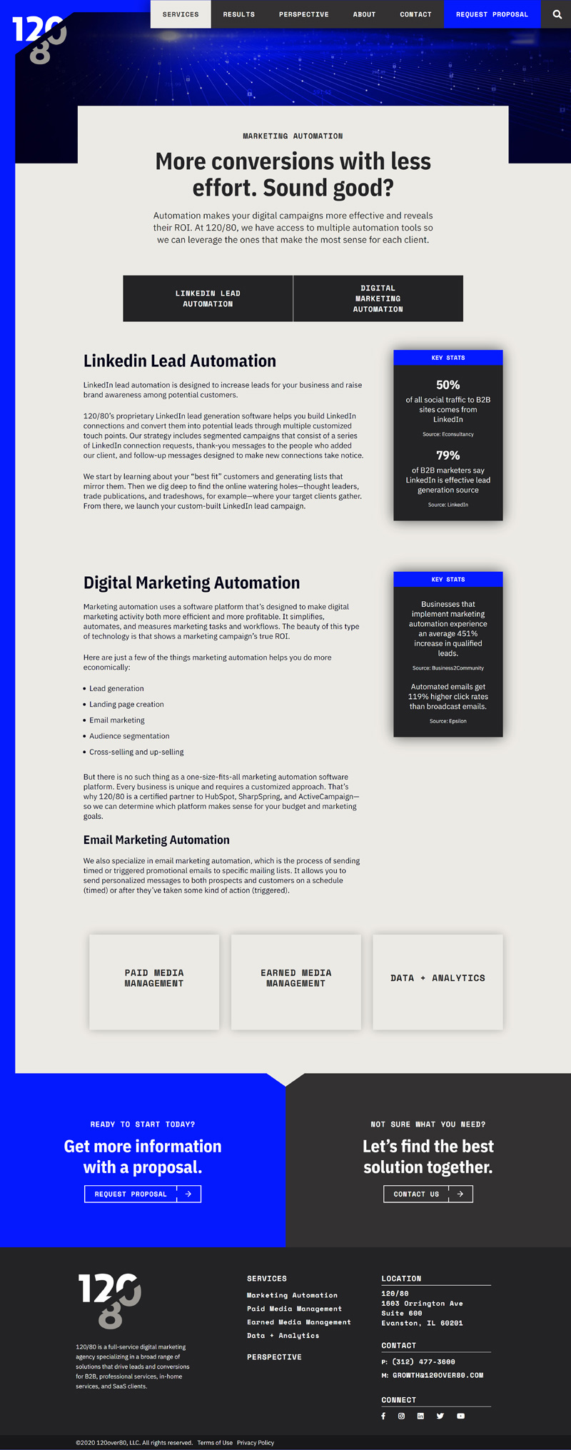
Organizing Content for a Seamless User Experience
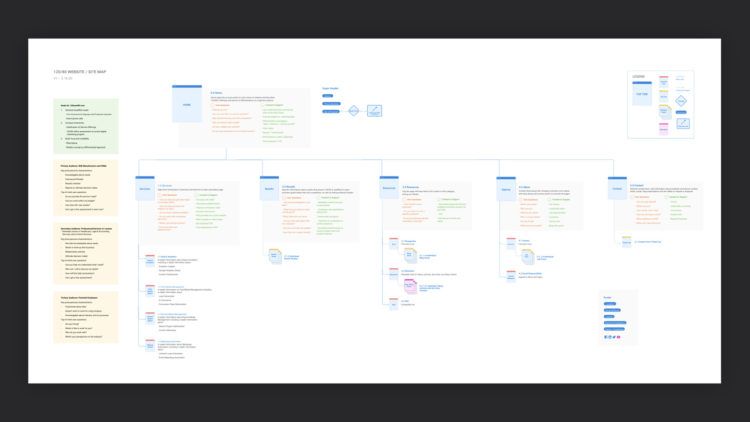
To craft a seamless experience on the web, we started by understanding their users and complexity of offerings. We then established a sitemap to serve as a compass for our teams to gather content. Right off the bat, we knew it was important to highlight the technical side of the business without losing personality. By doing so, we were able to appeal to primary audiences while showcasing 120/80’s passion for data. In the end, the fruits of our labor paid off as the carefully crafted user experience continues to help Sonny Sultani take his startup to new heights despite the COVID-19 global pandemic.
