Consulting, Law
TNG Consulting, NABITA & ATIXA
TNG Consulting, along with membership organizations NABITA and ATIXA, set the industry standard for risk management, behavioral intervention, and Title IX policy in K-12 schools, universities, and corporations.
Launch Website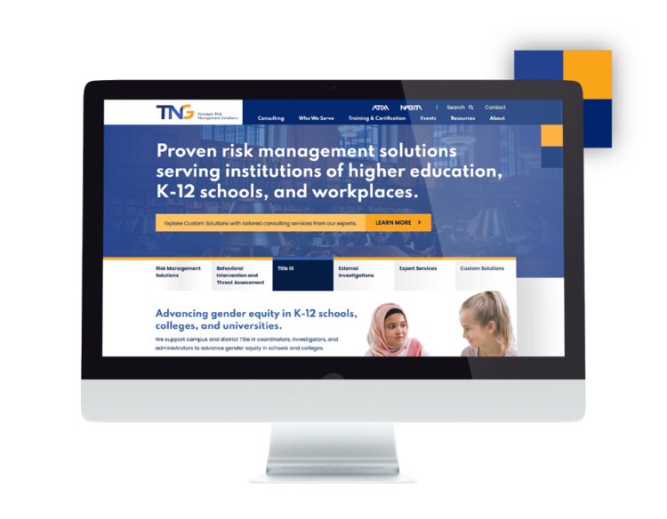
TNG, NABITA and ATIXA are pioneers in creating innovative risk management, behavioral intervention and Title IX solutions for schools and organizations. They came to Glantz Design with dated and disconnected branding, as well as websites that did not convey their expertise in the field. Our challenge was to create a three-pronged identity system across digital and print platforms that represents the missions of each company.
Three New Logos, One Cohesive Brand
Together with the client, we kicked the project off with a strategy session to better understand our target audiences and the benefits TNG offers them. Once our strategy was set, this information launched the design team to create solutions for an identity system. The result establishes interconnectivity and collaboration with overlapping letters, a blue used as an anchor, and a primary color for each brand. The chosen berry, teal, and yellow colors create a cohesive palette and give each logo its own personality. The system speaks to the trusted client relationships all three organizations have built over the years.

Complex Functionality for a Simplified User Experience
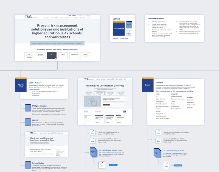
Our primary functional goal was to make their vast offerings digestible for users to easily understand through a restructured sitemap and user experience. Content was difficult to navigate, digest and search, and it was not clear who the three sites were talking to.
To create a sound information architecture, we analyzed 1,000s of pages of content to determine how to best structure the new sites. We facilitated a card sort activity for the TNG team to determine how products and services were organized, named and featured on the site, as well as identify overlaps, redundancies and inaccuracies.
We completely re-imagined the user experience to ensure all membership pages are in one section accessible from the main navigation. A filtering system was built with multiple functions for the vast collection of resources, events, and training available on the sites. This allows users to search by the specific topics, solutions, and types to efficiently find content relevant to them. Structural consistency across all three sites makes the UX intuitive and familiar.
Evolving Brand Presence Through Strategic Design
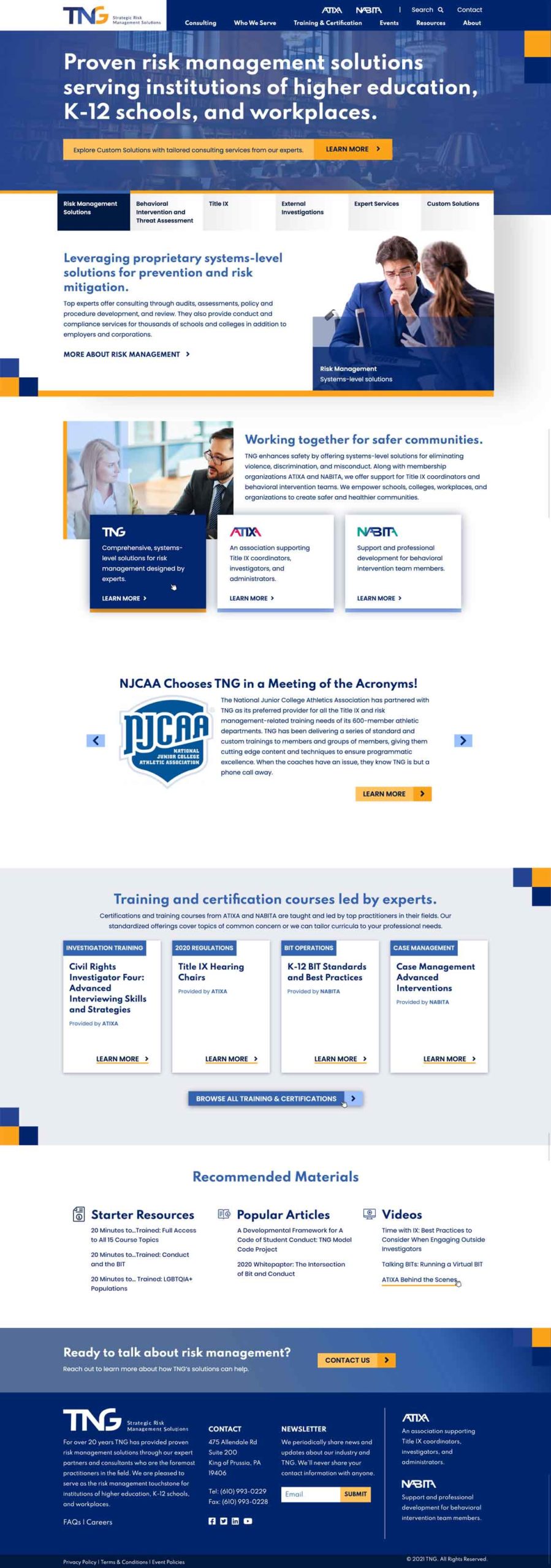
Once the IA and UX were established, we began the complete redesign and development of the three websites. The development was a collaborative process with their technical team to ensure the systems connected across various platforms. The final product: three completely transformed websites designed to maximize the relationship between TNG, NABITA and ATIXA. Colorful image overlays and square patterns throughout the designs allude to the overlapping letters in the logos. Modern fonts and colors associated with intelligence communicate TNG’s forward-looking wisdom. Thoughtful photography choices speak to the specific communities served by each organization.
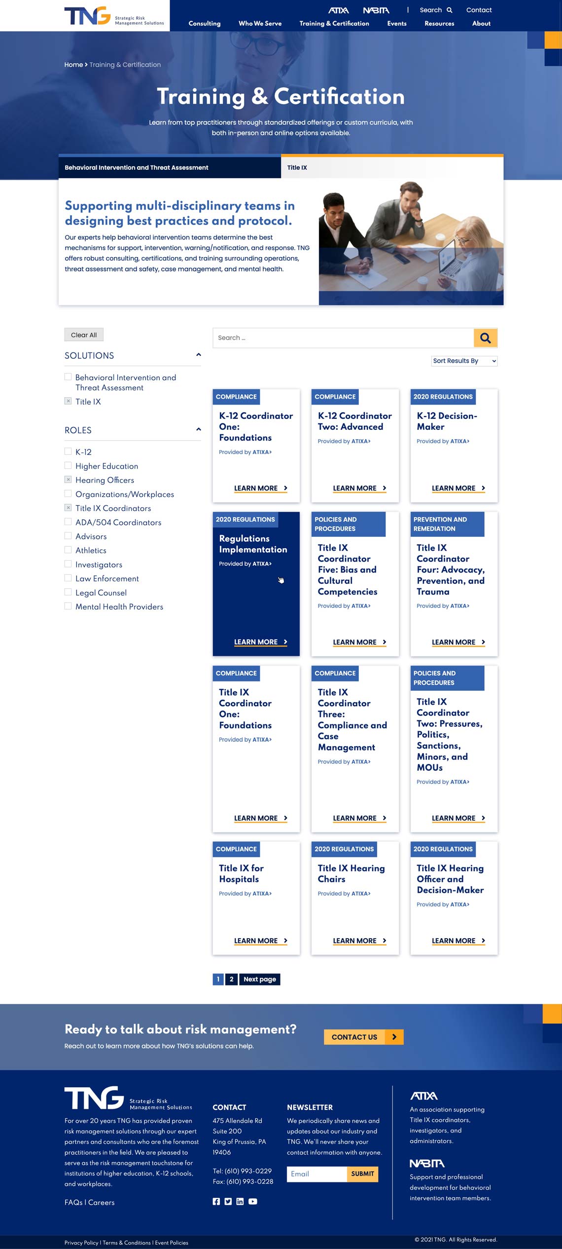
Before and After
Slide to see TNG Before & After
Slide to see ATIXA Before & After
Slide to see NABITA Before & After
Tying it all Together with Templates
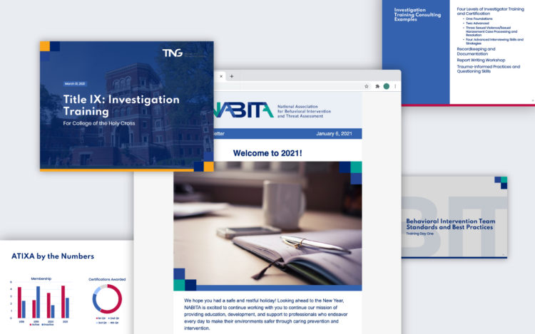
A revamped brand identity would not be complete without an updated set of collateral items to match. To bring the new branding to life, we designed templates for PowerPoint presentations, case studies, white papers, and marketing emails that match the new look and feel of the website and logos. The templates are pre-formatted with uniform fonts and styles throughout so content can be updated without changing the overall aesthetic. These turnkey tools ensure the branding remains consistent across the three organizations in every aspect of their work.
