Behind the Scenes: Our Logo Design Process

WANT TO SEE MORE LIKE THIS?
Sign up to receive an alert for our latest articles on design and stuff that makes you go "Hmmm?"
One of our favorite projects to work on at Glantz is logo design. We love the challenge of learning about a new client’s business and creating a logo that captures who they are and what they’re about. A company’s logo is its visual entry point for consumers. This first branding impression is crucially important.
A logo may wind up as a single mark with a single tagline, but it often takes a number of ideas to get there. For a more in-depth look at how our team approaches such design challenges, this article shows how we created a logo from scratch for Amber Kinetics, a commercial energy provider.
Step 1: Laying the Foundation (Understanding what needs to be delivered)
We’re industry agnostic at Glantz, so each of our projects begins with a little bit of discovery.
To define our goals for a branding project, we need to understand our client and their industry. How are our clients using metrics to determine the project’s success? What are the logistics for the project, things like the project’s timeline, budget, and resources? Are there any logo likes and dislikes within our client’s industry? This is information we gather via a logo questionnaire we have new clients fill out.
We also need to know what components of the logo we’ll be creating. A logo’s anatomy consists of several parts. Will we just be doing a logo mark, a visual without any sort of type treatment, or will a tagline be included? Are we creating the full logo lockup, which consists of the mark and the tagline together? Some clients ask for multiple iterations of a logo. In that case, are we creating multiple versions of a logo to send? These logo details establish the project scope and help us understand what needs to be delivered.
Once armed with this information, our designers divide and conquer, researching our client and conducting competitive analysis to see what others are doing in their marketplace. In the case of logos, the team looks for trends as well as industry staples. What colors are popular? Do logo shapes tend to be abstract or literal? How are competitors utilizing taglines to explain their position in the market? With that research, they then fan out to seek inspiration for the logo. The goal is to find as many avenues for exploration as possible. For some, that means walking outside and taking in natural colors, while for others, it may mean a trip to a favorite designer’s Instagram page. Or, it may be as simple as a long and winding series of Google searches.
Step 2: Come Together (to Concept)
Once this incubation period passes, the designers on the project share ideas and form them into concepts. They present their inspiration—often in the form of imagery, words, and web links—and pitch the vision they have for the logo. We look for commonalities between everyone’s ideas to see if there is overlap. Are any of the early concepts similar? Can we pair them in some way? Are there common themes or keywords that we can use as a springboard for sketching concepts?
When asked to give us five words they felt described their brand, Amber Kinetics responded with: enduring, advanced, eco-smart, flexible, and cost-effective. They also wanted their logo to “give people an impression of confidence in [their] company.” These were great jumping off points for the initial logo concepts.
Step 3: Sketching
The goal of our group brainstorm is to create a number of concrete directions for our designers to follow. Once we’ve developed and explored all initial concepts for the logo design, we delegate. Each designer explores one of these directions and starts to sketch.
When we sketch logos, we like to keep things simple at first. We keep our early designs barebones and typically only in black and white. A strong design should be able to stand on its own and not depend on colors. Only once we’re satisfied with the skeleton of the design we start experimenting more with style.
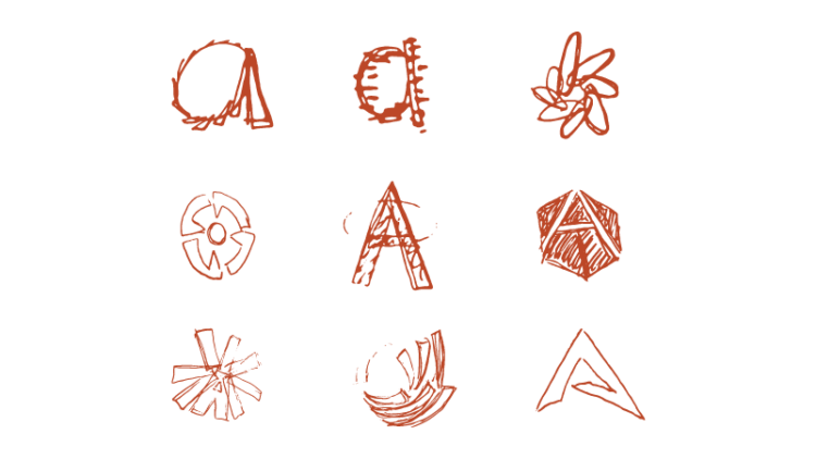
Here are some early sketches we did for the Amber Kinetics logo:

Our designers digitize their sketches and use our knowledge about the client to begin getting creative with colors. As we develop the logo design, we’ll share works in progress with people who represent the client’s customer base. You never know how one or two insightful comments from a fresh pair of eyes can help the work for the better.
Step 4: First Presentation to Client
When it comes time to present our logos, we narrow our ideas to the strongest initial concepts based on the agreed strategy. This is where the range of designs, based on our designers’ different inspiration, is advantageous. We ensure that the ideas showcase variety in theme and often range from a more conservative approach to one that pushes the envelope. Sharing a small range of ideas is helpful for our clients, too. It allows us to better gauge their likes and dislikes, and in doing so can help us arrive at a conclusive idea or concept to be developed further.
We often include mockups in the presentation of the logo in various places (t-shirts, tote bags, one page websites, etc.), where it might go. Sometimes seeing your brand on the side of a jet can be a selling point!
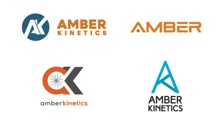
Here are the logo designs we pitched to Amber Kinetics during our first presentation:

Step 5: Client Feedback
We give our clients time to distribute the designs among their team members and gather feedback. When they do come back to us with feedback, they typically have narrowed down the set of logos we gave them to one or two. Depending on the number of designs they’d like us to move forward with, we again delegate to our designers, going through a reduced yet similar process as the first round. This time, the designers work in a more targeted fashion, refining the marks based on specific notes.
Following the first round, Amber Kinetics was stuck between the “safer” and “edgier” logos we pitched. They also asked that we drop the “Kinetics” from the logos for the next round. We applied their feedback to the logos for a final round of review.
Step 6: Color and Launch
Sometimes, we nail a logo on the first try. Other times, it takes a few rounds of feedback to get right. In any case, once we reach an agreed upon final logo with the client, we hash out some logistics. Depending on if the logo’s being shown in print, on the web, or both, we determine the color usage for its 1-Color, 2-Color, 4-Color, and Black & White iterations. We may incorporate the logo into components of a stationary system that we design. When we deploy the completed logo to its production environment, we make sure to deliver it in EPS, PNG, JPG, SVG, and PDF formats.
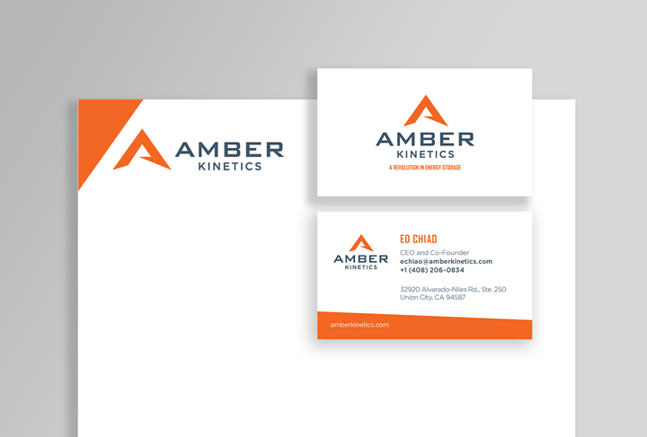
Amber Kinetics ultimately opted for the “edgier” option. They went with a forward-thinking logo mark that could stand on its own. It wasn’t intended to be literal, but the fact that the logo wasn’t exactly ‘amber’ or ‘kinetic’ demonstrated to us that they were thinking about the future when they one day might just be known to the world as “Amber.”
Here is the final product:

Conclusion
Various factors always influence a logo design project’s framework. Things like budgets and timelines impact how we execute the process above. Every project is a little case-by-case. The constant, however, is the creative expertise and perspective we bring to every logo design, no matter the parameters. Distilling the entirety of your brand into a single logo requires exploration, and we’re ready and able explorers. We know how to connect the dots between your brand’s major components until what results is a beautiful, emblematic logo. And we know how to do it on your terms—working within your means, respecting your timelines, and learning about you so what we create helps you reach your goals.
Want to work together? Go ahead and holler at us. We’d love to come up with all kinds of ways to show how awesome you are.

