


Book Cover Typography: The Forgotten Hero of Subtle Storytelling
WANT TO SEE MORE LIKE THIS?
Sign up to receive an alert for our latest articles on design and stuff that makes you go "Hmmm?"
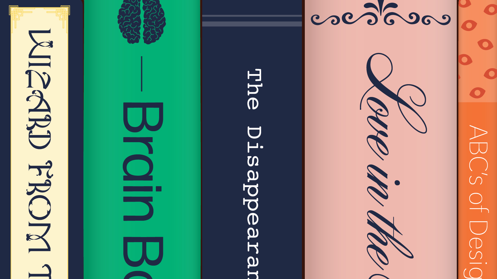
Book cover typography is a crucial, often overlooked element that subtly communicates a story's identity and genre, significantly influencing reader engagement. Glantz highlights that font selection can exemplify a story's identity, encouraging potential readers to delve into the book. For instance, fantasy novels often use fonts with elements referencing plot or characters, such as Harry Potter's lightning letterforms, while mystery novels frequently feature unembellished, clear titles to parallel the jarring truths within the story.

It’s safe to say that everyone has, at one point or another, been scolded for judging a book by its cover. It’s also safe to say we’ve all failed this challenge. Sometimes a book’s cover is simply too captivating to ignore or too bland to celebrate. Book covers feature many captivating design elements, but the power possessed by typography is often forgotten. Font selection can exemplify a story’s identity, and this encourages reading the book.
Now, it’s time to turn the page. Interestingly enough, different literary genres often follow specific type trends on their covers.
What are the typography trends in fantasy novel book covers?
Fantasy novels appeal to readers with vibrant imaginations. Their title font choices usually reflect this. The fonts often include elements that reference the story’s plot, characters, or themes. For example, a book about dragons and knights may have a title with glossy, silver letters. This pays stylistic homage to the shining armor worn by the characters in the story.
Additionally, the typography may carefully enhance a specific story element. For instance, consider Harry Potter. The lightning letterforms on the book cover pay tribute to Harry’s jagged scar. In this case, font selection is being leveraged to encourage readers to open the book. It hints at details that readers could only notice after reading. This makes exploring the book all the more rewarding. Indeed, typographic decisions can be leveraged to reinforce the whimsy of a fantasy novel’s themes. It may even entice readers to step into new worlds.
What are the typography trends in mystery novel book covers?
Mystery readers are nothing if not amateur detectives themselves. However, even an amateur would be remiss in overlooking story-relevant clues hidden on front covers. Consider the book cover of Murder on the Orient Express by Agatha Christie. One edition features simple, bold black letters. Often, the titles of mystery and thriller novels are unembellished and clear. This is no mistake. It parallels the jarring truths a detective would uncover while solving mysteries.
Further, page-turner mysteries can be suspenseful, harrowing, alarming, or surprising. The no-nonsense nature of mystery cover typography is almost daring. The story has the power to provoke suspicion, anxiety, and even fear in the pages to come. Despite this, the letterforms dare the reader to proceed beyond the front cover.
What are the typography trends in romance novel book covers?
Consider a typical impulse-buy romance. Often, these book covers are draped with curvy cursive or embellished with stylistic swashes. These decorative details effectively loop in themes from their stories. Guilty-pleasure romance reads feature flirtation, desire, love letters, and agonizing miscommunications. Despite ups and downs, the stories often offer the satisfaction of a happy ending. This is visually echoed through the looping ups and downs of cursive. All of the letters are carefully connected, and this parallels enduring romantic attachments in stories.
In some instances, cursive fonts may directly nod to the intimacy of handwritten letters. The cover of Jane Austen’s Pride and Prejudice is a fitting example of this. On the other hand, embellished letters symbolize the flirtation central to romance novels. The dynamic swoops of the letterforms are playful and alluring, much like romantic story themes. These type choices have the power to charm readers into falling for the story.
What are the typography trends in self-care book covers?
Think back to a time when a book supplied you with an arsenal of self-care strategies. The covers of these self-care books often feature simple, approachable type choices. The letters are readable, offering visual relief. The cover of The Highly Sensitive Person by Elaine Aron echoes this trend. Its title’s clarity mirrors the book’s solutions and offers a grounding sense of stability.
In a way, the simple font choices of self-care books make a symbolic promise to the reader. They provide assurance that the book’s strategies will bring readers clarity. Many self-help books aid in clearing up complicated situations or untangling overthinking. With this in mind, it makes sense that the type selection is reflective of the reader’s end goal. Readable titles align with the goals of increased understanding and self-betterment. Ultimately, the cover typography of self-help books instills the readers with hope. It promises pages full of fresh, clarifying strategies.
How do deliberate typographic choices infuse a cover with a story’s identity?
Deliberate typographic choices infuse a cover with a story’s identity by leveraging fonts to further storytelling, epitomizing a story worth exploring through the subtle power stored in the strokes and slants. This blog has touched on a few typography trends, but countless ways exist to utilize fonts for this purpose, highlighting typography's enduring and fascinating history.
So, don’t overlook the subtle power stored in the strokes and slants surrounding you. Letterforms may be epitomizing a story worth exploring. All you have to do is learn to read between the lines and celebrate it.