Today’s Typography Trends
WANT TO SEE MORE LIKE THIS?
Sign up to receive an alert for our latest articles on design and stuff that makes you go "Hmmm?"
As we head into the new decade, we expect to see several new and exciting typography trends.
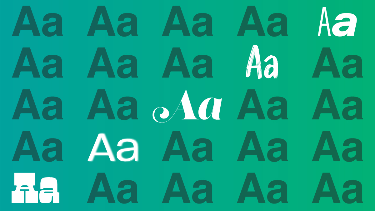
We predict minimalist design will continue to dominate, but warm, decorative serifs will be a major challenger. Retro chic will also make a comeback, specifically the seventies’ and rustic look. Lastly, avant garde trailblazers should seek variable and kinetic type. We are heading into new era and are eager to see how the letterforms we know so well will take on new appearances and technologies. Here is our take on the trends.
Not Your Mother’s Times New Roman: Fancy but Warm
This new age will usher in the rise of ornate, high contrast serifs. We predict these will be a great fit for young brands and audiences.
Familiar examples of serifs include Times New Roman, Baskerville, and Garamond. Serifs originated from calligraphy and flourished because they are legible even when printed at small sizes.
However, this new generation of serifs are for large headings and high-resolution screens that allow for fine details. This trend is part of a broad shift towards warmth, authenticity, and yearning for the analog past.
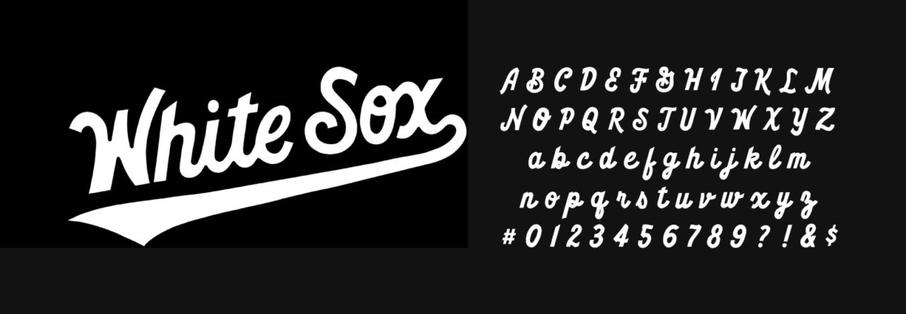
Welcome Back: Retro Chic
Two other alternatives include neon, curvy fonts from the seventies and handwritten fonts.
Why now? Why the seventies?
The visual landscape of this era is an antithesis to the modern corporate style. Longing for this era makes sense because it was an age of freedom, optimism, and diversity. Attitudes towards food, alternative medicine, and wellness also align with contemporary values.
We also predict folksy, handwritten fonts will be popular again. They are a great choice for human-focused companies and craft industries. These typefaces embody the DIY spirit: simple, unschooled, and most importantly, human.
Overall, these trends focus on authenticity and the analog, which is connected to conscious consumerism. According to Behance curator, Nami Berglund, the “use of hands signals a rejection of mass production, of plastic, of garbage.”
New Frontiers: Variable and Kinetic Type
For those seeking the radically new, we arrive at kinetic and variable type.
In a nutshell, kinetic type is animated typography. Animation is attention-grabbing. It sets the tone, and adds layers of complexity, such as timing and music. Moving type is not new; it is in movie credits, music videos, and commercials. Today, brands are increasingly adopting animation to meet the demands of digital platforms. Similar to writing and photography style, motion will soon become part of every brand’s identity.
In 2009, Typekit revolutionized the web by providing 14,000 fonts to its users with one license. It is popular to this day because it is fast and displays consistently across browsers. The next year, Google Fonts was launched, which lets anyone use roughly 1,000 fonts free of charge, hosted by Google.
The next big change to web typography will be variable fonts. Variable fonts are relatively new, introduced in 2016. They are single file that stores a range of design combinations. Fewer files mean faster load times, more flexibility for designers and end users.
Monotype predicts the market will greatly increase over the next decade. Chris Willis, head of design at VMLY&R, adds, “several high profile designers (are) already working in this space, so it’s poised to go mainstream.”
So why hasn’t variable type taken over the web?
A major hurdle is their limited support. Currently, they are only available on Windows 10, Adobe Creative Cloud, and three of the four major internet browsers. Additionally, according to a 2018 survey, only 38% of designers know what it is. But we know this number is growing.
As these barriers are removed, users will soon be able to customize their web experience via font sliders, similar to reading e-books.
Here to Stay: Classic Simplicity

Geometric sans serifs such as Helvetica will stay for several reasons. They easily create hierarchy, transition between mediums, and are legible on low-resolution screens. Minimalist Swiss design has become the face of neutrality and the modern corporate style. Monotype senior type designer, Carl Crossgrove writes, “There’s still a strong sense, in a corporate rebrand conversation, of getting things minimal and trustworthy, and those same conversations often turn into a geometric sans.”
Although utilitarian fonts will continue to be loved by many, we are eager for a new typographic era. According to our crystal ball, this new landscape will include warm serifs, throwbacks, kinetic, and variable type. Looking to learn more of the basics on typography? We have you covered in “A Briefing on Typography”! If you’re curious about upcoming design and marketing trends, head over to our 2020 predictions!