The 2022 Glantz Web Round Up
WANT TO SEE MORE LIKE THIS?
Sign up to receive an alert for our latest articles on design and stuff that makes you go "Hmmm?"
This year our website design and development projects ran the gamut–from education to entrepreneurs. This blog features our top ten web projects (in order of their launch date).
Garrett-Evangelical Theological Seminary
Project Goals:
—Utilize user research
—Balance diverse audiences
—Distinguish them as a different sort of seminary
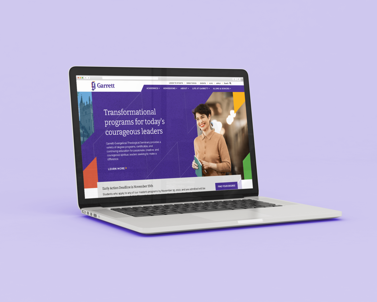
After designing a new logo for Garrett-Evangelical Theological Seminary a couple of years ago, we were thrilled to extend their identity to their new website. This was one of the most gratifying projects of our year so far. We conducted user research, crafted messaging, collaborated on moodboards, and developed flexible components. We invite you to explore the website of a very different seminary.
Union Home
Project Goals:
—Showcase product
—Account for both retail and wholesale customers
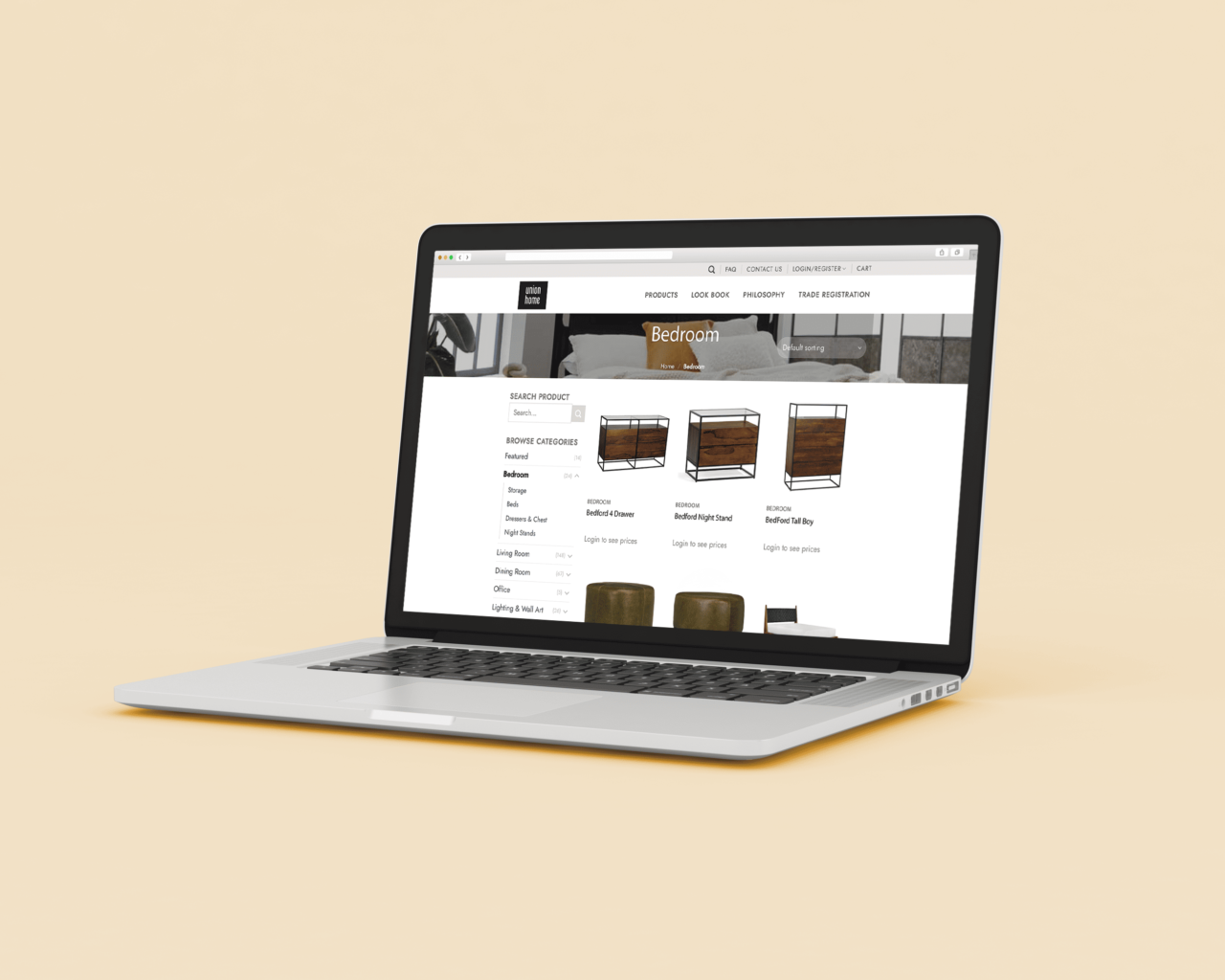
Gorgeous furniture made the visual design of the Union Home simple. The user experience and development were more complicated. Both retail and wholesale customers needed to see variable pricing and request accounts. Company owners needed to verify those accounts and easily update the site’s content. They’re able to keep the site updated with their latest beautiful pieces.
20/20 Foresight
Project Goals:
—Showcase success stories
—Promote team members
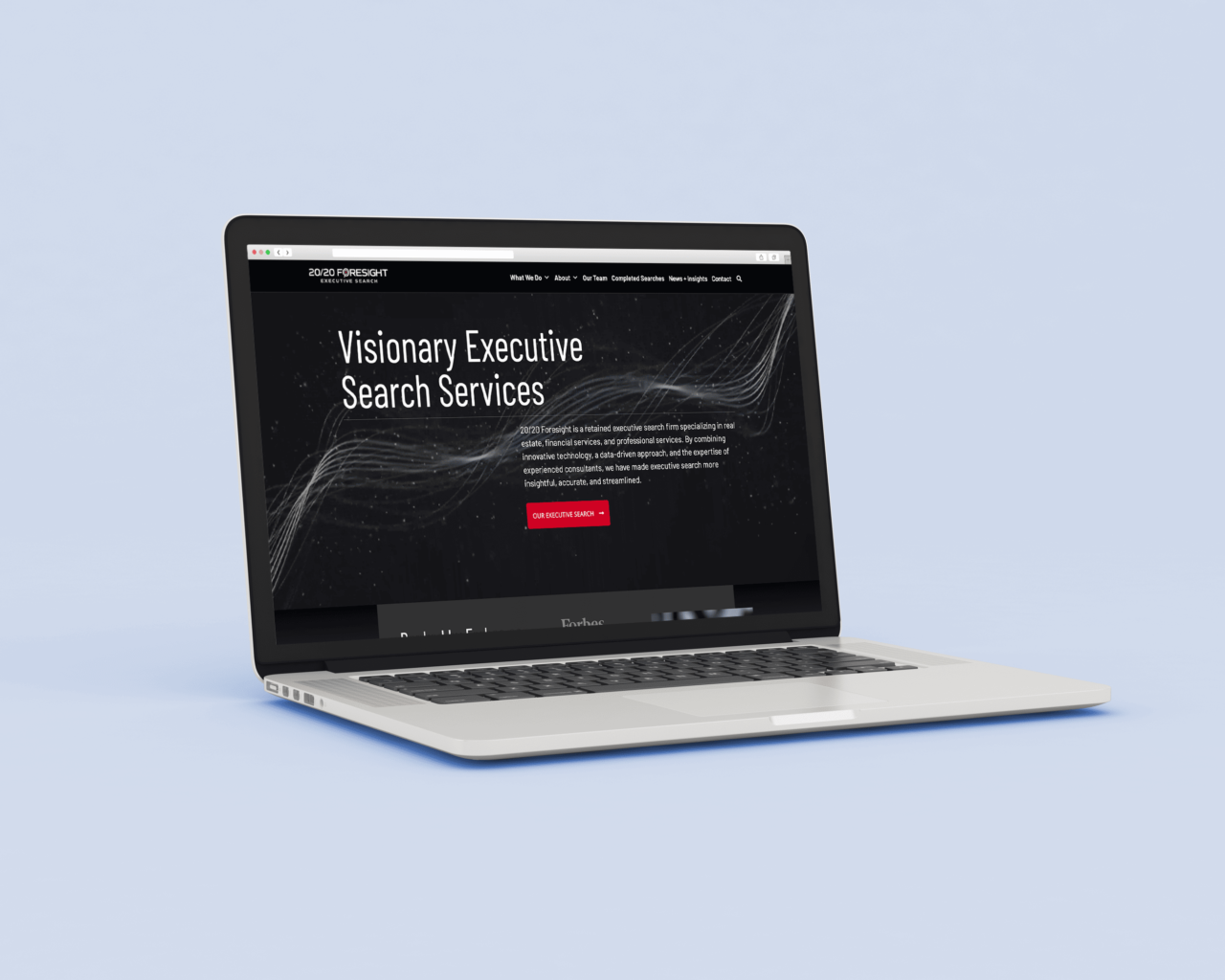
20/20 Foresight is among the nation’s foremost executive search firms. Their new website needed to not only convey their capabilities but also display their successes. The site showcases their incredible team and up-to-date completed searches.
Ark Chicago
Project Goals:
—Extend new branding
—Generate awareness for services
—Drive donations
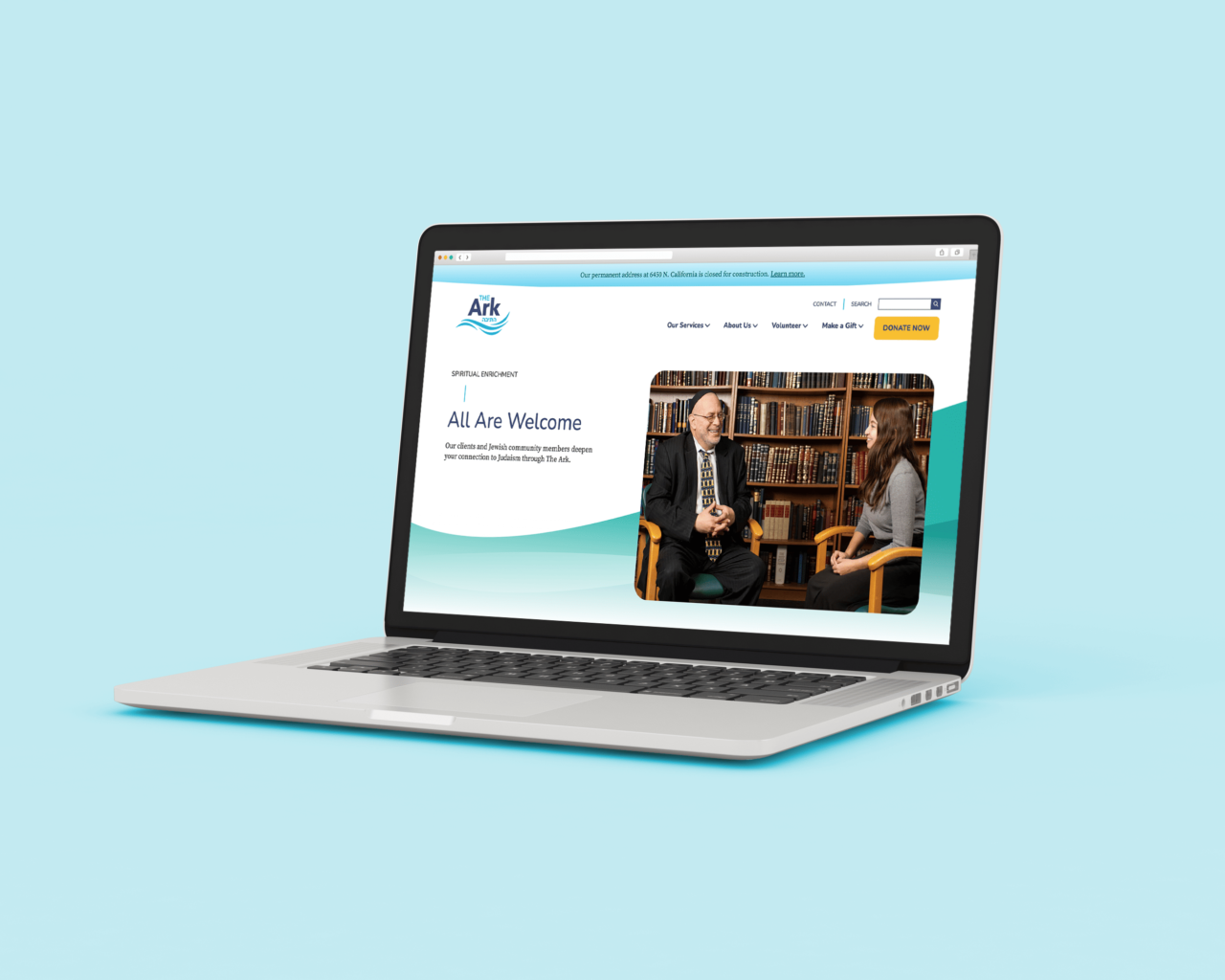
The Ark, which provides human services for our local Jewish community, needed a website to match their vibrant new brand. The site also needed to simultaneously serve their clients and encourage donations. With a capital campaign for a new facility under way, we’re excited to see The Ark make the most of their new site.
SARA
Project Goals:
—Extend brand identity
—Appeal to prime target
—Showcase work in before and after gallery
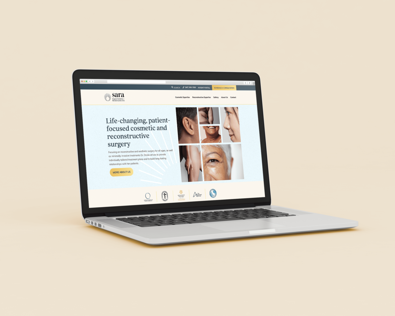
After creating a new logo and business cards for plastic surgery practice SARA, our team had the opportunity to revamp her website. Her new site needed to reflect the new branding and appeal to her prime target – middle-aged women in the Chicagoland area.
SARA practices both cosmetic and reconstructive surgery, so we wanted to build a site that separated the two. To do so, we focused on using visuals of real patients in a before-and-after gallery.
The Shy Flower
Project Goals:
—Establish new company
—E-commerce and subscription
—Showcase product photography
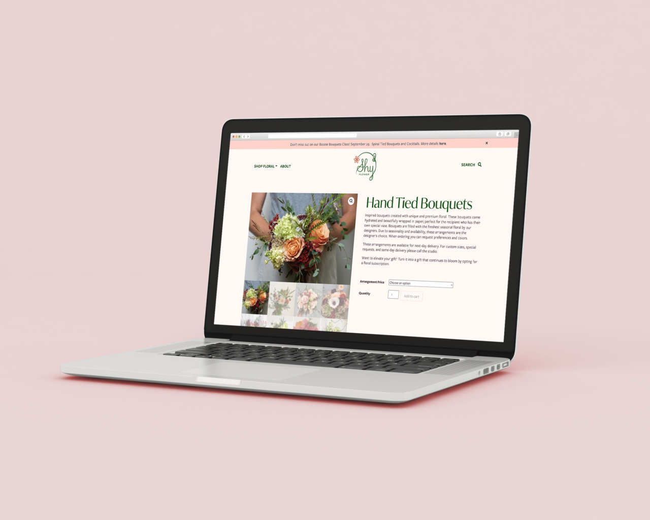
What a thrill to launch this florist’s brand and website! We loved collaborating with The Shy Flower’s proprietor on her website’s user experience. It features her unique floral arrangements and offers customers one-time and subscription purchases. Bask in her blooms’ beauty, won’t you?
LeadJen
Project Goals:
—Drive qualified leads
—Promote site match
—Drive toward conversion
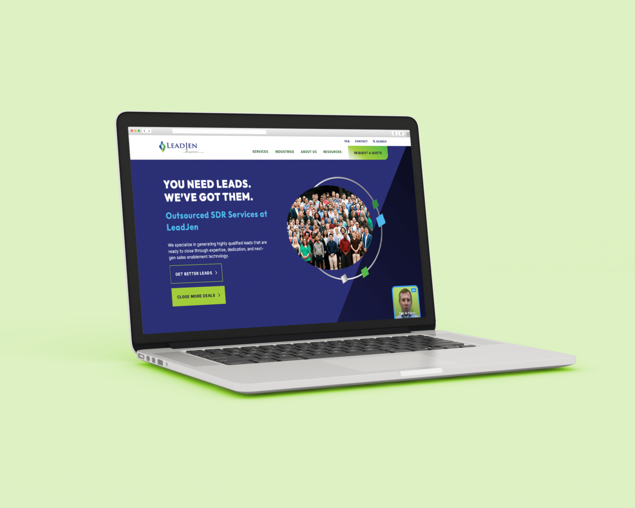
LeadJen, an outsourced sales firm, needed a new website that (no surprise) generated leads. Using conversion data from sister company Acquirent, we crafted a clear, digestible experience. We also capitalized on Acquirent’s WordPress theme and customized it for LeadJen’s brand. The streamlined design and development allowed us to focus leads, leads, and more leads.
WiTronix
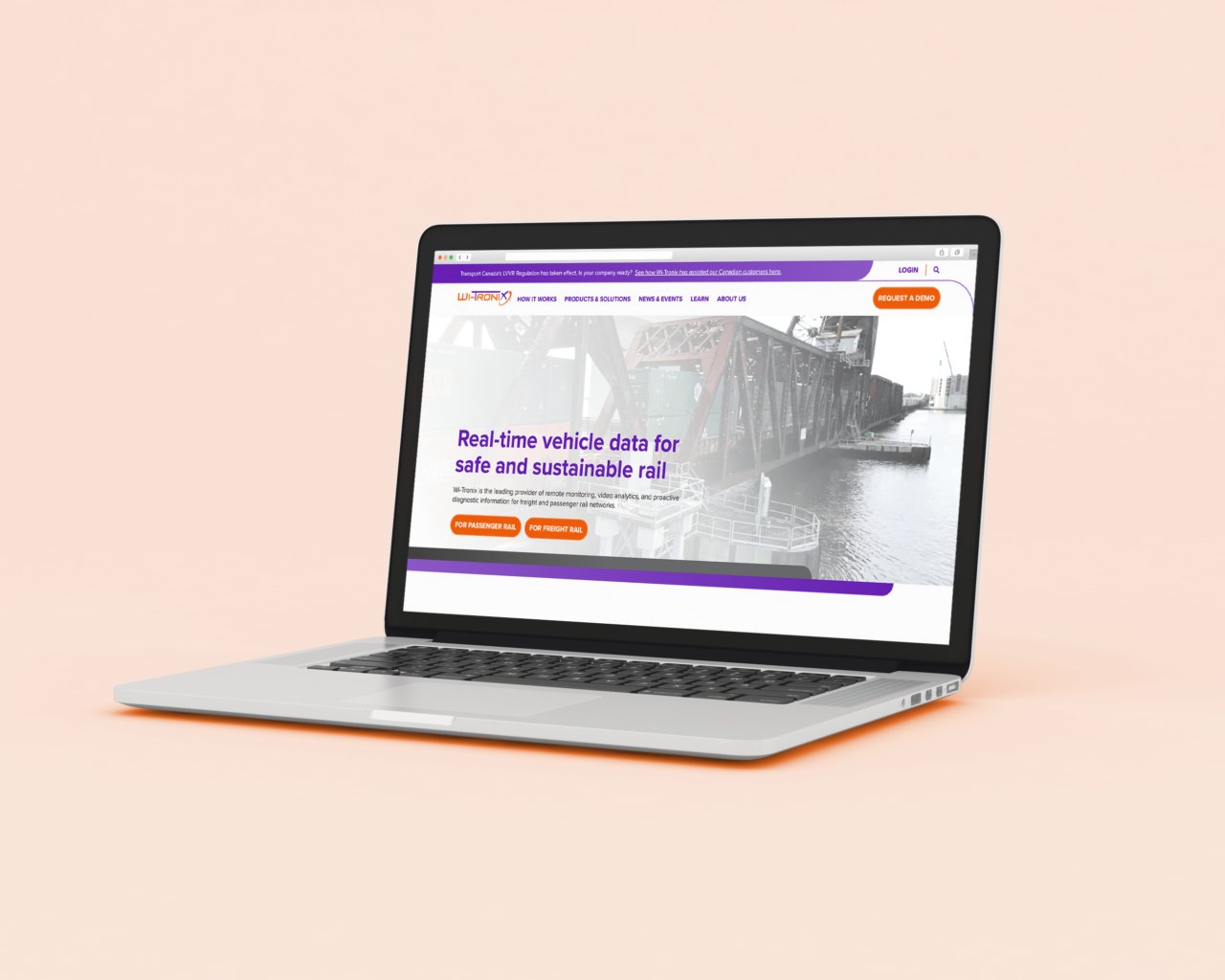
Project Goals:
—Showcase industry innovation
—Leverage intellectual property
—Elevate site experience
Most companies want to be known as industry innovators, but few have the credentials to back it up. That’s not the case for Wi-Tronix, a leader in rail technology, safety, and sustainability. Our goal was to craft a website and content strategy that match their level of expertise. Custom imagery and content creation elevated the site even further. The result is dynamic and transformative, just like Wi-Tronix’s platform.
St. Charles Public Library District
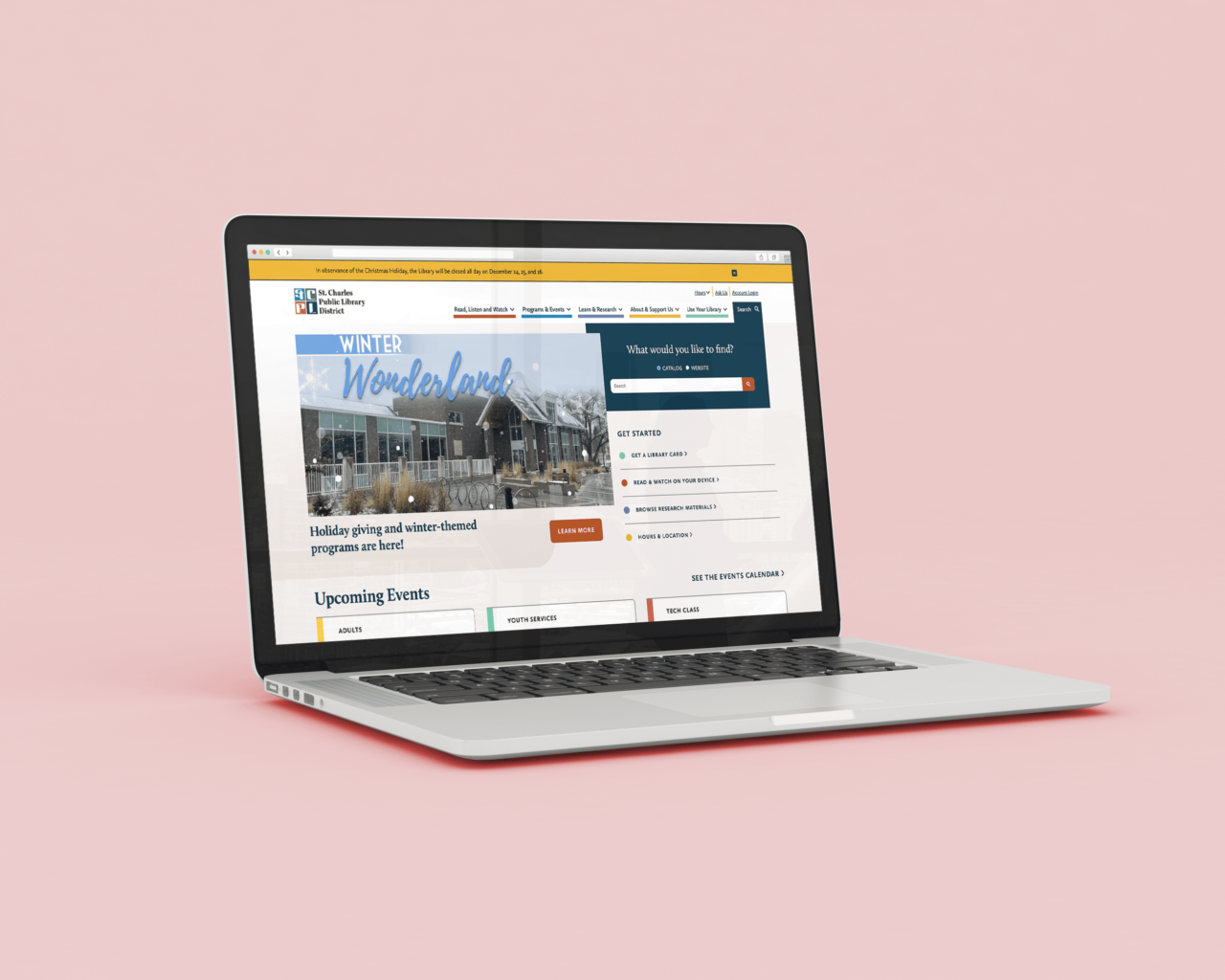
Project Goals:
—Appeal to broad array of users
—Seamlessly integrate catalogs
—Make navigation of site easy
There are many types of library patrons, which is why their websites need to have more than visual appeal. For the St. Charles Public Library District, we focused on a broad yet deep user experience. The new site has multiple paths for every type of user to find what they need — a book, event, research database, or service, just to name a few.
Styberg Library
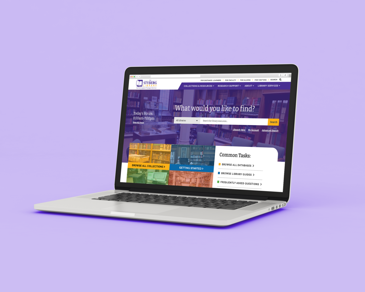
Project Goals:
—Apply the Garrett brand with unique features
—Integrate catalog search
—Integrate book river displays
—Rework information architecture
Adapting the new Garrett-Evangelical website to its Styberg Library was an absolute pleasure. With an integrated catalog search and an intuitive site map, the library website serves its unique audiences. The site creates an easy-to-use hub for the many resources available to students and faculty.
Verato
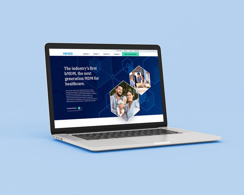
Project Goals:
—Showcase industry innovation
—Elevate copy to appeal to a B2B audience
—Showcase Verato’s advantage with animated web graphics
Verato is the leader in identity data management for healthcare. On the cusp of a product launch, the software company needed a new website to announce its latest innovation and resonate with heathcare system, insurance, and hospital executives. We crafted a holistic written and visual narrative that touted Verato’s industry leadership with accessible, human stories.
With technology always advancing and our sites set ever higher, we can’t wait to see what 2023 brings for website design and development.


