With the Click of a Button
WANT TO SEE MORE LIKE THIS?
Sign up to receive an alert for our latest articles on design and stuff that makes you go "Hmmm?"

Why are buttons an essential part of digital accessibility?
In an ideal world, websites would be designed and developed to work for everyone. Unfortunately, many modern websites are unusable for people with disabilities. If the goal is to create a website that generates leads, digital accessibility is a must-have.
Buttons are one of the primary ways of engaging the user and the website. In our ongoing commitment to make websites accessible, we learned that making buttons perceivable, understandable, and operable is one of the easiest and most important steps to take.
How do you make buttons accessible on the web?
Buttons are interactive elements that allow users to navigate a website. Ensuring website visitors can recognize, identify, and click the buttons on a website is crucial. To achieve these requirements, it is helpful to examine the three main features of buttons: form, color, and label.
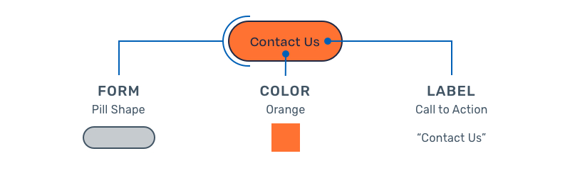
Form
To read the text on a computer screen, blind or visually impaired users rely on software programs called screen readers. Screen readers allow users to read text with a speech synthesizer or braille display. There are numerous types of screen readers, such as JAWS, NVDA, Apple VoiceOver, and ChromeVox, and each has different functions.
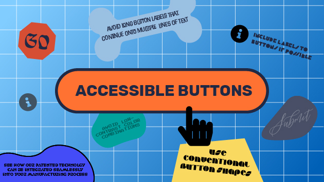
Many buttons use standard shapes, such as pill, square, or square with round corners. While using other shapes is possible, it is not recommended as it may be confusing for screen readers.
Color Choice & Contrast
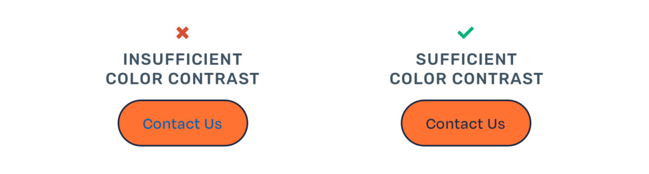
Color choice is critical when it comes to making a button perceivable. However, color choice doesn’t necessarily mean colorful. Instead, there should be a significant difference in the color of the button shape and the color of the text inside. Those with impaired vision need high contrast between a button’s text and background colors.
Labels
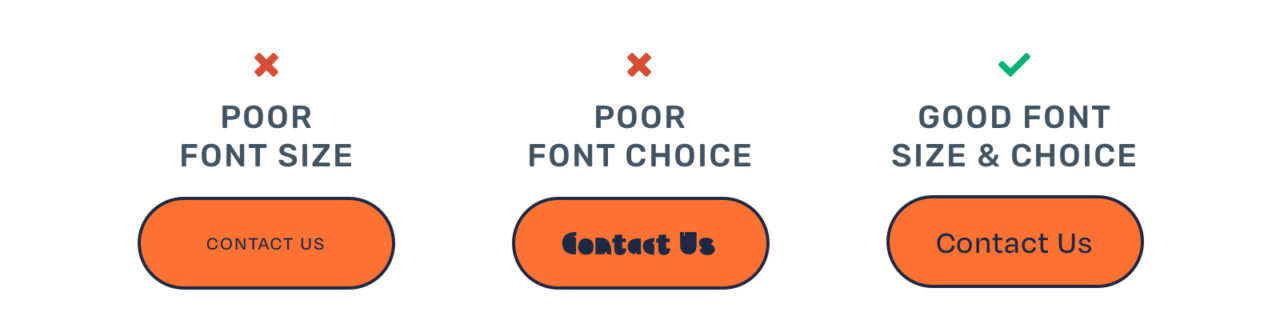
If a button has a visible label, it’s important to keep the button text short and descriptive. Good examples of labels include “Sign Up” or “Send Message.” The text also should be in a legible font, readable size, and high contrast color. Unlike color, there is no official guidance for readable font sizes. However, it’s widely accepted that text should be at least 16px on the web.
Not all buttons have visible labels. For instance, search buttons are often represented by only a magnifying glass icon. Clicking on the magnifying glass triggers the search action.
Very few button actions can be represented by an icon alone. In fact, “search” is one of the only ones. In all other instances, adding a label next to the icon is recommended. Adding an “invisible” label in the website code can further improve an icon button’s accessibility. This makes the button’s purpose more clear to website visitors and screen readers.
Consistency
Almost every website will have multiple buttons. Sometimes, there will be multiple buttons on a single page. Keeping the button shape, color, and text size consistent is essential. It helps make them quickly recognizable for visitors with vision and cognitive disabilities.
States
Finally, understanding and considering button states is essential to digital accessibility. A button can be in many different positions, or states. These positions include default, hover, focus, active, disabled, and loading. For digital accessibility, the focus state is what’s most critical. The focus state occurs when a visitor uses their keyboard instead of their mouse to navigate down a webpage. The focus state highlights a single button, often with a light blue outline.
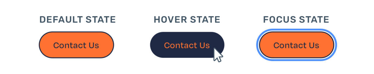
Many people rely on the focus state to understand where they are on the page. To increase usability, designing a focus state that meets color contrast requirements is crucial.
Buttons are essential interactive elements
Buttons are one of the primary ways people interact with websites, so they must be accessible for people with disabilities. Make sure your buttons have distinctive shapes, high color contrast, and clear labels. These considerations will make sure all website visitors will be able to use your website.
We encourage you to commit to making your website accessible and to continue to educate your team about digital accessibility by understanding your business risk or by learning more about the essentials of accessible color contrast.