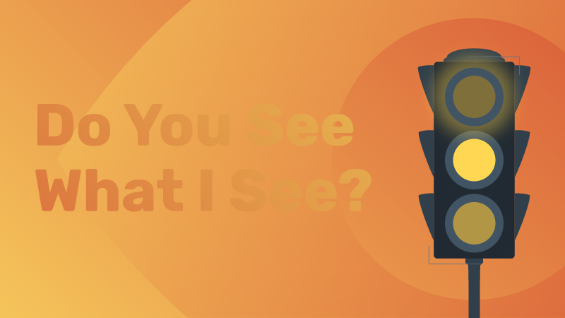
Color Contrast for Web Accessibility
WANT TO SEE MORE LIKE THIS?
Sign up to receive an alert for our latest articles on design and stuff that makes you go "Hmmm?"
As part of our series on web accessibility, we are exploring what color contrast means for web designers and owners.
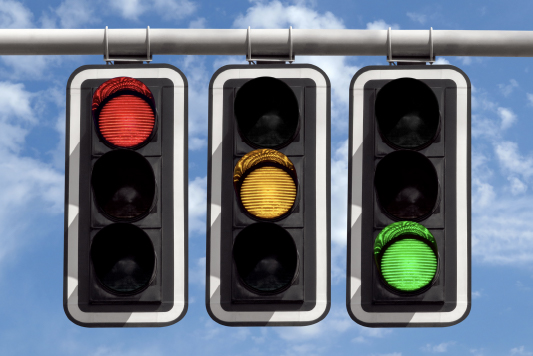
Worldwide, more than 2.2 billion people have a visual impairment. It’s estimated that 1 in 12 men and 1 in 200 women are colorblind. Many of us take for granted the way we see the world. Take driving as an example. Stoplight signals can look very different for people with colorblindness. For example, red and green can look very similar.


To us at Glantz, that means our work should be beautiful and functional for everyone. Legally, that means websites need to be accessible under Section 508 of the Rehabilitation Act of 1973 and similar laws.
But what do we mean when we say the colors on a screen are “accessible”? How do we measure it? And what are the challenges?
Let’s start by defining what it means to have accessible color contrast.
We follow the Web Content Accessibility Guidelines (WCAG 2.1). This is the international standard for web accessibility for people with disabilities. It explains how to create accessible websites for people with disabilities, such as vision loss.
The WCAG addresses color in success criterion 1.4.1 Use of Color. It requires that color cannot be the only visual indicator:
- conveying information
- prompting action
- distinguishing a visual element
An example is the hyperlink style many web browsers and apps use: blue underlined text. The underline makes it easier for those with colorblindness to find links.
Additionally, success criterion 1.4.3 Contrast (Minimum) says that text color and its background color needs to have a contrast ratio of at least 4.5:1. Exceptions are made for:
- Large text (at least 18pt). In this case, the text has a lower standard of at least 3:1.
- Incidental text. There’s no contrast provision if text is part of an inactive button, purely decorative, part of a picture that contains lots of other content, or not visible to anyone, such as content only for screen readers.
- Logos.
What does a “contrast ratio of at least 4.5:1” look like? How is color contrast measured? Let’s see accessibility testing in action.
Evaluating color contrast
How we ensure color contrast for accessible websites
At the start of a web project, we’ll often receive branded color palettes with HEX values (six numbers that represent a specific digital color).
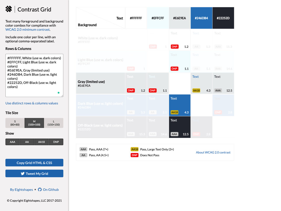
We copy these values into a contrast tool (we like Contrast Grid by Eight Shapes). This tool shows us all possible color combinations and calculates their contrast ratios. This way, we’re able to see if color pairings meet the WCAG 2.1 standard.
Here’s how a sample contrast grid looks:
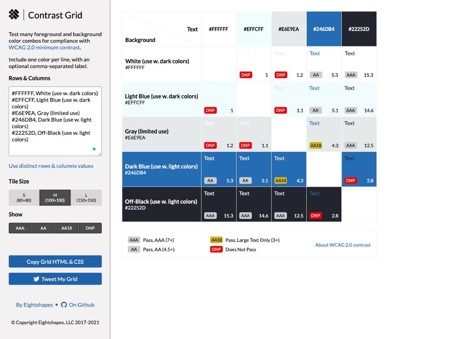
In the sample, the light blue and white have at least 4.5:1 contrast when used with dark colors. This means they’re different enough to be perceivable to people with visual impairments. Generally, very bright and very dark colors will have at least 4.5:1 contrast ratio.

But the gray should only be used with off-black or as large text over 18pt when used with dark blue.

When we need to check the contrast for a one-off color combination, we turn to the Stark plugin. It comes with a colorblind simulator as well.
Common challenges to meeting WCAG color guidelines
Working with complex backgrounds
How do we ensure text is accessible when it appears over an image, video, or gradient?
Unfortunately, WCAG 2.1 does not provide guidance for these scenarios. So we do our best to plan for worst-case scenarios. If there is white text on top of a gradient, for example, we take the lightest or darkest colors of the gradient and test them for contrast. Colors might need adjusting as a result (more on that below).

If there’s text on top of a photo or video—something that’s common on home pages—an overlay may be necessary. An example is the NABITA homepage hero, shown below.


Adapting inaccessible brand colors
If the contrast grid for your brand palette is full of the red DNP (does not pass) icon, don’t panic. First, remember logos are exempt from WCAG requirements. And inaccessible color combinations can function as decorative elements throughout the site. You don’t need a full rebrand!
But you do need to adapt the brand palette for the web. An easy method is to incorporate shades, darker versions of the color, or tints, lighter versions. Tools like WebAIM’s contrast checker will come in handy here.
It might be difficult to find on-brand, accessible alternatives for bright colors. In that case, it’s time to expand the palette by adding supplementary colors. To do this, we turn to the brand’s tonal keywords to ensure all colors feel true to the identity.
Budget concerns
This may sound great, but also complicated. How does it affect your budget and timeline?
At Glantz, there’s no impact. Ensuring colors have accessible color contrast is an integral part of our process. It’s a part of our promise to do the right thing for the client and the problem at hand.
Testing live websites for color contrast
Now that you know what you’re looking for, is your website accessible for users with limited vision? Find out using a free browser tool.
For an automated whole-page audit, we recommend the axe or Wave browser extension. For tech-savvy users, Chrome, Edge, and Firefox‘s developer tools have great accessibility features. Firefox can even simulate what a visually impaired user would see on a webpage.
More than meets the eye
Color contrast is one of the ways we create beautiful, accessible websites. For users with significant vision loss, we ensure our websites are screen reader-ready. And outside of visual impairments, how about people with mobility or cognitive disabilities? How do they navigate the web? Keep an eye out for future posts as we dive deeper into the world of accessibility.