How to Make Accessible Word Documents and PowerPoints
WANT TO SEE MORE LIKE THIS?
Sign up to receive an alert for our latest articles on design and stuff that makes you go "Hmmm?"
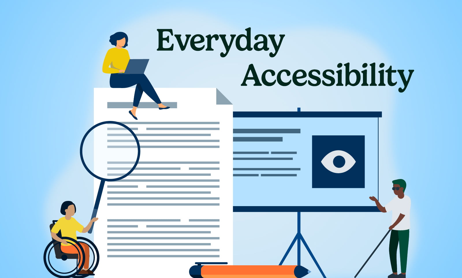
Here’s how you can make your everyday documents readable for people with disabilities
Digital accessibility generally refers to ensuring websites are usable and readable for people with disabilities. In recent years, web designers and developers have made concerted efforts to make the internet more usable for more people.
But digital accessibility isn’t just for websites. Technology permeates the typical workday, especially if you’re in a job that requires creating documentation or pitch decks.
Making sure your Word documents and PowerPoint presentations can be read by people with disabilities is essential for personal and business success. After all, your customer or co-worker may be one of the 61 million Americans with a disability.
Unlike website accessibility, making a Word document or PowerPoint more accessible does not require coding or design skills. A few simple actions will make an impact.
General tips for making Microsoft Word, and PowerPoint documents accessible
The best way is to address accessibility in the source program, like Word or PowerPoint. These tips are a combination of Microsoft-recommended tactics and the tried-and-true methods our studio uses. The screenshots below were taken on an Apple computer in dark mode. The programs will look slightly different on a PC and in light mode.
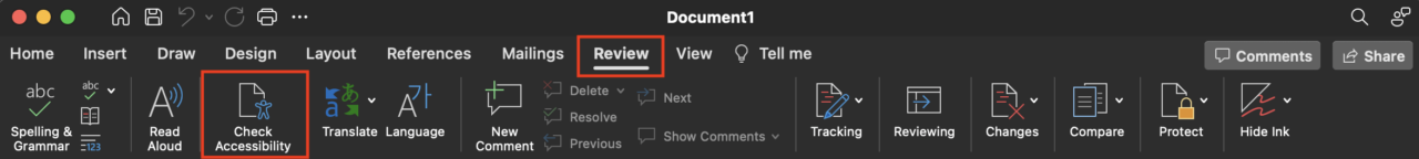
Use the Accessibility Checker
This comprehensive tool flags accessibility concerns and provides suggestions to fix them. Use this throughout your writing or design process or at the end to confirm the document is accessible for people with disabilities.
Here’s how to run the Accessibility Checker:
- Navigate to the review menu
- Click on Check Accessibility
Use colors strategically
Use high contrast colors that are perceptible to people with vision disabilities. Don’t only rely on color alone to convey meaning.
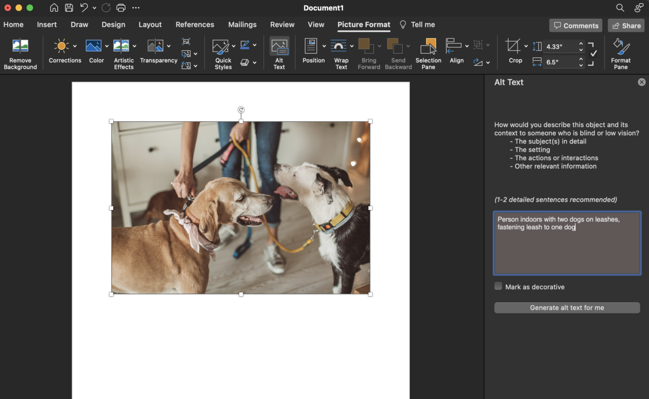
Add alt text for informative images and mark decorative images
Alternative text, or alt text, is a text description of an image’s meaning or context. It makes digital images understandable to screen readers. When a screen reader reaches an image with alt text, it will read it aloud.
If an image conveys information, add a description of what it shows in alt text. Microsoft has a helpful article about writing great alt text.
Ornamental images, such as slide backgrounds, should be ignored by the screen reader. You can tell the screen reader to skip the image by marking it as decorative
Here’s how to add alt text and mark decorative images in Word and PowerPoint:
- Click on the image to select it
- Navigate to the Picture Format menu
- Click on “Alt Text”
- Write the alt text in the area provided
Use descriptive language for hyperlinks and screen tips
Like images, hyperlink text should be descriptive. Screen readers can scan a document for a list of the included hyperlinks, but a list of several “Read More” or “Click here” links lacks essential context. When you add a hyperlink to text, make sure the text hints at the link destination.
Avoid using tables
Tables are often used to organize text in Word and PowerPoint documents. However, tables are hard to read for readers who use assistive technology that magnifies text and images.
When possible, avoid presenting information in tables. If a table must be used, such as for displaying a large amount of data, include table headers and don’t make it a fixed width. Mircosoft has more tips for creating accessible tables.
Additional guidelines for making accessible presentations in PowerPoint
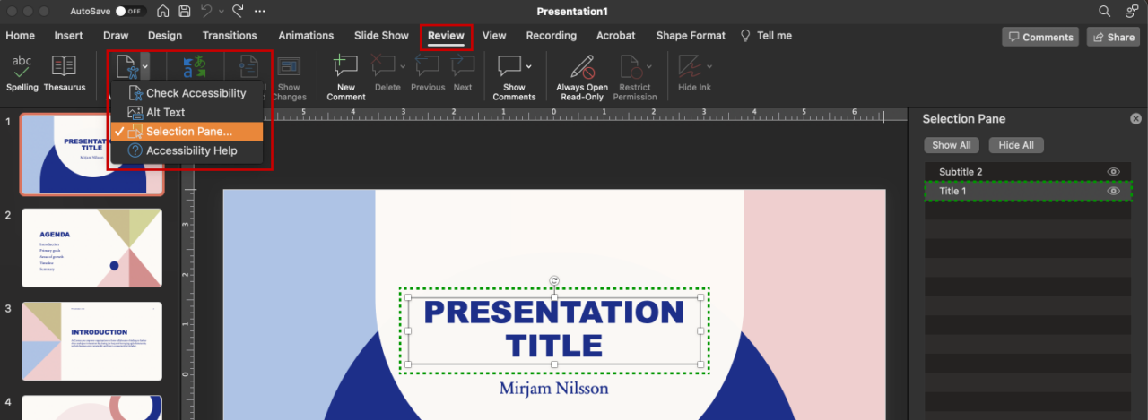
Order content
The order in which you add elements to a slide matters for screen readers. Items added first to the slide also are read first.
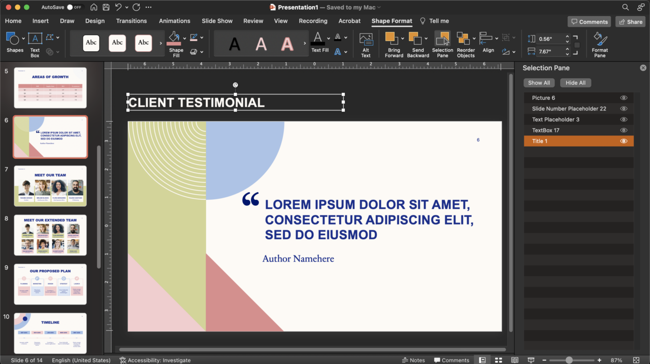
You can view the order of the content and reorder it in the Selection Pane under the Check Accessibility menu. Screen readers read the items in this list from the bottom up. For example, in the screenshot below, Title 1 will be read first.
Here’s how to reorder your content on a slide:
- Navigate to the Review menu
- Click the arrow next to the Check Accessibility icon
- Select “Selection Pane” from the dropdown menu
- Drag and drop the items in the list that appears on the right into the correct order
Use unique slide titles for every slide
Every slide should have a unique title, or headline. If you use a PowerPoint template that already has a title, be sure to fill it in. Placeholder content, such as “Click to add title,” will be read as an error in the Check Accessibility pane.
Sometimes, a slide’s content or layout won’t have space for a title. In this case, we recommend adding an invisible headline. Add a title text box, fill it in, and position it off the slide.
Microsoft has a list of other ways to title a slide.
Additional guidelines for making accessible documents in Word
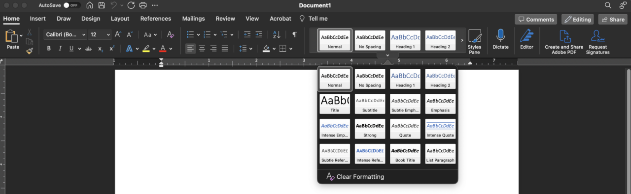
Use built-in text styles
This gives the document structure for screen readers. The text styles appear as thumbnails under the Home menu.
Avoid putting important info in the header or footer
Screen readers do not read content in the header or footer. This means that crucial information, such as “Confidential,” should be placed in the main body of the document.
Avoid interrupting lists
When using bullets or numbering, be sure to complete the full list without breaking the sequence with a plain paragraph. This helps screen readers accurately announce the number of list items and prevent the impression that the list ended prematurely.
Accessible documents benefit everyone
Weaving digital accessibility practices into your professional day-to-day requires a little bit of attention and commitment. But it will make a big impact. Accessible documents and presentations make your message clearer for everyone.
Dive deeper into digital accessibility on our blog. There, you can learn about: