The Power of Rebranding: Transform Your Business
WANT TO SEE MORE LIKE THIS?
Sign up to receive an alert for our latest articles on design and stuff that makes you go "Hmmm?"

Refreshing your brand and website doesn’t mean tossing everything out—it’s about leveling up what’s already working and reshaping what’s not. A thoughtful rebrand brings clarity, opens new doors, sparks growth, and deepens the connection between your brand and the people it serves.
When to Rebrand & Why It’s Worth It
Think of your brand as the face your business shows the world. It’s how people recognize you, remember you, and feel about you.
A good brand does three important things:
- It tells people who you are at a glance
- It builds trust with your customers
- It sets you apart from competitors
When your business evolves, your brand should too. A refresh keeps you relevant while holding onto what makes you special. Your logo, colors, words, and website all work together to create one clear message about your business. When these align perfectly, customers understand your value immediately.
Rebranding allows you to realign your external identity with your internal vision—making sure you’re speaking to the right people, in the right way, at the right time.
Think it might be time? Here are a few signs:
- You’ve grown, shifted, or redefined your mission
- Your audience has evolved
- Your brand identity feels outdated or inconsistent
- You’re expanding, merging, or pivoting into new markets
- Your message isn’t resonating—or is attracting the wrong audience
A well-executed rebrand can:
- Clarify your purpose and story
- Strengthen consistency across channels
- Differentiate you in a crowded market
- Improve recognition and memorability
- Build credibility and emotional connection
Famous Rebrands: The Hits and Misses
Rebrands can be powerful—but only when done intentionally. Let’s look at a few recognizable examples:
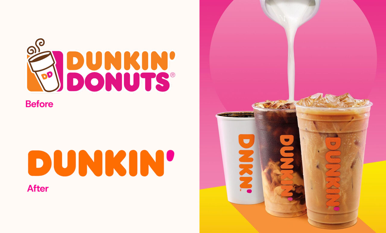
Dunkin: Streamlining for a broader identity
In 2018, Dunkin’ Donuts made a bold move to drop “Donuts” from their name. Why did they do it? The rebrand to simply “Dunkin’” reflected their evolution into a beverage-led, on-the-go brand, while still holding onto the playful, energetic spirit that made them iconic. The update brought clarity, gave the brand broader appeal, and modernized their image without losing the familiarity and loyalty tied to their roots. Check out the official announcement here.
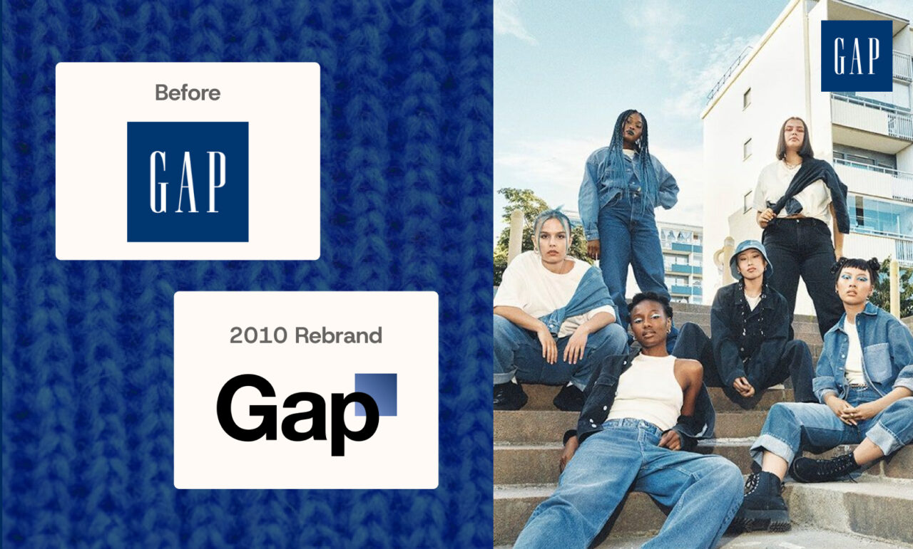
Gap: Too much, too fast
In 2010, Gap dropped their new logo. Why did they revert to the old one so quickly? While the design was meant to modernize their image, it felt generic and disconnected from the brand customers knew. The sudden change, with no rollout or explanation, sparked immediate backlash across social media and news outlets. More than just criticism, it revealed a deeper problem: the redesign lacked strategy, customer involvement, and brand alignment (as explored in The Branding Journal). Within a week, Gap reverted to their original logo — a reminder that even big brands can’t skip the hard work of building change thoughtfully and collaboratively.
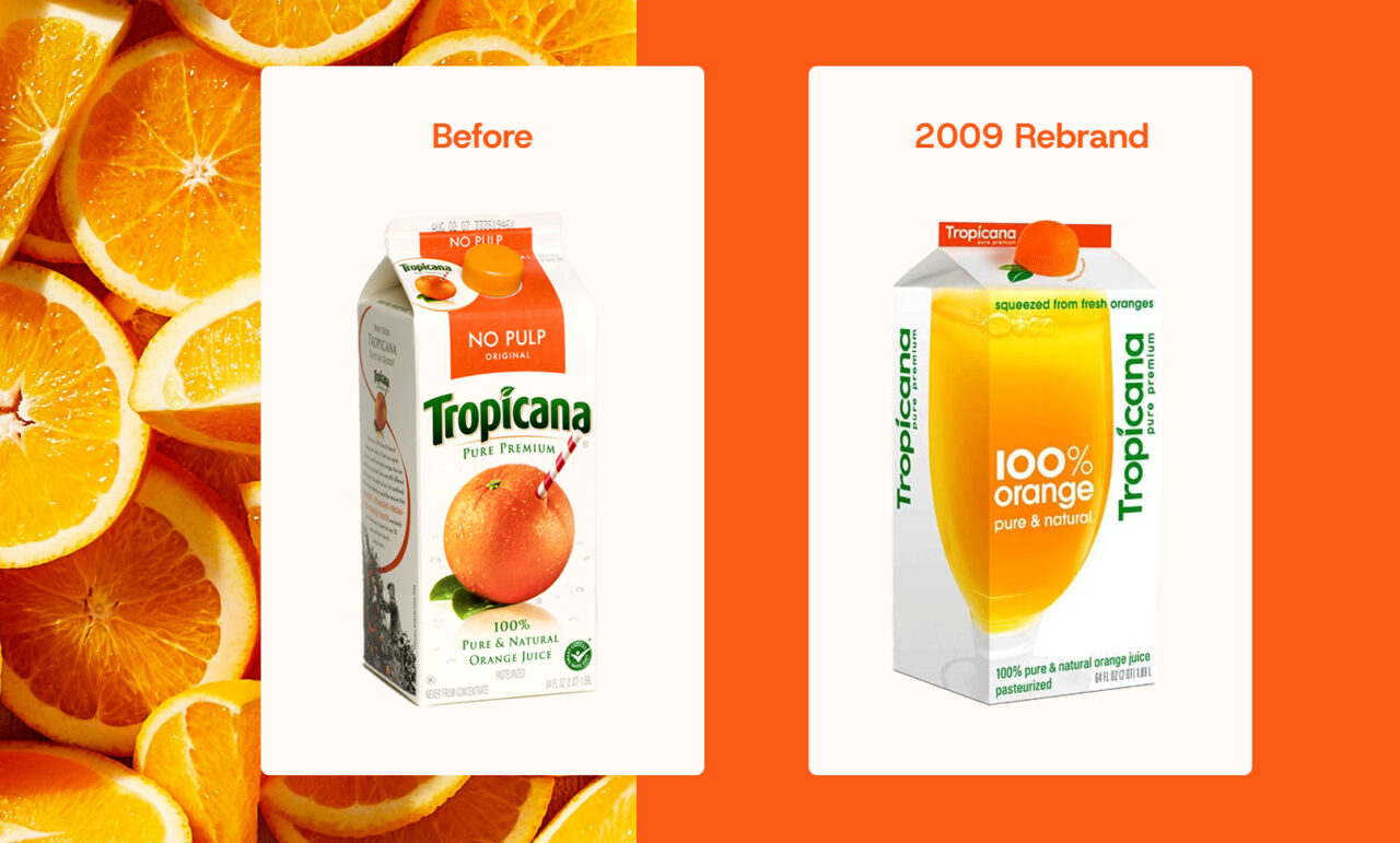
Tropicana: A refresh that erased recognition
In 2009, Tropicana unveiled a new logo and packaging. Funnily enough, most customers never even noticed the new designs hit the shelves. Why did they revert to their original look so quickly? The redesign replaced their iconic orange-with-a-straw image and familiar logo with a plain glass of juice, making the product almost unrecognizable to previously loyal customers. Buyers were confused, and sales dropped quickly. Without strong brand recognition anchoring the update, Tropicana realized the new design was costing more than it gained and quickly switched back (as analyzed in The Branding Journal). The failure showed that even well-intentioned modernizations must protect what customers already trust.
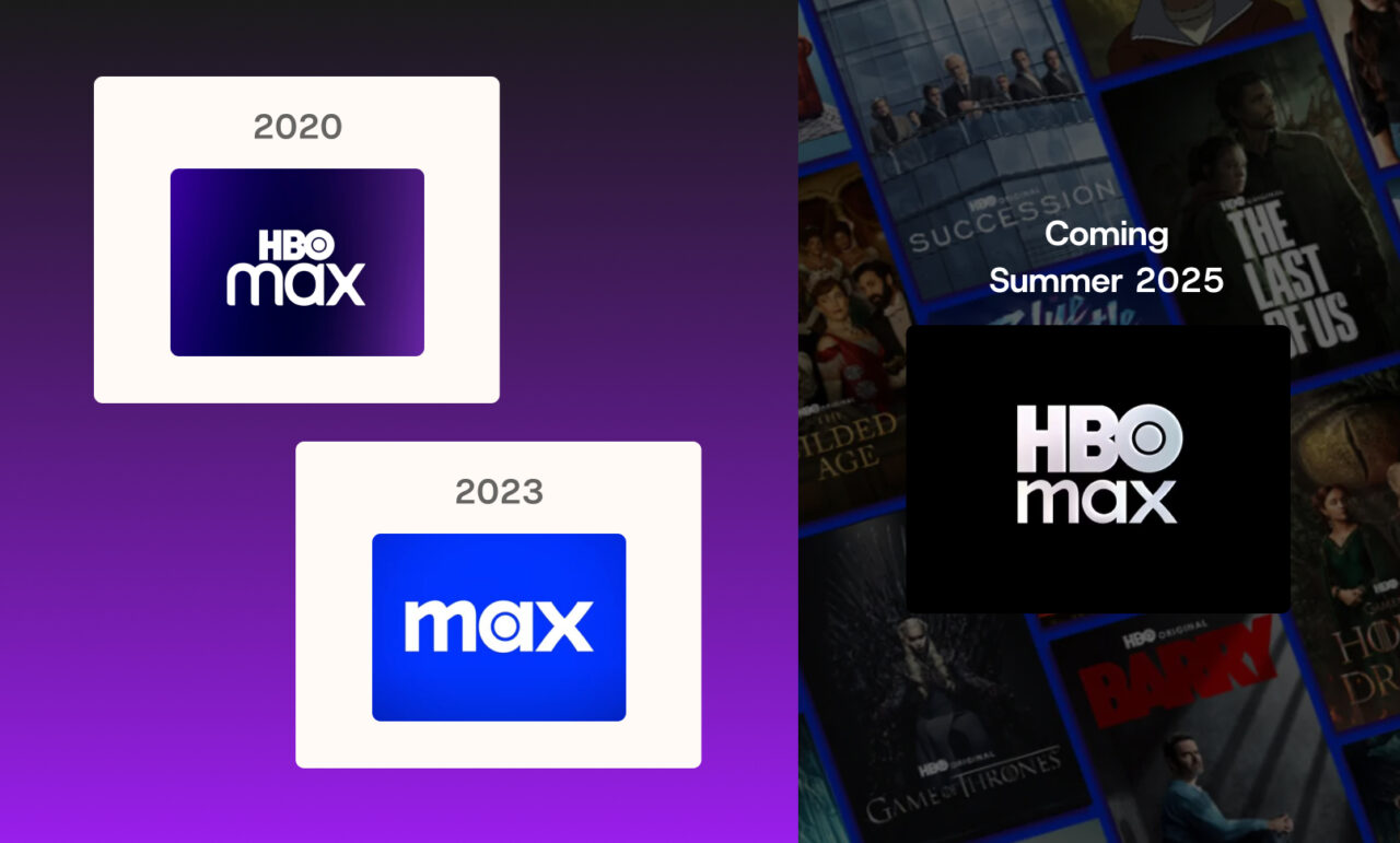
HBO Max: When “less Is more” goes too far
In May 2023, Warner Bros. Discovery boldly stripped “HBO” from HBO Max, rebranding to simply “Max” to signal broader programming beyond prestige television. The move aimed to encompass everything from reality TV to family content under one roof. But after two years of consumer confusion and lukewarm reception, the company announced in May 2025 that it’s reverting to “HBO Max” — admitting that dropping television’s most prestigious brand name was perhaps not the smartest play. As executives sheepishly explained, quality beats quantity in the streaming wars, and “HBO” still carries unmatched brand equity.
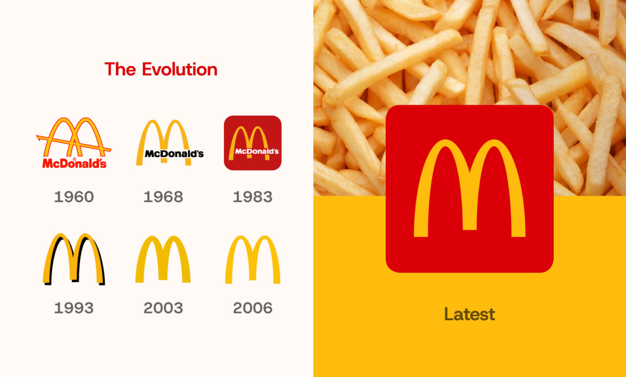
McDonald’s: Classic, but always evolving
Instead of reinventing their iconic mark, McDonald’s gradually simplified it to better fit digital platforms, ensure global consistency, and appeal to modern audiences who value clean, contemporary design. By refining rather than replacing, they strengthened brand recognition and proved that thoughtful evolution can keep a brand culturally relevant without breaking its connection to the past. Check out how they’re expanding the use of the golden arches for the digital age.
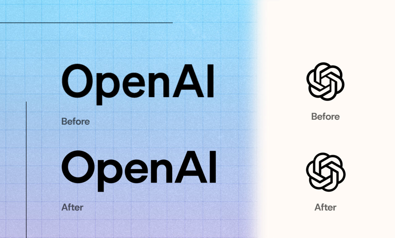
OpenAI: Simple looks, big thinking
At a glance, what really changed about the new OpenAI logo? While they kept the flower-like symbol, they gave it a clean makeover. The new look pairs stripped-down visuals, computer-perfect geometry, and handcrafted collages. By balancing tech precision with human creativity, OpenAI tries to make cutting-edge AI feel less intimidating without hiding what it is. The redesign shows how a simple tweak can help brands stay true to their roots, while opening new doors to connect and adapt with its users. Check out their full brand guidelines here.
Glantz Client Highlights
At Glantz, strategy is at the heart of everything we do—but we never forget the magic of great design. These client transformations showcase our belief that thoughtful, collaborative rebranding doesn’t just look good—it delivers measurable impact, meaningful connections, and even a little delight along the way.
Beacons Point: Energizing a brand to stand out in a saturated market
Beacons Point, a B2B video production studio, came to us looking to stand out among a sea of West Coast competitors. They wanted a brand that reflected their creativity, joy, and cinematic flair. Check out the full case study here.
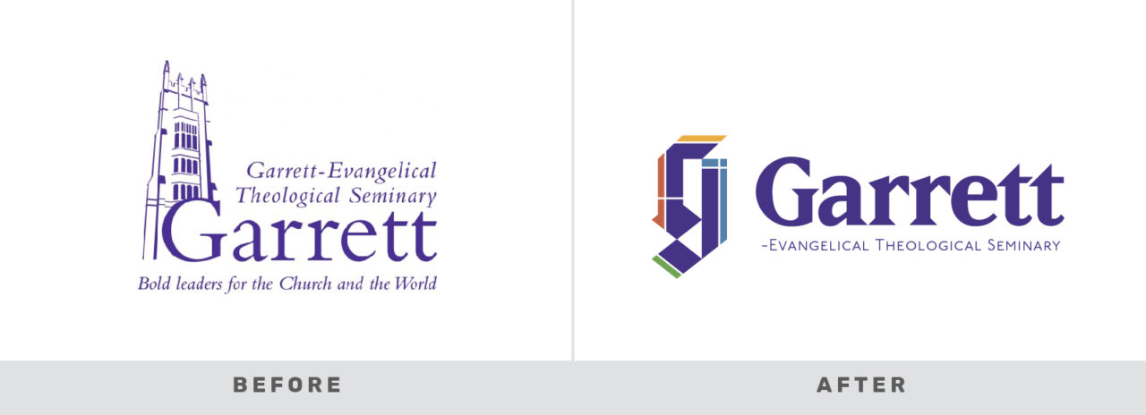
Garrett-Evangelical Theological Seminary: Honoring a 166-year legacy while looking ahead
Garrett needed a refreshed identity that honored its history while connecting with modern, digital-first audiences. Check out the full case study here.
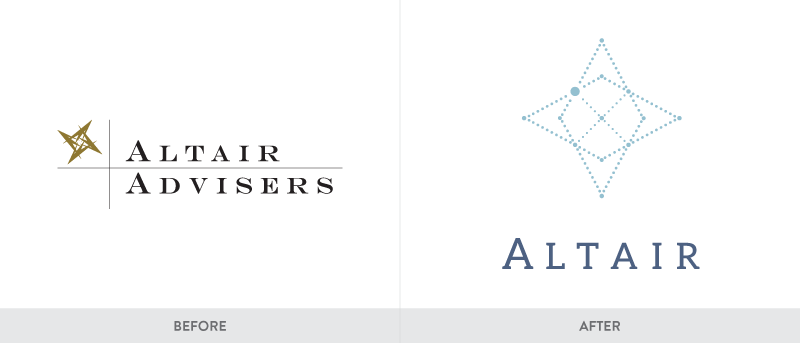
Altair Advisers: Redefining a Brand Rooted in Client-First Values
Altair, a leading independent wealth advisory firm, partnered with us to elevate their brand and digital presence. They needed a refined identity and website that matched their reputation for thought leadership and a client-first philosophy. Check out the full case study here.
Stemloop: Modernizing a premier biosensor brand
Stemloop, a bioscience startup developing advanced biosensors, needed a brand that reflected their forward-thinking, responsible approach. Check out the full case study here.
Why It Works
A rebrand can be an evolution, or a revolution—refining what’s working and elevating what’s not. These transformations aren’t just about aesthetics. They are grounded in strategy and guide a brand to move forward with consistency.
At Glantz, we blend discovery sessions, audience insights, and collaborative design thinking to shape brands that are built to last. When every part of your brand is working together, you create a presence that builds trust, drives engagement, and moves your business forward.
Ready to Elevate Your Brand?
If your current brand doesn’t reflect who you are or where you’re headed, it’s time for a change. Whether you’re starting fresh or refining what’s already there, we’re here to help.